UTM Campaigns
Analyze Digital Marketing Campaigns
Use UTM Campaigns' Insights to Better Achieve End-Goals
Introducing UTM Campaigns
Make Outreach More Successful
UTM campaigns is a powerful website statistics feature that enables you to analyze the performance of any online marketing campaign. From individual newsletters to paid ads and large multi-channel initiatives, get the insights you need to drive campaign results.
With TWIPLA, analyzing campaigns is easy. Simply generate the UTM link, share it with your audience, and dive back into TWIPLA to analyze performance in real time. Then, quickly increase traffic, clicks, and engagement by using these data-driven insights.
Why Use UTM Campaigns Stats?
- Identify your top ads, campaigns or channels.
- Improve engagement across all social media accounts.
- See all campaign insights in one place and compare data.
- Know which campaigns generate the most revenue.
Advanced UTM Campaign Analytics
Get Actionable Insights for Improving Campaign Success
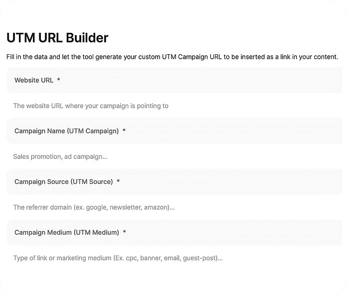
UTM URL Builder
Create a UTM Campaign Link
Our UTM link generator allows you to quickly build the URL you need for any marketing campaign, and enables our platform to accurately analyze performance later. Everything's been designed to be as intuitive as possible, just as you'd expect from TWIPLA.
So dive into this module. Input the webpage address that your campaign is built around. Specify the digital channel type you're using. Name it, and include any other information you may need to analyze your custom campaign later.
Then you're ready! Copy the generated UTM link and add it to your campaign outreach. Share it with your audience in whatever channel you want. If you're creating a multi-channel campaign, simply create another UTM code for each element of it in the same way.
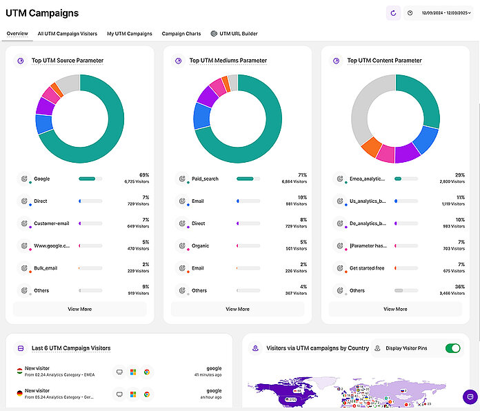
UTM Campaigns Overview
All Your Top Metrics At-a-Glance
After you use the UTM URL Builder to create links, TWIPLA automatically begins to generate categorized insights when users visit your website via these links. When you have several UTM campaigns running, visit the overview section to compare their performance.
The campaigns' summary displays all the important metrics clearly for easy comprehension. View an intuitive chart of campaign visitor statistics. Rank your campaigns by website traffic and also identify your most effective keywords across your various initiatives.
Further down, you will find charts for your top referral sources, traffic channels, and URL segments. View a list of the most recent campaign visitors, complete with an interactive map showing their locations. Use TWIPLA to gain the insights for campaign success.
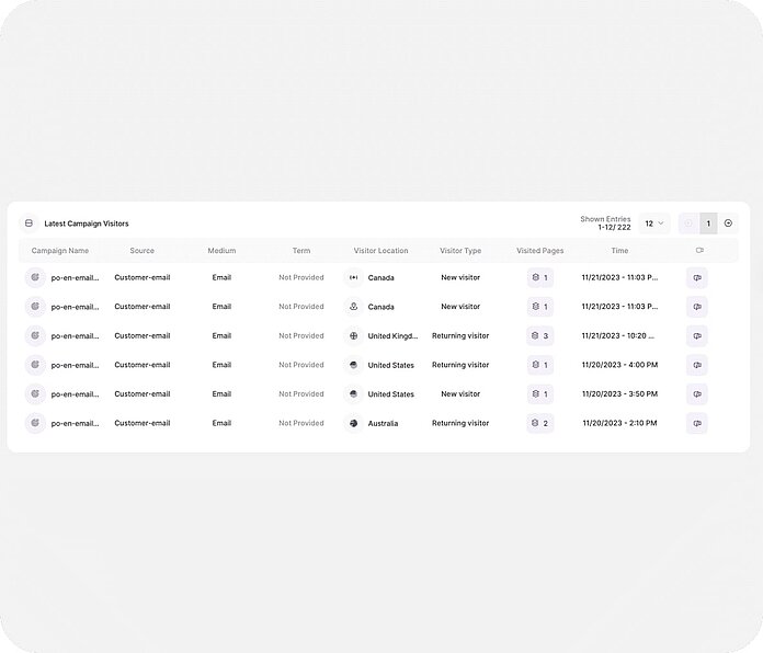
Latest Campaign Visitors
Analyze UTM Campaign Visitors
Our tool enables you to track all UTM campaign traffic at a glance. So dive in, and see all the data that matters: campaign, source, and channel. It's all displayed for ease of references, and you can also use the filters to focus on any visitor type you're interested in today.
Then, go deeper. See what time they visited your website. Know whether they're new or returning users. See their location, what pages they visited, and their total page view count. Watch a session recording and see exactly what they each did during the visit.
So use TWIPLA and measure the performance of your various marketing efforts and the quality of the prospective customers brought in. Understand campaign visitor behavior better, and then use these insights to improve targeting strategies and ROI.
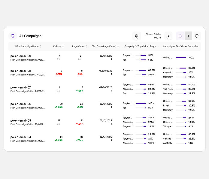
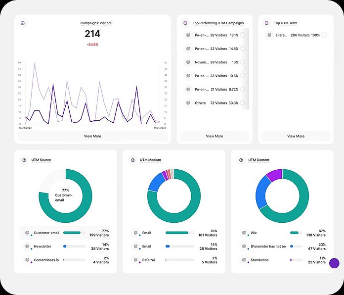
My Campaigns
Track Each Marketing Initiative
Alternatively, analyze each marketing campaign individually. Jump into this section of the feature to know they're all doing side by side. See a granular list of performance metrics and statistics related to the various UTM campaign terms themselves.
Total visitors. Overall visits. Total sessions. UTM_Source. UTM_Term. UTM_Content. It's all here, and you can filter what you see to the time period you need. Click into any of the campaigns, and you'll also see a breakdown of all the campaign elements side by side.
So use this module to track campaign performance from any angle. Identify successful campaigns to replicate, and poor performing ones that can be improved for next time. Get the insights you need and make effective, data-driven improvements to your outreach!
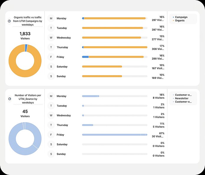
UTM Campaign Charts
Bring Campaign Data to Life
With TWIPLA, you can view all your data in graphic form. See how traffic is broken down between campaigns and organic visits. Know how these visits are distributed throughout the week. See the total website visits on each day, and their percentage of weekly traffic.
Then, go deeper. See similar charts on your UTM_Source, as well as for each of your campaigns. And remember, everything display can be quickly filtered down to the date range of your choice, enabling you to identify peaks, drop offs, and broader performance trends.
So use these intuitive charts to understand complex UTM campaign data at a glance. And then leverage these insights to make data-driven decisions that will refine your marketing strategies and increase campaign effectiveness significantly.