- Why Us?
- Features
White Label
For SaaS Platforms & Agencies
Provide our complete analytics suite to your clients, directly within your own interface and with your/their own branding. Discover Analytics-as-a-Service and White Label Analytics. Great benefit, minimal effort.
- Pricing
- White Label
- Success Stories
- ResourcesGetting Started
CONTENTS
- What is a Landing Page?
- Choosing an Effective Landing Page Builder
- How to Creating a Landing Page on Wix
- What to Include on Your Landing Page
- 1. An Enticing Headline
- 2. Clear Value Proposition
- 3. A Relevant Form
- 4. An Effective Call to Action (CTA)
- 5. Strong Social Proof
- 6. Attractive Visual Content
- How to Track and Measure the Success of a Landing Page
- 1. Get Visitor Numbers, Conversion Rates, and Location Details
- 2. Compare Data and See How the Landing Page Performs Over Time
- 3. Use Visitor Behavior Analytics to Improve Your Page
- 4. Collect Feedback from Visitors
- Bonus Tips for Creating an Effective Landing Page
- 1. Define Your Goal and Audience
- 2. Keep it Simple, Clean, and Organized
- 3. Match Landing Page Copy with PPC Ads
- That's Effective Landing Page Construction Explained!
How to Create a Successful Landing Page from Scratch

If you want to get your website performing well, you'll need to learn how to create a successful landing page.
Simply put, these pages are often the first page of your website that internet users see, and getting them right will result in longer sessions, higher engagement rates, and also more conversions.
But what are the different elements to consider?
Read on, and this blog will teach you everything you need to know.
What is a Landing Page?
In essence, the purpose of landing pages is to direct visitors to take a specific action.
This action can be subscribing to a newsletter, signing up for a service, making a purchase, or anything else you might consider a success for your business.
No matter the case, the final objective of a landing page should always be to increase your conversion rates.
Creating an effective landing page is crucial as it is the first thing visitors see after clicking on your ad, promotional email, or have found you elsewhere on the internet.
A clear and straightforward structure on this web page is very important as it will help you increase conversions, generate leads, and also turn a potential customer into a loyal one.
Choosing an Effective Landing Page Builder
Learning how to create a successful landing page starts with the right software.
There are many options available but one of the most simple and professional ways is by using the Wix Landing Page Builder.
In essense, this drag and drop editor allows you to create beautiful and user-friendly pages even if you lack coding skills.
The design is very flexible and you can turn any free template into a webpage that looks a million dollars.
Besides, if your landing page is eCommerce oriented, Wix will provide a great number of online store enhancements for you, such as secure payment solutions and sales boosters.
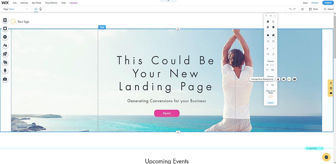
Start creating an effective landing page on Wix by following these steps:
- Log into your Wix account.
- Click Create New Site.
- Choose your industry (Music, Photography, Online Store, and many other options)
- Select a template and create the landing page on your own, or answer a few questions and allow the Wix Artificial Design Intelligence (ADI) to generate 3 different opinions for you to choose from.
- Now all you have to do is edit the template. There are more than 800 templates for you to choose from and also thousands of design features. Change elements and move them around as you wish until you get the design you wanted, or just keep the template as it is, after all, it was created by a professional designer.
- Add your logo and start editing the text to describe your product and services, make sure your contact and social media information then hit Save and Preview your new landing page.
- Once you are finished click Publish.
What to Include on Your Landing Page
An effective landing page will include the following elements:
1. An Enticing Headline
If you don’t manage to get your visitors’ attention right from the headline, you’ve already lost them.
This is where their interest should be sparked.
The headline should explain the product/service’s essence, in not more than 10-15 words and should be benefit-oriented.
2. Clear Value Proposition
Your landing page should act as a lead magnet.
It tells your visitors what they can gain and expect from your product or service.
It does not have to be a single element. Think about a list of benefits and use bullet points (yes, just like this one).
These benefits have to be focused on the potential customers’ needs, otherwise, the message will not get through to them.
Customers need real and proven reasons to be convinced by your product/service.
3. A Relevant Form
It is advised, no matter what your end goal is, that you have included an opt-in form when you create high converting landing pages.
The content and number of form fields depend on your design, the products or services you are offering, your industry, and, of course, your audience.
If you are offering something minimal for free, you should not ask for too much information from the users.
Asking them for their email address in order to send them a free monthly newsletter is a pretty fair exchange.
However, if you ask them for their cell phone number and job information, without offering anything valuable in exchange you will lose them on the spot.
And always make sure you are GDPR compliant when collecting such data.
4. An Effective Call to Action (CTA)
This one is extra important because is the element that tells users who land on your page what you want them to do, and how to do it.
Make it a clickable button. We advise you to choose a color that contrasts with the background for this button.
You can have more than one of these buttons on your landing page, but you should be mindful of the fact that you might confuse the visitors if there are too many different actions for them to take.
If you want as many landing page conversions as possible, you should stick to only one option, shown in multiple places. With Wix it’s easy to duplicate elements while also maintaining your design.
It’s best to keep it as simple as possible and create different landing pages for each CTA button.
5. Strong Social Proof
Whether it is a product or service, social proof guides a visitor down the conversion funnel.
It refers to the numbers of likes, tweets, pins, subscribers or testimonials your company has.
Whichever suits your website the best, that’s the one you should be using.
You should display them on your page because social media and recommendations from trusted individuals play a big role in the purchase decision.
Use testimonials from real people who are most relevant to your audience.
It is best if these testimonials are specific: real numbers and real data. Wix will provide you with a wide range of elements created especially for this.
6. Attractive Visual Content
This one, just like the CTA, is mandatory!
Images and videos are faster and easier to comprehend, underline the message and influence your visitors’ behavior on your page.
This means more conversions.
You can use attractive images to direct your visitors’ attention exactly where you want it on the page and they will eventually take action.
Product videos and demos are also recommended.
There are other good landing page builders on the market, like Kyvio, HubSpot, Unbounce, Instapage, but in our opinion, Wix is the most intuitive and flexible.
How to Track and Measure the Success of a Landing Page
Now that you have all the information for how to create a successful landing page.
However, you will also need analytics to see how your newly created web pages are performing.
To get all the basic statistics along with more complex visitor behavior analytics, you can add the TWIPLA app to your landing pages and you will be able to:
1. Get Visitor Numbers, Conversion Rates, and Location Details
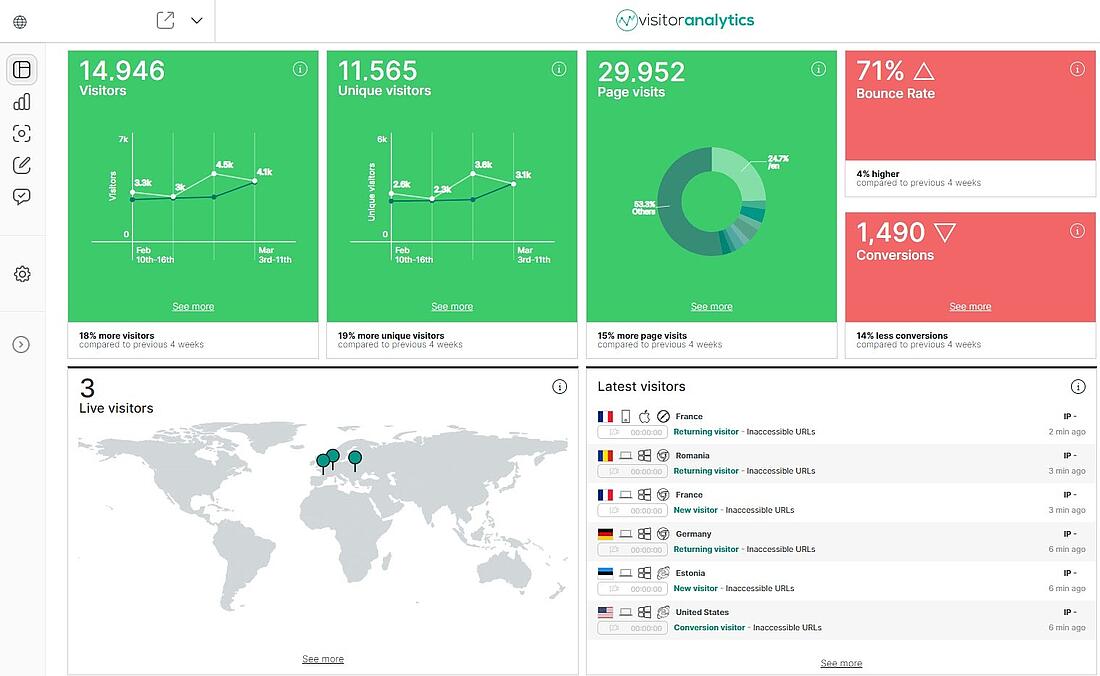
Once you installed the TWIPLA app you will be able to see in its dashboard the number of visitors, unique visitors, and also conversions. The data is being tracked in real-time and you can choose from the app settings to ignore your own visits so that the data you track is more accurate. You will get a preview of the latest visitors country, operating system, browsers, and devices.
Among other data displayed in the TWIPLA Dashboard, you will also get 2 maps. A map of the live visitors, which we must admit can be pretty addictive to look at, and a map of visitors by country. These 2 features will help you get an overview of how your landing page is performing worldwide and get a better understanding of your target audience’s geolocation.
2. Compare Data and See How the Landing Page Performs Over Time
In the TWIPLA website statistics section, you will get detailed information about the features mentioned above, for an even deeper understanding of your landing’s page efficiency. Among others, you will see the amount of new and returning visitors, the session duration, and also page visits.
You will get a complete chronological list of your visitors with their approximate location, status (new/returning/converted visitor), device used to access your page, and other valuable info that can have a real impact on your marketing strategy and how, where and to whom you decide to promote your landing page towards.
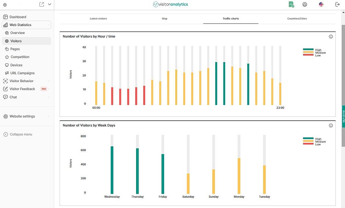
Another important feature when you decide to promote your landing page is also the color-coded traffic charts. By looking at these you will be able to see when it’s best to post on social media or send out your newsletter.
Here’s a sneak peek:
You will see your referral traffic, or from what other websites your visitors came to your landing page, so you can decide what ads to keep and also what partnerships might not be working out for you.
In the competition tab, you will be able to compare your page to the ones of your competitors by selecting your country and also your business domain. And while in the URL Campaigns tab you will be able to see where your traffic is coming from. Just add UTMs to your links whenever you post them somewhere and use TWIPLA to see if your traffic is coming from your Facebook ads, your other website, or any other source.
3. Use Visitor Behavior Analytics to Improve Your Page
TWIPLA provides 3 main ways of analyzing how your visitors interact with your landing page once they start navigating.
The Visitor Recordings feature, alternatively known as session replays, “records” what your visitors are clicking on your landing page and provides you with a video of their exact journey on your page. You basically get a full video of their actions on your landing page. By watching these videos, you will see at what point your visitor decided to leave your website without converting. If you notice a pattern you might have to make some adjustments.
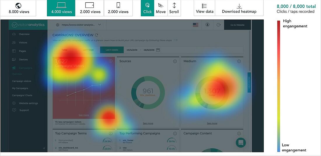
The case is also similar for the Heatmaps tool, but instead of analyzing individual visits, this feature takes information from larger amount of visits and turns it into a color-coded visual allowing you to see which parts of your landing page are the most attractive. Intense activity such as user clicks, mouse movement, taps, and scrolls will be shown with red, orange, and yellow, while low levels of activity will be displayed with blue, green, or no color at all.
Different heatmaps will be shown depending on the type of device (desktop, tablet, or mobile) so that you can easily see if your visitors are clicking or tapping on the wrong elements, instead of your CTA buttons.
By setting up a Conversion Funnel for your landing page within TWIPLA you will also get to see the number and percentage of people who visited your page and have turned into a buyer/subscriber/follower/etc. Since you are working with a single page, your conversion funnel will only have these 2 steps: Visitor and Converted Visitor, but for websites with multiple pages, the funnels can have a large number of steps to track the exact pages on which visitors lose their interest.
4. Collect Feedback from Visitors
TWIPLA also provides you with the option to easily set up polls and surveys for your visitors and to integrate them into your landing page with just a few clicks. Feedback from your visitors is crucial in running a successful business. By using the TWIPLA Feedback module it will be easier than ever before to see what your customers lack or even what they enjoy most and over time will help you improve your strategy, thus your landing page.
Bonus Tips for Creating an Effective Landing Page
You now know how to create a successful landing page, but here are some more advanced tips to help you get the most out of them:
1. Define Your Goal and Audience
The purpose of this page should be very clear. Before starting to work on the page, you need to figure out why you are creating it in the first place. This is closely tied to the call to action, as well as all the included content.
It is important that you stick to a single goal in order to minimize the number of choices you give to your visitors and have a truly successful landing page.
The landing page also has to be relevant to your audience. In order for this to become possible, you have to really know who your audience is and then create the landing page with that specific target in mind.
2. Keep it Simple, Clean, and Organized
The feel and overall structure of the page design have a big impact on the visitors. Your primary goal should be in focus here, so you should only keep the necessary information that visitors need in order to convert.
As such, the page must be easily scannable, so use bullet points to explain features and details when possible. Avoid using too much text. Naturally, the most important pieces of information should be kept above the fold.
Let go of distracting navigational links and extra clutter. Links, menus, and buttons that have nothing to do with the particular action you want users to take are not welcome. You have to basically make it impossible for the visitor to get distracted or ignore your main message.
3. Match Landing Page Copy with PPC Ads
The keywords in the page copy should match the text used in the PPC ads. Using the same language and key phrases show consistency and reassure users that they are on the right path.
Brand consistency is also key, so you should not make this particular page too different from your overall website. Keep the fonts and colors that can be found on your main website as well.
That's Effective Landing Page Construction Explained!
Congratulations, you now know everything about how to create a successful landing page!
Of course, there will always be room for improvements. Technology is always advancing, and you'll find that you have to keep adapting to a target audience that can change over time.
So sign up to TWIPLA, and keep analyzing results, and finding new ways to entice your website community into action!
Share article
Get Started for Free
Gain World-Class Insights & Offer Innovative Privacy & Security

You might also like
A full guide to page load speed and how to improve it 12 November 2020 - by Simon Coulthard


