- Why Us?
- Features
White Label
For SaaS Platforms & Agencies
Provide our complete analytics suite to your clients, directly within your own interface and with your/their own branding. Discover Analytics-as-a-Service and White Label Analytics. Great benefit, minimal effort.
- Pricing
- White Label
- Success Stories
- ResourcesGetting Started
23 Must-Try eCommerce Optimization Tips for Consistent Results

Did you know that 90% of eCommerce businesses fail within their first 120 days?
That’s a pretty depressing statistic, and yet it’s not all doom and gloom since online retail spending is expected to double between now and 2028 - creating opportunities for businesses that have responded to every aspect of eCommerce optimization.
This refers to the ongoing process of refining each stage of the customer journey - from attracting visitors to guiding their shopping experience, enhancing product pages, streamlining checkout, and keeping them engaged after purchase.
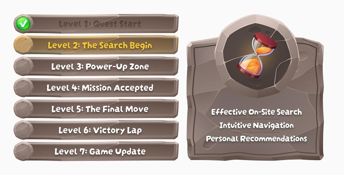
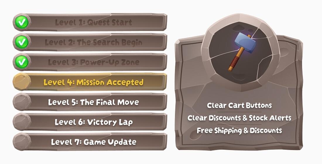
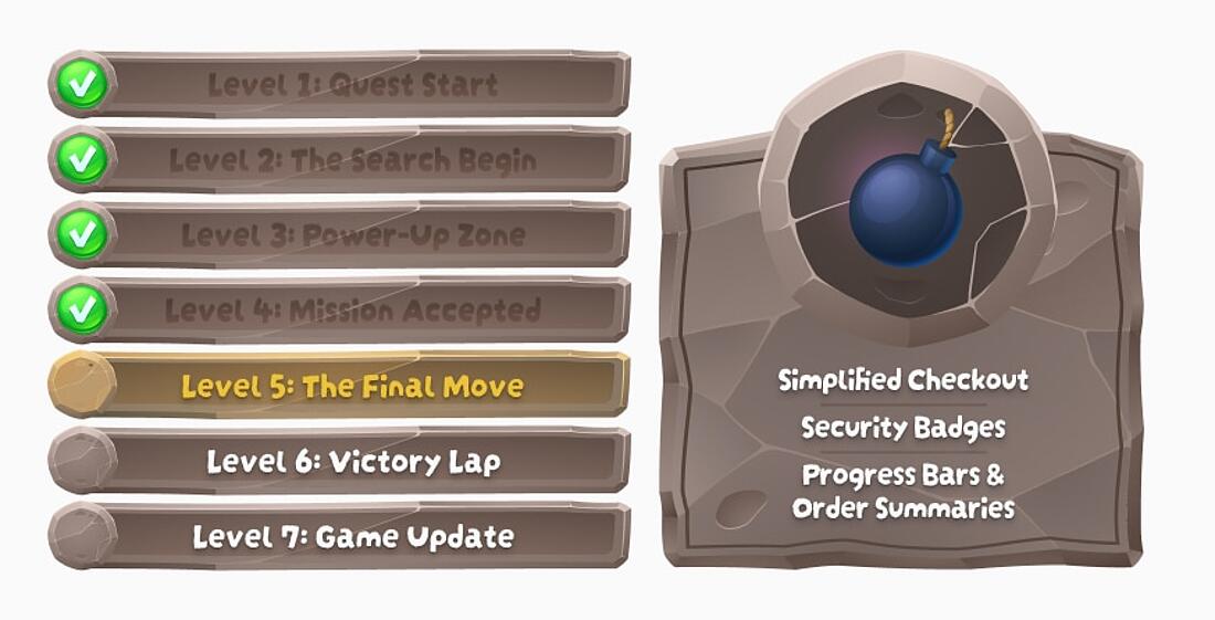
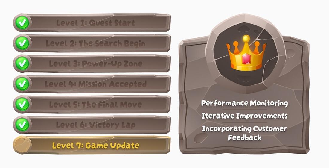
In this blog, we'll walk through each "level" of eCommerce optimization. Think of it like a computer game, with actionable tips, cheats, and hacks to ensure that your player doesn't just survive but thrives:
eComm Optimization and Analytics
eCommerce optimization is practically impossible without analytics - you might as well be playing without a controller.
Without a clear picture of customer behavior, conversion rates, and sales patterns, it’s nearly impossible to make decisions that actually enhance the customer experience and, ultimately, increase revenue.
Choosing the right eCommerce analytics is key to gathering meaningful insights.
TWIPLA is a fantastic option. But there are many others available, and it’s essential to adopt one with the eCommerce optimizations services and features that align with your business. To help, check out our list of the best eCommerce analytics platforms.
You’ll then want to track the metrics that really matter. For a complete guide to which data points you should prioritize, see our blog on the 42 best eComm metrics. This will ensure you’re focusing on insights that drive growth and give you an edge in today’s marketplace.
Bringing Shoppers to Your Store
→ Level 1: Quest Start
Before shoppers can explore your store, you need to draw them in - and make sure their first visit is memorable and enjoyable.
Optimizing key areas like site speed, mobile design, and homepage experience is crucial to engaging customers right from the start.
Let’s dive into these ecommerce website optimization areas, and how they can help to transform casual visitors into loyal buyers.
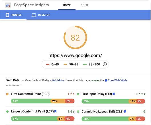
1) Boost Site Speed
Summary: Fast loading speeds aren’t just nice to have - they’re essential.
Shoppers have high expectations for quick-loading sites, and slow pages lead them to bounce.
Plus, search engines prioritize fast sites, making speed a powerful tool for gaining visibility and attracting traffic.
A good page load time for Google is considered to be under 2.5 seconds, with 2.5–4 seconds needing improvement and over 4 seconds being considered bad.
Optimize Images for Faster Loading
- Tip: Many eCommerce platforms, like Shopify, recommend compressing images. JPEGS are a good option, but Webp is 25-34% smaller - making it a great option if you want to compress images while preserving image quality.
Use a Content Delivery Network (CDN)
- Stat: Sites like TWIPLA that use CDNs load about 60% faster on average. CDNs serve content from servers closer to each visitor, reducing lag and improving the user experience.
Enable Browser Caching
- Tip: Caching lets returning visitors load your site quicker by storing site versions on their browsers. This means smoother browsing for repeat visitors and higher chances of conversion.
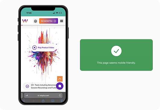
2) Mobile-Friendly Design
Summary: With mobile traffic accounting for over 60% of eCommerce visits, a mobile-optimized design is non-negotiable. Mobile users expect fast, easy navigation on their devices, and without it, you risk losing them before they even start exploring.
Responsive Layouts for All Devices
- Example: ASOS’s mobile site scales smoothly for any screen size, giving users a consistent, intuitive navigation experience regardless of device.
Simplified Mobile Checkout
- Stat: An overwhelming 85% of mobile shoppers abandon their carts due to complex checkouts. Streamlined checkout flows prevent this drop-off, boosting conversions.
Essential Features within Thumb’s Reach
- Tip: Position crucial elements like search, filters, and checkout buttons for easy access. One thing we recommend is to position these elements right under the user’s thumb to make navigation as easy as possible.
3) Great Homepage Experience
Summary: Your homepage is your digital storefront, setting the tone for new visitors. A visually compelling, well-organized homepage guides visitors smoothly into browsing, helping them feel confident as they navigate.
High-Quality Visuals with Clear Messaging
- Example: Apple’s homepage uses sleek visuals and short, impactful messages to create a clean, engaging look that reflects the brand’s quality. Have a look, and you’ll see that a little can go a long way.
Organized Navigation for Smooth Browsing
- Stat: Nearly 40% of users will leave a website if the navigation is confusing. Clear menus and categorized sections help users find what they’re after quickly, keeping them engaged.
Engaging Calls to Action (CTAs)
- Tip: Use bold CTAs that guide users towards products and deals. Amazon’s homepage places “Shop Now” and “Explore Deals” buttons prominently to nudge visitors in the right direction.
Optimizing these foundational areas is your Level 1 quest. Get these fundamentals right, and you’ll bave built the foundation for a powerful eCommerce experience that keeps customers coming back for more.
Guiding the Shopping Journey
→ Level 2: The Search Begin
After bringing visitors to your store, the next step is guiding them seamlessly through their shopping journey.
Every click should lead them closer to discovering the products they’re searching for - without confusion or friction.
Let’s look at eCommerce search optimization, and how also optimizing navigation features will help keep visitors engaged, prevent bounce rates, and encourage product discovery.
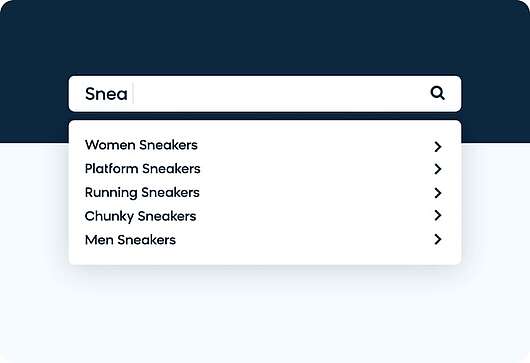
1) Effective On-Site Search
If your search function falls short, you risk losing potential buyers early in their journey.
Smart Search Suggestions
- Example: Amazon’s search bar offers predictive text and popular suggestions as users type, helping them locate products quickly and reducing search time.
Filters for Precise Results
- Stat: Nearly 60% of online shoppers prefer sites with filters to narrow down results by price, size, color, and rating. Offering intuitive filters enhances relevance, making it easier for customers to find exactly what they want.
Error Tolerance in Search
- Tip: Account for typos and similar terms in your search function. Zalando, for instance, adjusts for common misspellings, ensuring customers find relevant products even if they make a small error in spelling.
Organized Categories and Subcategories
- Example: H&M organizes products by category and subcategory, such as “Women’s Clothing” > “Dresses” > “Casual Dresses.” This structure guides visitors to products faster, making browsing more enjoyable.
Sticky Navigation Bars
- Stat: “Sticky” navigation bars improve user engagement by 22%, allowing shoppers to move between sections without scrolling to the top.
Logical Menu Arrangement
- Tip: Place popular categories or sales items prominently in the menu. Zara, for example, features its “New Arrivals” and “Best Sellers” right on the main menu, helping visitors quickly access trending products.
3) Personalized Recommendations
By suggesting items based on browsing history and personal preferences, you encourage deeper exploration and increase engagement. For example, if you have a home decor e-commerce store, showcasing embroidery-patterned products can captivate customers’ interest. This creates a more enjoyable and personalized shopping journey, leaving customers eager to discover more.
Dynamic Product Suggestions
- Example: Amazon’s recommendation engine displays “Customers who bought this also bought” and “Recently viewed items,” personalizing the shopping journey and boosting engagement.
Related Products on Product Pages
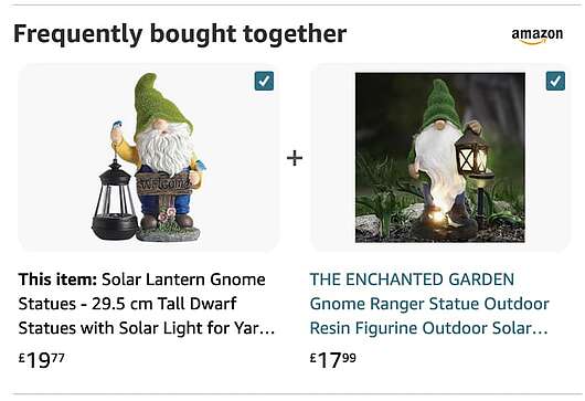
- Stat: Displaying related products on item pages increases average order value by up to 20%. This cross-selling strategy keeps customers browsing longer and improves their experience.
Personalized Homepages for Returning Visitors
- Tip: Show recently viewed or recommended items on the homepage for returning visitors. Platforms like Etsy use this approach to help customers pick up where they left off, increasing the chances of a purchase.
Guiding shoppers through a smooth journey, from search to product discovery, lays the foundation for a satisfying shopping experience and a successful conversion.
Optimizing Product Pages
→ Level 3: Power-Up Zone
Product pages are where interest transforms into intent.
A well-designed product page showcases each item in its best light, making it easy for customers to see the value and take the next step toward purchasing.
By working on eCommerce content optimization - including visuals, descriptions, and trust-building elements - you create a more engaging and persuasive product page experience.
1) High-Quality Product Images
Multiple Angles and Zoom Functionality
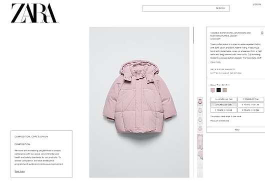
- Example: Zara’s product pages offer images from multiple angles, with a zoom feature allowing customers to view details up close, helping them feel more confident about their purchase.
360-Degree Product Views
- Stat: 360-degree views increase conversion rates by up to 27%. By showing products from all angles, you give customers a fuller sense of what they’re buying.
Consistent Style and Quality
- Tip: Use consistent image quality, background, and lighting across product photos. Brands like ASOS maintain uniform styling, which gives the product pages a polished, professional look that builds trust.
Marketing Case Studies: Get Inspiration from Famous Success Stories
2) Detailed Product Descriptions
Summary: Detailed descriptions provide answers to shoppers' questions, helping them visualize how the product fits seamlessly into their lives. A well-crafted description highlights key features, benefits, and practical uses.
By addressing common concerns, it sparks a sense of need, making the product feel like an essential addition to their routine or lifestyle.
Highlight Key Features and Benefits
- Example: Apple’s product descriptions detail key features and benefits without overloading visitors, focusing on what makes each product stand out in practical terms.
Include Specifications and Sizing Information
- Stat: Providing precise measurements and specs reduces returns by up to 50%, as customers are better informed about what they’re buying.
Storytelling Elements
- Tip: Incorporate a bit of storytelling to engage readers. Patagonia weaves sustainability stories into descriptions, making customers feel more connected to the product and the brand’s mission.
Learn 16 Actionable Content Marketing Tips for Guaranteed Results
3) Customer Reviews & Ratings
Summary: Reviews and ratings build trust by providing social proof, showing potential buyers that others are happy with the product. Including customer feedback on product pages can increase conversions and reduce bounce rates.
Prominent Star Ratings
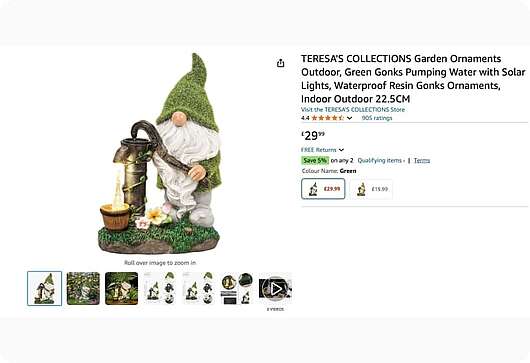
- Example: Amazon places star ratings and review counts at the top of product pages, instantly showing shoppers what others think and encouraging them to read more reviews.
Verified Customer Photos and Feedback
- Stat: Product pages with customer photos have up to 91% higher engagement, as shoppers appreciate seeing real-world use cases.
Encourage Review Submissions
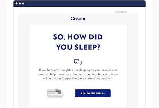
- Tip: Invite customers to leave reviews after purchase. Glossier, for instance, follows up with an email asking for reviews, which keeps the feedback fresh and relevant for new shoppers.
By optimizing product pages with compelling visuals, informative descriptions, and social proof, you create an environment that builds customer trust and boosts conversions, making your product pages a powerful conversion tool.
Building Website Credibility: Essential Tips for a Trustworthy Reputation
Turning Interest into Cart Adds
→ Level 4: Mission Accepted
After capturing a shopper's interest, the next mission is to encourage them to add items to their cart. Small tweaks on product pages, such as persuasive calls to action and a sense of urgency, can make all the difference in turning interest into intent. Here’s some cheats for responding to this aspect of online store optimization effectively.
Here’s how to optimize this crucial step.
High Contrast and Strategic Placement
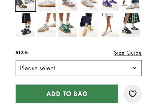
- Example: ASOS uses a contrasting color for its “Add to Cart” button, positioning it in a prime location to catch the eye and encourage clicks.
Action-Oriented Language
- Stat: Buttons with action-oriented phrases like “Buy Now” or “Get Yours” can boost conversions by up to 20%, creating a subtle but effective nudge.
Keep It Simple
- Tip: Ensure the button is simple, uncluttered, and clearly labeled. Avoid confusing text or surrounding it with other elements that distract from the primary action.
2) Limited-Time Offers & Stock Alerts
Display Limited-Time Discounts
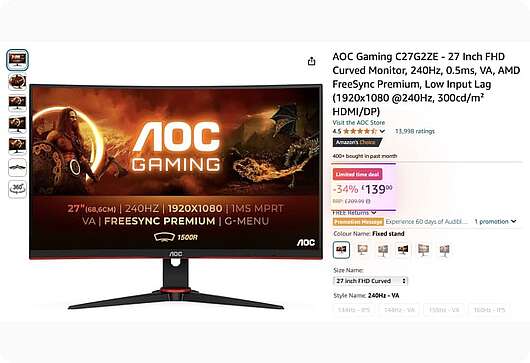
- Example: Amazon often highlights time-sensitive deals, showing a countdown timer that prompts customers to add items to their cart before the offer expires.
Low Stock Warnings
- Stat: Low-stock messages can increase conversion rates by up to 33%, as shoppers are encouraged to buy before the item sells out.
Encourage Quick Decisions with Clear Urgency
- Tip: Use phrases like “Only 2 left in stock” or “Limited-time offer” to add subtle pressure, helping to turn interest into action without appearing too pushy.
3) Free Shipping & Display Savings
Summary: Shipping costs are a leading cause of cart abandonment, so highlighting free shipping or savings can be the extra push needed for shoppers to add items to their cart. Offering a perceived deal keeps customers moving toward checkout.
Show Savings with Discounts or Bundles
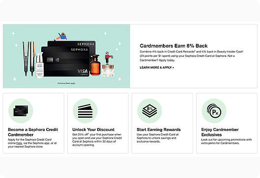
- Example: Sephora displays savings on bundled items, showing customers how much they’re saving compared to buying each item separately, which can incentivize adding more products to the cart.
Free Shipping Thresholds
- Stat: 90% of shoppers are more likely to add items to their cart to reach a free shipping minimum. Displaying this threshold can encourage additional purchases.
Highlight Total Savings
- Tip: Show total savings at the cart level to keep customers motivated. Brands like Target display the total amount saved in bright text, reinforcing the value of what’s in their cart.
By implementing these strategies, you make it easy for shoppers to take the next step, turning their interest into active engagement. Each tactic brings them one step closer to completing their mission of adding items to their cart.
Optimizing Checkout for Conversions
→ Level 5: The Final Move
The checkout process is the last, critical step in the customer journey. A smooth, optimized checkout experience reduces friction, builds trust, and ensures that all the effort bringing a customer to this point culminates in a completed sale. Here are essential strategies for eCommerce conversion optimization.
1) Streamlined Checkout Process
Guest Checkout Option
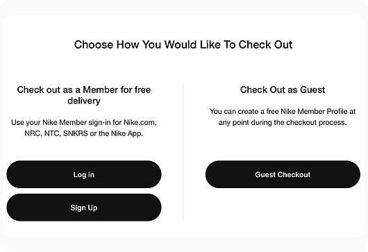
- Example: Urban Outfitters offers a guest checkout option, eliminating the need for account creation and allowing first-time customers to check out quickly and without hassle.
Auto-Fill and Address Verification
- Stat: Auto-fill and address verification features reduce checkout time by 30%, minimizing errors and making the process smoother.
Remove Unnecessary Fields
- Tip: Only ask for essential information, like shipping and payment details, to keep the checkout as short as possible. Brands like Nike streamline checkout by focusing only on necessary fields, increasing the likelihood of a completed purchase.
2) Trust Signals & Security Features
Summary: Trust is essential at checkout, as customers are required to enter sensitive information. Displaying trust signals, such as security badges and clear privacy policies, reassures customers that their data is safe.
Trust Badges and SSL Certificates
- Example: Shopify displays SSL security icons and well-known trust badges on its checkout page, signaling to customers that their payment information is secure.
Visible Privacy Policies
- Stat: 75% of shoppers feel more comfortable completing purchases on sites with visible privacy policies, as they know their data will be handled responsibly. Get the information you need to create a privacy policy, and you'll start seeing tangible results.
Reassuring Payment Options
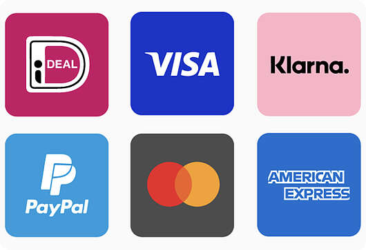
- Tip: Offering recognizable and reliable payment options, like PayPal or major credit cards, builds confidence. Amazon’s checkout includes multiple payment methods, giving customers more flexibility and comfort in choosing a secure option.
3) Progress Indicators & Order Summary
Summary: Showing customers where they are in the checkout process, along with a clear order summary, keeps them engaged and reduces abandonment. Progress indicators provide transparency, while order summaries ensure clarity on items and total costs.
Step-by-Step Progress Bars
- Example: ASOS includes a progress bar during checkout, helping customers see exactly how many steps remain before completing their order.
Detailed Order Summary
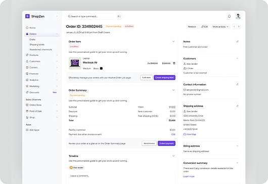
- Stat: 40% of shoppers are more likely to complete a purchase when they can easily review their cart contents, including item details, shipping costs, and taxes, at checkout.
Transparent Total Costs
- Tip: Avoid surprise fees by showing a clear breakdown of all costs upfront. Brands like Apple itemize totals, giving customers confidence that they’re fully aware of what they’re paying before finalizing the purchase.
The checkout process is a key aspect of conversion optimization for eCommerce websites.
Optimizing this ensures a smooth and secure experience, keeping customers focused on completing their order. By reducing friction, building trust, and providing transparency, you create a final step that leads shoppers comfortably across the finish line.
Retaining and Engaging After Purchase
→ Level 6: Victory Lap
The post-purchase phase is your victory lap - where you turn one-time buyers into loyal customers and brand advocates. By continuing engagement after the sale, you build trust, foster repeat business, and strengthen your relationship with customers. Here are ways to optimize the post-purchase experience.
1) Thank-Yous & Order Confirmations
Tailored Order Confirmations
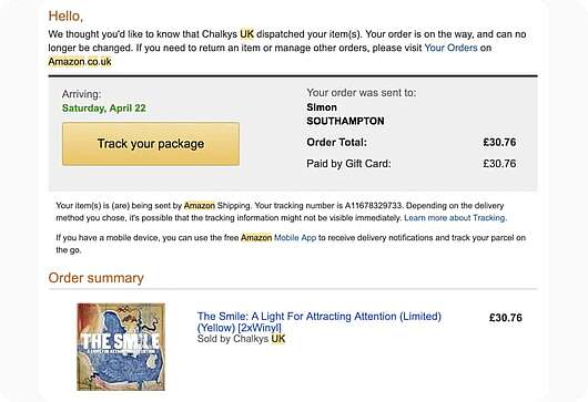
- Example: Amazon sends detailed order confirmation emails with personalized recommendations based on the purchased items, subtly encouraging customers to keep browsing.
Friendly and Reassuring Language
- Stat: Brands that use friendly language in order confirmations see a 10% increase in customer satisfaction, as it reinforces a positive shopping experience.
Include Next Steps
- Tip: Inform customers about what happens next, such as estimated delivery times or how to track their order. Brands like Wayfair include this information in their thank-you emails, which keeps customers informed and engaged.
2) Follow-Up Emails & Recommendations
Summary: After the initial purchase, follow-up emails nurture the relationship and keep your brand top of mind.
Tailored product recommendations and check-ins encourage repeat visits and make customers feel valued.
Product Care and Use Tips
- Example: Glossier sends follow-up emails with product care tips, helping customers get the most from their purchase and fostering brand loyalty.
Personalized Product Suggestions
- Stat: Emails with tailored recommendations generate 30% more repeat purchases by suggesting complementary or relevant products.
Ask for Feedback and Reviews
- Tip: Encourage customers to leave feedback or a review. Brands like Sephora invite customers to rate and review their purchases, building social proof and helping future buyers make informed decisions.
Email Automation: Learn About an Approach That Enhances Customer Intelligence
3) Loyalty Programs & Exclusive Offers
Summary: Loyalty programs and exclusive offers show appreciation for repeat business, encouraging customers to return. Rewarding loyalty increases customer lifetime value and strengthens brand connection.
Offer Points or Rewards on Future Purchases
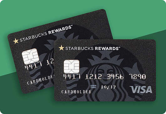
- Example: Starbucks’ loyalty program rewards customers with points for every purchase, which can be redeemed for discounts or free products, motivating repeat visits.
Send Exclusive Discounts for Returning Customers
- Stat: Loyalty members are 70% more likely to make additional purchases when offered exclusive discounts, as they feel valued and incentivized to buy again.
Invite Customers to Join a VIP Program
- Tip: Provide a VIP experience by offering early access to new products or exclusive events. Fashion brands like ASOS offer VIP memberships, creating a sense of exclusivity that appeals to loyal shoppers.
Engaging customers after purchase keeps the momentum going, turning one-time buyers into repeat customers. By showing appreciation, offering value, and inviting them into your brand community, you ensure that each purchase leads to a lasting relationship.
In eCommerce, the journey never truly ends. Continuous improvement is essential to keep up with changing customer expectations, market trends, and technological advancements. Regularly optimizing your store based on real data, testing new ideas, and adapting to feedback keeps your brand competitive and engaging. Here’s how to keep leveling up your eCommerce strategy.
1) Regular Analysis & Monitoring
Summary: Analyzing key performance metrics gives you valuable insights into customer behavior, site performance, and sales trends. Tracking data like bounce rates, conversion rates, and cart abandonment helps you pinpoint areas for improvement.
Set Up KPIs and Benchmarks
- Example: Shopify offers dashboards with real-time KPIs, allowing businesses to monitor sales, customer behaviors, and traffic sources to track performance.
Identify Patterns and Pain Points
- Stat: Companies that monitor analytics regularly can improve conversions by up to 30% by making data-driven optimizations based on customer behavior.
React Quickly to Trends
- Tip: Use analytics to stay on top of trends and changes in customer preferences. Brands like H&M monitor data to adjust stock levels or promote trending products, ensuring they meet demand and customer expectations.
2) A/B Testing & Iterative Optimization
Summary: Testing different elements on your site, such as layouts, copy, or visuals, allows you to identify what resonates best with customers. A/B testing is a powerful tool for refining pages and improving conversion rates based on actual user interactions.
Run A/B Tests on Key Pages
- Example: Etsy conducts A/B tests on product pages, adjusting elements like button placement and image sizes to see what drives more engagement and conversions.
Optimize Based on Results
- Stat: A/B testing can boost conversion rates by up to 20% by showing which changes lead to the best user experiences and outcomes.
Test One Change at a Time
- Tip: Test individual changes rather than multiple elements at once to get clear insights into what works best. Brands like Booking.com are known for testing one variable at a time, ensuring reliable results that guide ongoing improvements.
3) Further Refinement Through Feedback
Summary: Customer feedback is an invaluable resource for understanding where your store excels and where it could improve. Listening to your customers’ suggestions and concerns provides actionable insights to enhance the user experience and build stronger relationships.
Conduct Post-Purchase Surveys
- Example: Glossier sends follow-up surveys asking customers about their experience, which helps the brand gather insights and make product or service improvements.
Discover the Best Customer Survey Tools
Monitor and Respond to Reviews
- Stat: Over 80% of shoppers trust user reviews, so addressing negative feedback and thanking positive reviewers can improve your reputation and customer loyalty.
Use Feedback for Product and Service Updates
- Tip: Regularly review feedback to find common themes. Brands like Zappos use customer feedback to inform product descriptions and sizing guidelines, enhancing the accuracy and usefulness of their listings.
With a mindset of continuous improvement, you’re always one step ahead, adapting to your customers’ needs and the latest industry developments. Regular data analysis, testing, and customer feedback ensure your eCommerce store is never static - always evolving for a better shopping experience.
Share article
Get Started for Free
Gain World-Class Insights & Offer Innovative Privacy & Security

You might also like
How to Set Up eCommerce Statistics 03 March 2024 - by Simon Coulthard
Expert-Picked: 10 Trustworthy eCommerce Analytics Tools 24 February 2020 - by Simon Coulthard


