- Why Us?
- Features
White Label
For SaaS Platforms & Agencies
Provide our complete analytics suite to your clients, directly within your own interface and with your/their own branding. Discover Analytics-as-a-Service and White Label Analytics. Great benefit, minimal effort.
- Pricing
- White Label
- Success Stories
- ResourcesGetting Started
CONTENTS
- What Are Analytical Reports?
- Analytical Report Examples
- E-commerce Analytics Report
- Business Performance Report
- Marketing Analysis Report
- Customer Experience Report
- International Report
- Crafting an Analytical Report
- Importance of Data Privacy and Compliance
- How TWIPLA Can Help with Analytics Reports
- Streamlined Data Collection
- Customizable Dashboards
- Visual Insights
- Privacy-First Features
- Designed for Action
- FAQs for Analytical Reports
- What is an Analytical Report?
- Why Are Analytical Reports Important?
- How to Create an Analytical Report?
Analytical Reports Explained: Steps and Examples
Data is in many ways the language of modern business, making it crucial to learn how to communicate this information to stakeholders in a way that they can understand.
That’s where analytical reports come in.
They don’t just present raw numbers; they translate data into actionable insights that inform decisions and drive results.
Whether you’re analyzing website performance or evaluating the success of a marketing campaign, these reports are indispensable tools in the professional toolkit.
In this blog, we’ll dive into the different types of analytics reports, uncover their value, and share how to create one that delivers real impact.
What Are Analytical Reports?
→ “Your Numbers, Now in HD”
Think of analytics reports as giving your data an upgrade to high definition.
They take raw numbers and transform them into clear, structured insights that anyone can understand and act on.
These reports are not just about data; they’re about clarity - showing you exactly what’s working, what needs attention, and where to focus next.
Writing an effective report starts with understanding what your audience needs to know.
Are they looking for trends in website performance, insights from a marketing campaign, or solutions to operational bottlenecks?
When you frame your data around these questions, your report becomes sharper, more focused, and immediately actionable - just like switching to HD.
But whatever the analytical report topics, presentation is key.
Use visuals like charts, graphs, and infographics to give your data that high-definition impact, making complex information easier to see and understand. A well-crafted report doesn’t just communicate - it empowers, providing the insights and direction needed to navigate challenges and seize opportunities with confidence.
Analytical Report Examples
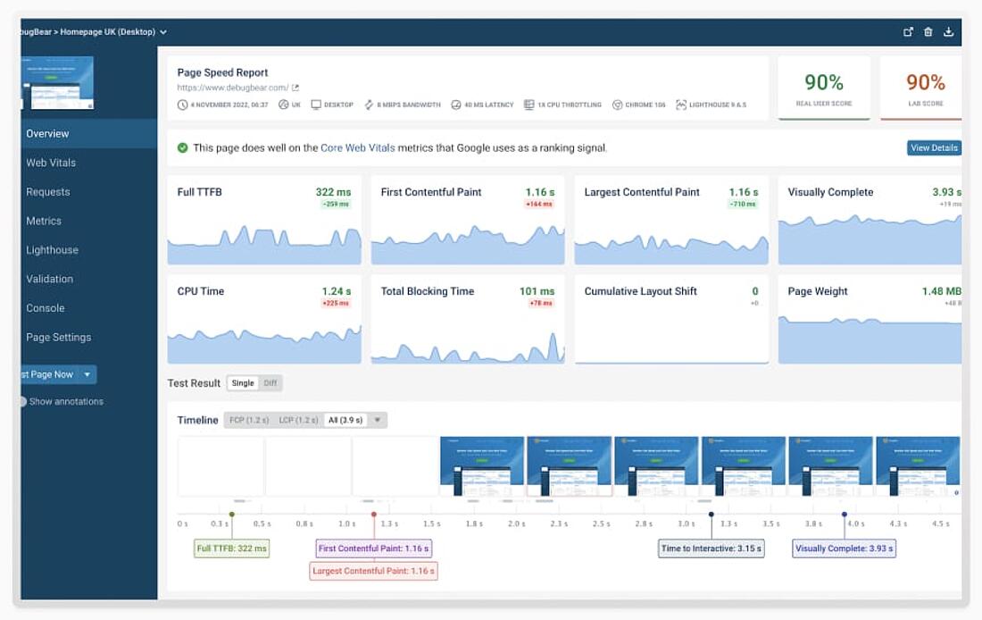
Website Performance Report
A website performance report uncovers the unseen factors that shape user experience, from loading speeds to navigation issues.
For instance, it might highlight that slow page load times are driving visitors away, giving you the data needed to fix bottlenecks and keep users engaged.
By focusing on uptime, technical health, and engagement metrics, this analytical report example ensures your site remains competitive and user-friendly.
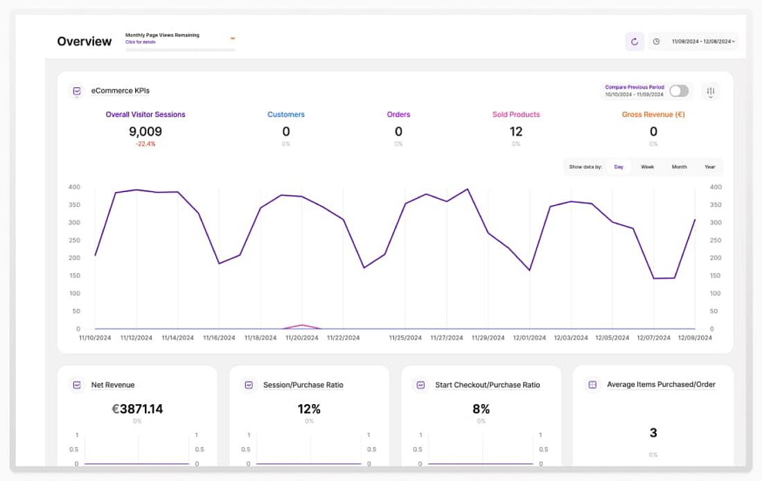
E-commerce Analytics Report
An e-commerce analytics report helps you identify what’s working in your sales process and where customers are running into obstacles.
Imagine discovering that most abandoned carts occur at a specific step during checkout - this insight allows you to refine that step and recover lost sales.
By analyzing sales conversions, product performance, and customer demographics, this report becomes an essential tool for the eCommerce optimization needed to driving revenue and enhance the customer journey.
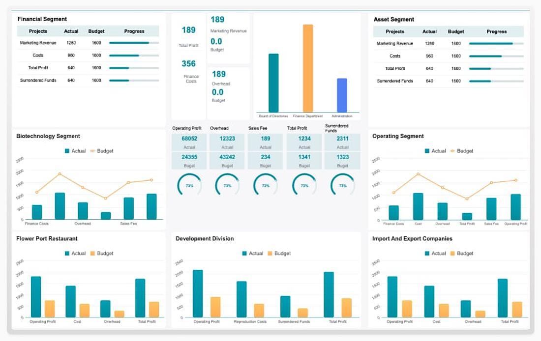
Business Performance Report
Think of a business performance report as a health check for your organization.
It evaluates operational efficiency, financial metrics, and KPIs to provide a comprehensive overview of where your business stands.
Whether it’s identifying inefficiencies or showcasing areas of success, this analytical report example equips decision-makers with the clarity needed to create a marketing strategy - or others - that aligns with organizational goals.
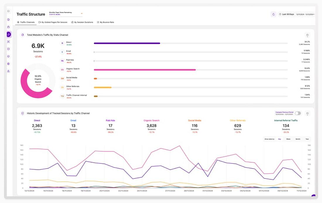
Marketing Analysis Report
A marketing analysis report shines a spotlight on your campaigns, showing what’s capturing your audience’s attention and what’s not.
For example, you might analyze social media metrics and discover that the ads drive higher engagement than email campaigns, prompting a shift in your strategy.
By analyzing ROI, channel performance, and audience engagement, this report helps ensure your marketing dollars are spent wisely.
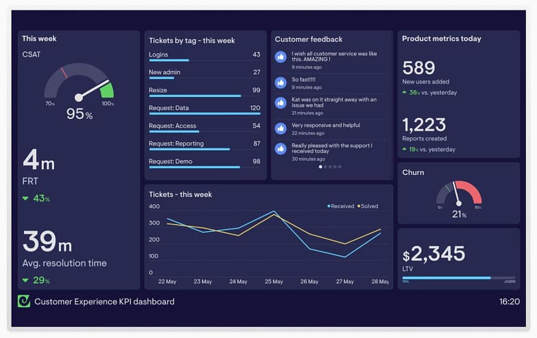
Customer Experience Report
A customer experience report delves into how people interact with your business across multiple touchpoints, offering a lens into their needs and frustrations.
For instance, if support interactions reveal recurring complaints, this report can guide efforts to address them and boost satisfaction.
By focusing on customer experience (CX), pain points, and satisfaction trends, this analytical report example empowers you to deliver seamless, loyalty-building experiences.
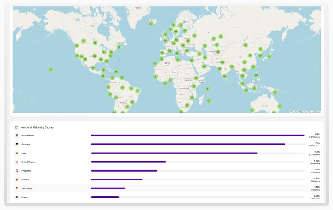
International Report
An international report provides a comprehensive view of performance across multiple regions or countries, helping businesses navigate global markets with confidence.
For example, a retail chain might use this report to compare sales trends across Europe, Asia, and North America, identifying which regions are driving growth and where improvements are needed.
International reports often include regional comparisons, localized insights, and global trends to offer a complete picture.
By aligning strategies with regional performance, an international report ensures that businesses can adapt and thrive in diverse markets.
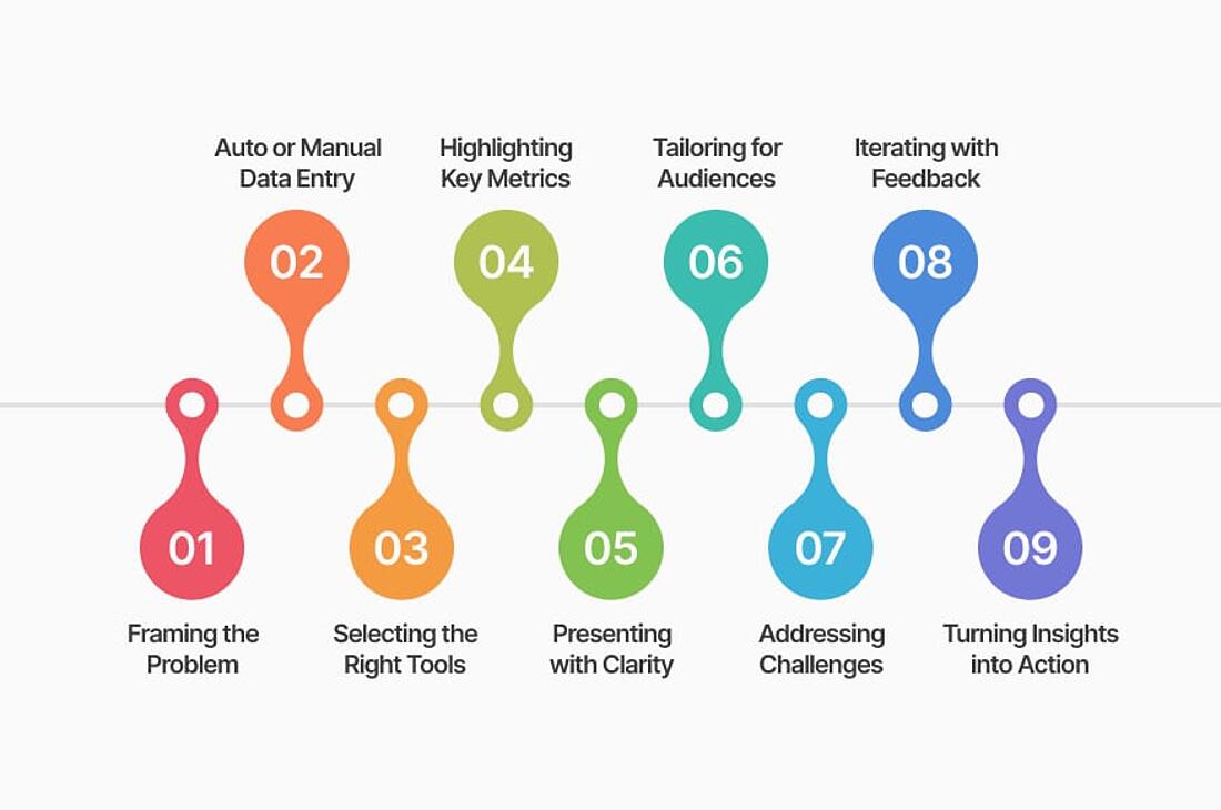
Step 1: Framing the Problem
Every great report begins with defining its purpose.
Start by identifying the key questions your report needs to answer.
For example, are you trying to track website traffic patterns to see which pages are performing well? Or are you analyzing customer behavior to understand why users abandon their carts at checkout?
A clear goal helps you focus on the most relevant data, avoiding unnecessary complexity and ensuring your report delivers actionable insights aligned with your business objectives.
Step 2: Choosing Full Automation or Manual Data Entry
Next, decide how you’ll collect and organize your data. Manual entry might work for small datasets but can become tedious and error-prone as complexity grows.
Automated tools, such as TWIPLA, streamline this process. For instance, if you’re tracking click behavior on your website, TWIPLA can automatically organize this data into heatmaps and dashboards, saving hours of manual work.
Automation ensures your data is accurate and ready for analysis, forming the backbone of a solid analytical report template.
Step 3: Selecting the Right Tools
The tools you use can determine the success of your report.
Choose tools that not only collect data but also make it easy to analyze and present.
TWIPLA, for example, provides features like session recordings and event tracking. Let’s say you want to analyze how users interact with a new landing page. With TWIPLA, you can visualize user behavior through heatmaps, showing where visitors click and what they ignore.
These insights can then be organized into an analytical report format that effectively communicates your findings.
Step 4: Highlighting Key Metrics
Focus on metrics that matter most to your goals. For a website performance report, this could include bounce rates, page load times, or conversion rates.
Avoid overwhelming readers with too many numbers - instead, present a clear narrative that connects the data to your objectives.
For example, if your goal is to increase sign-ups, highlight how a faster load time on your sign-up page correlates with improved conversions.
Structuring these insights into an analytical report structure ensures your audience can quickly grasp the key points.
Step 5: Presenting Your Findings with Clarity
Visuals are a powerful way to make data digestible.
Use charts to compare metrics over time, heatmaps to show user behavior, or infographics to summarize key takeaways.
For example, if you’re reporting on email campaign performance, a bar chart comparing open rates and click-through rates across campaigns can quickly show what worked best.
Tools like TWIPLA’s custom dashboards help you create professional visuals that resonate with your audience, leveraging the capabilities of analytics reporting tools to deliver clarity.
Step 6: Customizing for Different Audiences
Not all readers need the same level of detail.
For executives, focus on high-level summaries like revenue impact or key performance highlights. For technical teams, provide detailed metrics or step-by-step analysis.
For instance, a marketing manager might want a breakdown of campaign ROI, while a developer might need insights into website load times.
Tailoring your report ensures it’s relevant and useful to each audience, a key consideration in effective analytics reporting.
Step 7: Addressing Common Challenges
Challenges like unclear goals, messy data, or overwhelming visuals can derail your report.
Suppose your team collects data from multiple sources, but it doesn’t align. Start by ensuring all metrics are consistent and formatted correctly. Simplify complex visuals by sticking to one or two key points per chart.
Overcoming these hurdles ensures your report is both reliable and engaging.
Step 8: Iterating with Feedback
Think of your report as a work in progress.
After sharing it, ask for feedback from your audience.
For example, if a marketing team finds a section too detailed, consider adding a summary to streamline the content. Incorporate new data as it becomes available, and refine your focus based on evolving business needs.
Iteration keeps your reports relevant and valuable.
Step 9: Turning Insights into Action
The ultimate goal of your report is to drive action.
Tie each insight to a recommendation.
For example, if a report shows that visitors drop off on a specific product page, suggest improving the page layout or simplifying the checkout process.
By turning data into actionable steps, your report becomes a powerful tool for achieving results.
Crafting an analytical report involves following these structured steps while remaining flexible to your unique needs. With clear goals, the right tools, and a focus on actionable insights, you can create reports that not only inform but inspire meaningful change.
Importance of Data Privacy and Compliance
When creating an analytics report, you must think about data privacy. Mishandling sensitive information can lead to fines, a damaged reputation, and a loss of trust from your customers.
That’s why protecting user data isn’t just a good idea - it’s a must.
Laws like GDPR in Europe and CCPA in California set strict rules for how businesses handle data.
To follow these rules, make sure the data you collect is secure, anonymized, and only used for its intended purpose. For example, tools like TWIPLA help you stay compliant with features like cookieless tracking, so you don’t need to rely on cookies that require user consent.
Who you’re showing the report to also matters.
If it’s going to stakeholders or external parties, double-check that any sensitive data is anonymized or aggregated to avoid exposing personal information. Sharing raw data can be risky, so ensure the information in the report is relevant, compliant, and appropriate for the audience.
As you build your report, include checks to ensure your data sources are safe and legal.
Avoid gathering information you don’t need, and always prioritize transparency about how the data will be used.
By thinking about privacy at every step, your reports won’t just be useful - they’ll also be ethical and trustworthy.
How TWIPLA Can Help with Analytics Reports
Creating an analytics report can feel overwhelming, but TWIPLA simplifies the process with tools designed to make data easy to collect, understand, and present.
Whether you’re tracking website performance, analyzing user behavior, or identifying trends, TWIPLA equips you with everything you need to create impactful reports.
Streamlined Data Collection
TWIPLA automates data collection, so you can say goodbye to manual input and errors.
And thanks to cookieless technology and consentless tracking, it ensures that you capture accurate data from all your site visitors - even those who opt out of your cookie policy. This means your reports are based on complete and reliable data.
Customizable Dashboards
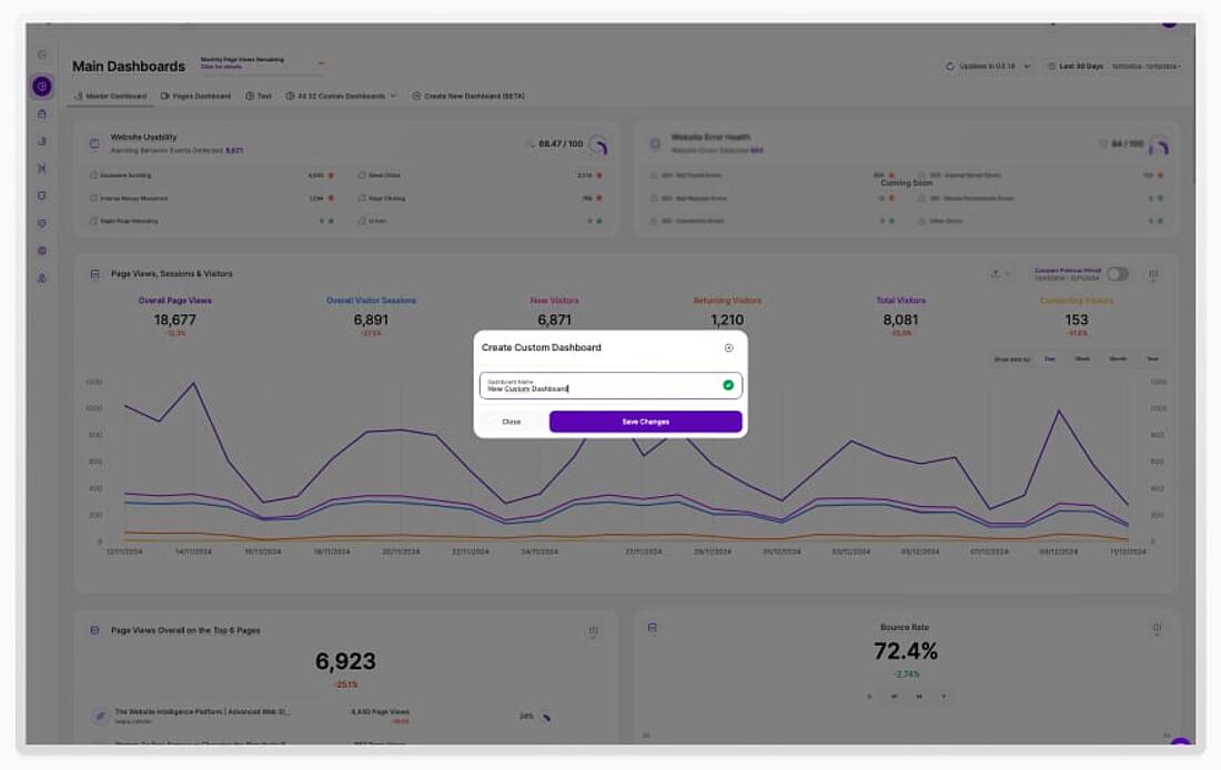
One size doesn’t fit all, and TWIPLA gets that. Our custom dashboards let you organize your data in ways that suit your goals.
You can create as many dashboards as you need - one for each report you’re working on.
Activate pre-set filters to display exactly the data you want, whether it’s campaign performance metrics or user behavior trends.
Plus, TWIPLA gives you full control over who can access each dashboard, ensuring that sensitive reports are shared only with the right people.
Visual Insights
TWIPLA turns numbers into visuals that are easy to understand and share.
From heatmaps showing where users click to charts that track campaign performance, TWIPLA ensures your insights are clear and compelling.
These visuals make it easier for stakeholders to grasp the story behind the data.
Privacy-First Features
Worried about compliance?
TWIPLA’s privacy-first approach means your data collection and reports stay aligned with regulations like GDPR and CCPA.
With advanced anonymization tools and cookieless tracking, you can confidently include insights in your reports while protecting data privacy.
Designed for Action
TWIPLA doesn’t just help you create reports - it ensures those reports lead to action.
By highlighting trends, identifying issues, and offering insights into user behavior, TWIPLA makes it easy to turn your data into decisions that improve your website and business performance.
With TWIPLA, creating analytics reports is no longer a daunting task. It’s an opportunity to uncover meaningful insights and share them in a way that drives real results.
Whether you’re a beginner or a data pro, TWIPLA gives you the tools to make your reports clear, actionable, and impactful.
FAQs for Analytical Reports
What is an Analytical Report?
An analytical report presents data insights, trends, and actionable recommendations, helping businesses make informed decisions based on detailed analysis.
Why Are Analytical Reports Important?
Analytical reports are vital for identifying strengths, addressing weaknesses, and uncovering opportunities. They provide clarity, ensure data-driven decision-making, and help businesses adapt to changing circumstances effectively.
How to Create an Analytical Report?
Use tools like TWIPLA to gather data, define goals, customize dashboards, and present findings with clear visuals and concise summaries.
Share article
Get Started for Free
Gain World-Class Insights & Offer Innovative Privacy & Security

You might also like
Dual Tracking Code Options for Optimized Visitor Tracking 04 June 2024 - by Simon Coulthard
The Complete Guide to Getting the Fundamentals of Your Website Right 12 April 2023 - by Simon Coulthard
Sleep Tight, Data Safe: Secure Data Storage Guide 22 May 2024 - by Simon Coulthard


