- Why Us?
- Features
White Label
For SaaS Platforms & Agencies
Provide our complete analytics suite to your clients, directly within your own interface and with your/their own branding. Discover Analytics-as-a-Service and White Label Analytics. Great benefit, minimal effort.
- Pricing
- White Label
- Success Stories
- Partner
- ResourcesExpand Your Knowledge

Simon Coulthard December 06, 2024
6 min
CONTENTS
- What Are Heatmaps?
- Website Heatmaps
- Scroll Patterns
- Click Behavior
- Cursor Journeys
- Frustration Points
- Ready to See Heatmaps in Action?
- Other Heatmaps in Action
- Weekly Patterns
- Retail Decisions
- Social Engagement
- Urban Planning
- Geographic Heatmaps
- Customer Demographics
- Event Popularity
- Delivery & Logistics
- Heatmaps in High-Stakes Industries
- Gaming Insights
- Sports Performance
- Financial Trading
Heatmaps are more than just colorful data visuals - they’re a gateway to understanding behavior, optimizing strategies, and sparking innovation.
From marketing heat map analysis to uncovering insights in high-stakes industries, there are today many fascinating heat map examples that turn complex data into actionable intelligence that anyone can understand.
In this article, we’ll explore the many practical uses of heatmaps, starting with their essential role in website analytics and expanding to unconventional uses that might just inspire your next big idea.
What Are Heatmaps?
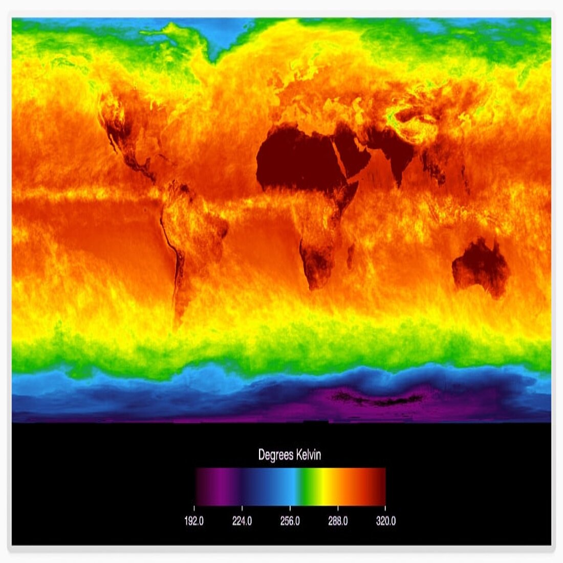
Heatmaps are powerful visual tools that represent data intensity using color gradients, making it easier to identify patterns and trends.
Typically, warmer colors like red and orange indicate higher intensity or activity, while cooler colors like blue and green represent lower levels.
The term heat map or heatmap was trademarked by Cormac Kinney in 1993, and the first large-scale application of it looked like a table of colored rectangular cell blocks. The purpose of this heatmap visualization was to try to show data from stock markets in a user-friendly way that could then help identify trends and beat financial markets.
Simply put, they were data visualizations that used color to represent values in a matrix.
Over time, heat mapping evolved beyond their financial roots, and you can find heat map examples in fields that range from website analytics and geographic mapping to retail, meteorology, and sports performance.
Their ability to simplify complex datasets and provide immediate visual clarity has made them an indispensable tool for decision-making. Whether tracking user clicks on a webpage or mapping customer behavior across regions, heatmaps continue to unlock actionable insights in a visually intuitive way.
Website Heatmaps
A heat map for website analytics is the ultimate guide for understanding in-page visitor interactions.
These data-driven tools transform user activity into intuitive, color-coded visuals, giving you immediate insights into what works, what doesn’t, and where opportunities lie.
Heatmaps Infographic: Everything You Need to Know at a Glance
By analyzing where users linger, click, scroll, or hesitate, you can fine-tune your website to improve navigation, boost engagement, and eliminate roadblocks.
Let’s break down the key insights that different website heat map examples have to offer:
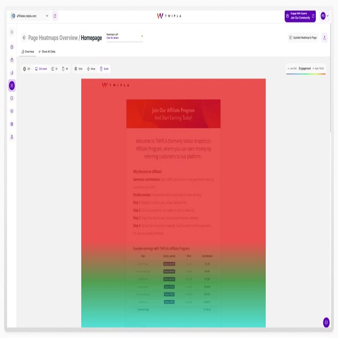
Scroll heatmaps highlight how far down a page users go, helping you pinpoint the exact spot where interest drops off.
For example, if the majority of visitors stop scrolling before reaching an important offer or CTA, you know it’s time to reposition or redesign.
This data heat map type can also indicate whether your content length aligns with user expectations, ensuring you keep them engaged from top to bottom.
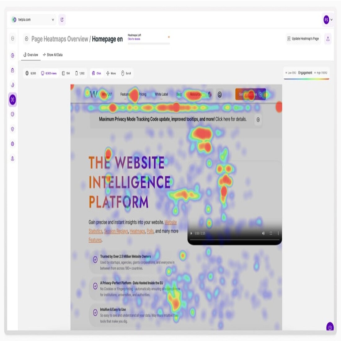
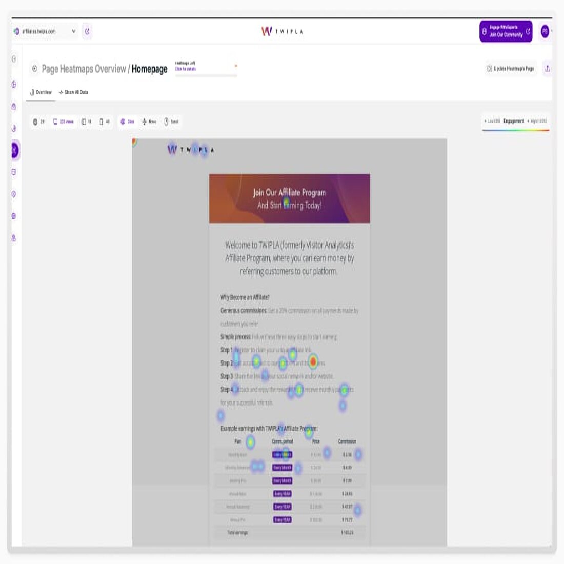
Click heatmaps show the most active areas of user interaction, offering a clear picture of what grabs attention and where users expect action.
For instance, if users frequently click on a product image expecting it to enlarge but nothing happens, it signals an opportunity to align functionality with user intent.
Additionally, understanding click patterns can help you refine the layout of high-conversion elements, ensuring users are guided naturally through their journey.
Mouse movement or cursor heatmaps visualize the paths users' cursors take as they navigate your site.
This movement often reflects user intent and can uncover subtle but significant insights.
For instance, patterns of hesitation or back-and-forth movements might indicate confusion about where to go next.
By tracking these micro-interactions, you can refine your site’s design to eliminate any ambiguity and create a seamless browsing flow.
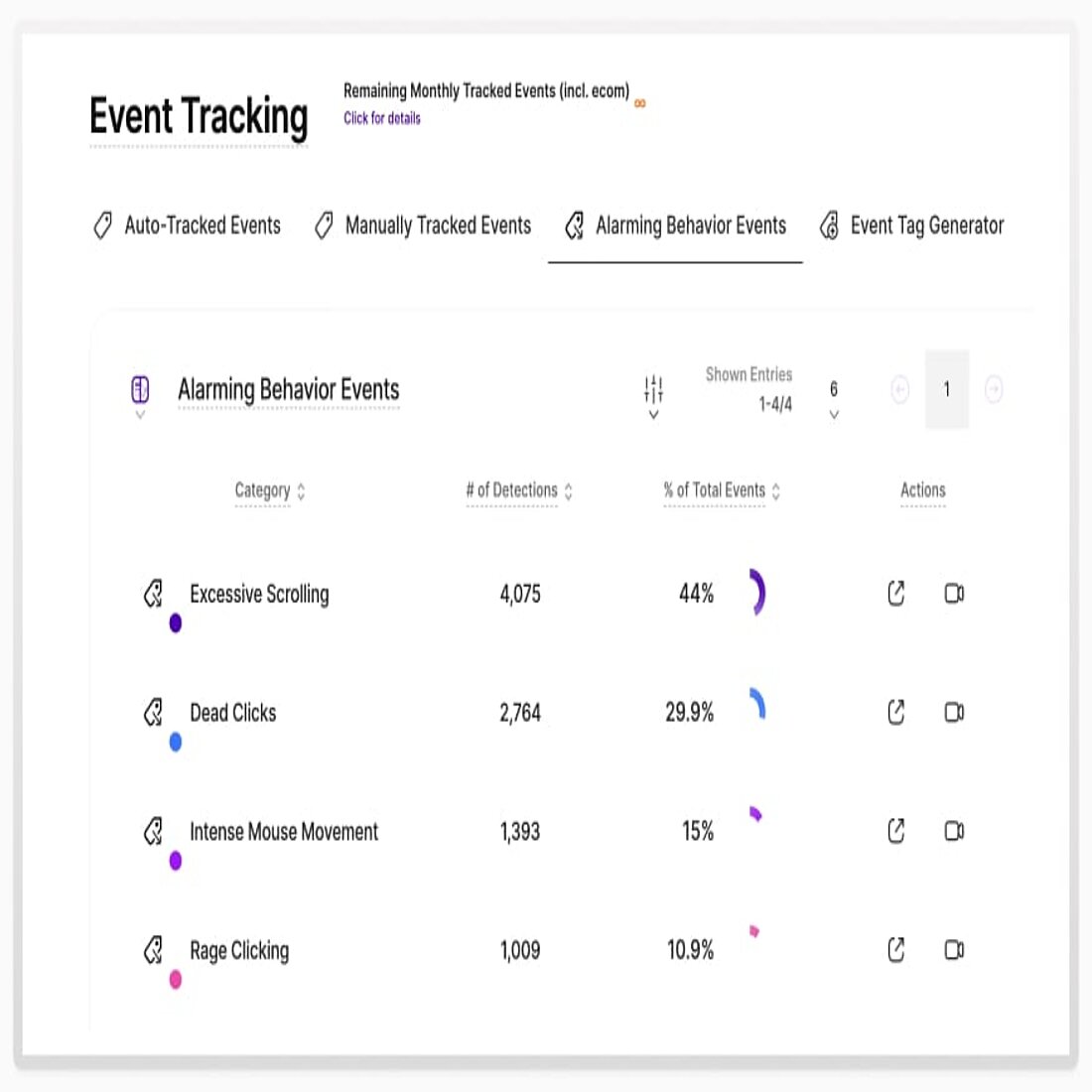
When users encounter barriers, they leave behind digital breadcrumbs - like rage clicks or erratic cursor movements - that heatmaps can spotlight.
These frustration signals often stem from unresponsive elements, poorly placed buttons, or confusing layouts.
We've written elsewhere about improving content marketing. But by addressing these pain points, you not only reduce bounce rates but also foster a more enjoyable and frustration-free experience for your visitors.
Ready to See Heatmaps in Action?
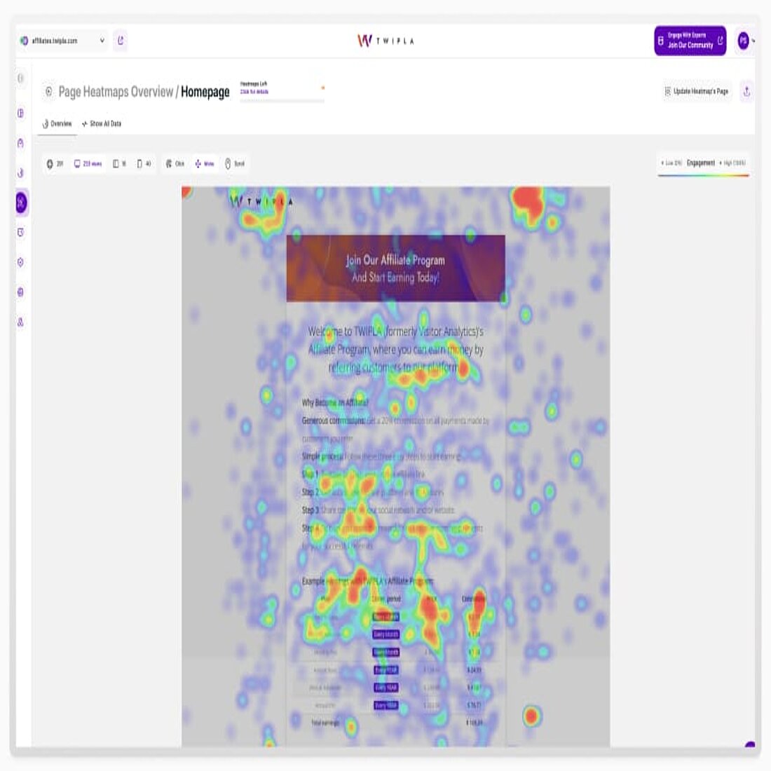
TWIPLA heatmaps bring your website’s engagement data to life, helping you visualize visitor interactions with unparalleled clarity. From scroll depth to click hotspots and mouse movements, you’ll uncover actionable insights to optimize your website and achieve your goals. Generating a heatmap is quick and effortless - just set it up, let it gather data, and start exploring the results.
Tailored for real-world challenges, TWIPLA heatmaps let you segment data by device to ensure your site performs flawlessly across desktops, tablets, and smartphones. Whether you’re refining navigation, identifying usability issues, or boosting conversions, TWIPLA makes it easy to spot opportunities for improvement.
Ready to take the next step? Start using TWIPLA heatmaps today and see how these intuitive tools can transform your approach to website optimization.
Other Heatmaps in Action
→ Practical Applications Across Industries
Heatmaps aren’t just for websites - they’ve found unconventional applications across industries, bringing fresh perspectives and actionable insights to areas beyond the digital sphere.
Whether it’s optimizing retail layouts or enhancing social media strategies, these heat map examples provide a visually compelling way to understand human behavior in innovative contexts.
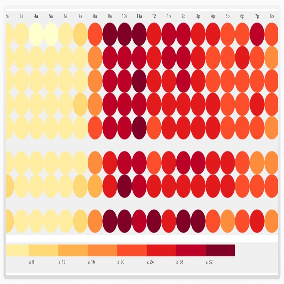
A heatmap chart showing popular times of the week helps businesses and organizations optimize their operations. By analyzing when activity peaks and drops, these charts provide a clear view of behavioral trends across different days and hours.
For example, restaurants can identify their busiest periods to streamline staffing and inventory, while gyms can schedule classes during peak hours to maximize attendance.
These heatmap charts make it easier to match resources with demand, improving efficiency and customer satisfaction.
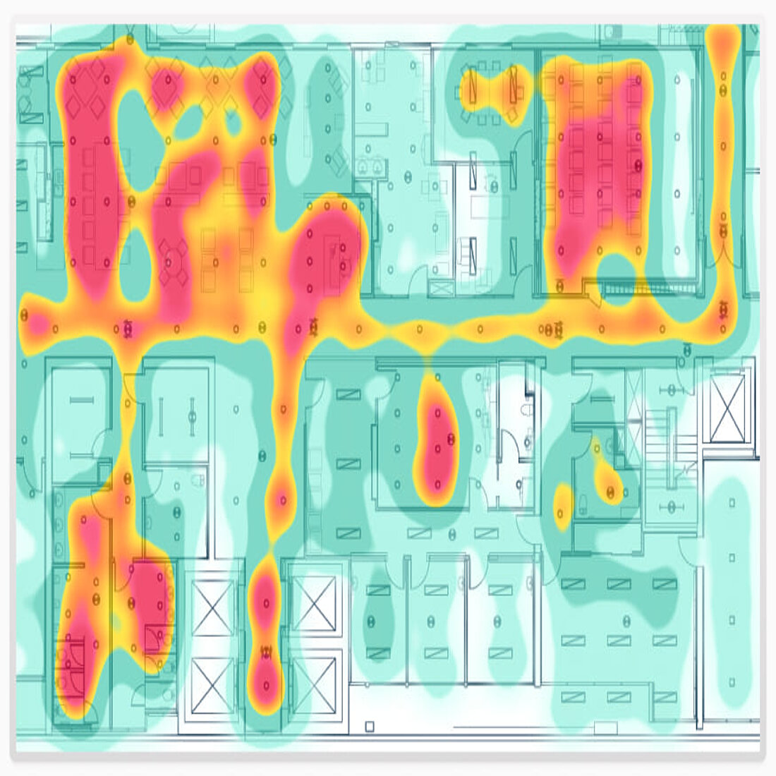
In the retail world, heatmaps are used to analyze foot traffic patterns within physical stores.
By tracking how customers move through aisles or which displays they gravitate toward, retailers can design store layouts that maximize visibility for high-margin products or streamline customer flow. Heatmaps can also reveal underutilized areas, providing opportunities to reimagine shelving or promotional placements.
For example, placing seasonal products in a “hot zone” of activity can boost sales dramatically, while quieter areas might be revitalized with strategic redesigns.
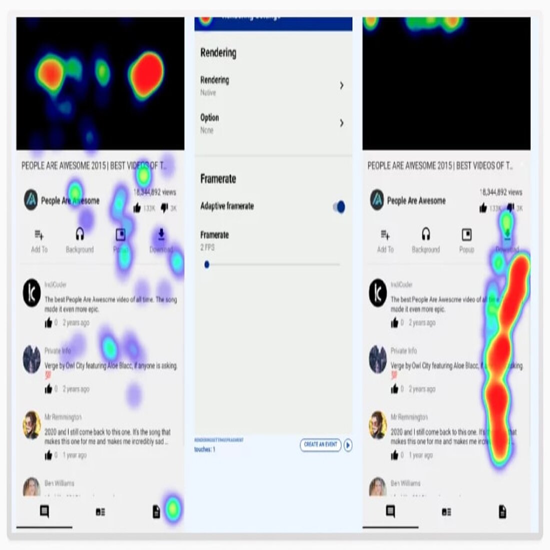
Heatmaps applied to social media platforms provide insights into user behavior, such as where their attention focuses on a feed or which interactive elements draw the most clicks.
This data is invaluable for crafting engaging posts, optimizing ad placements, and even designing user interfaces that keep users scrolling.
For example, by identifying which parts of an Instagram story or a carousel post hold attention longest, brands can refine their content to emphasize their message at the right moment.
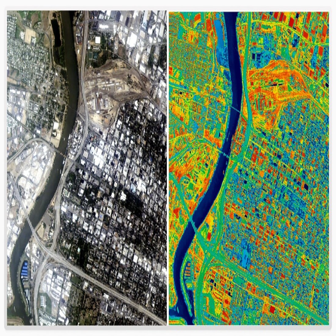
Cities and planners use heatmaps to analyze how people interact with public spaces.
For instance, pedestrian heatmaps can reveal popular walking routes or areas where foot traffic drops off, helping urban designers create safer crosswalks, better lighting, or more engaging public amenities.
Heatmaps can also guide decisions about park layouts, showing which spaces attract the most visitors and which could benefit from improvements like seating, shade, or recreational equipment.
Geographic Heatmaps
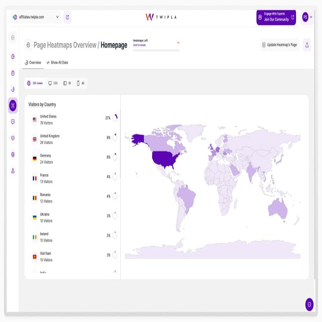
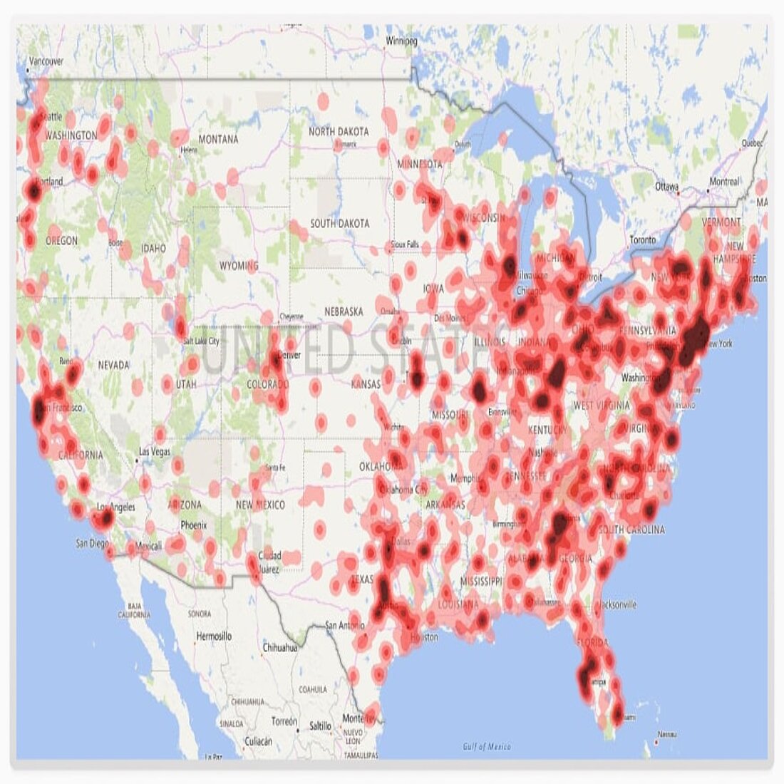
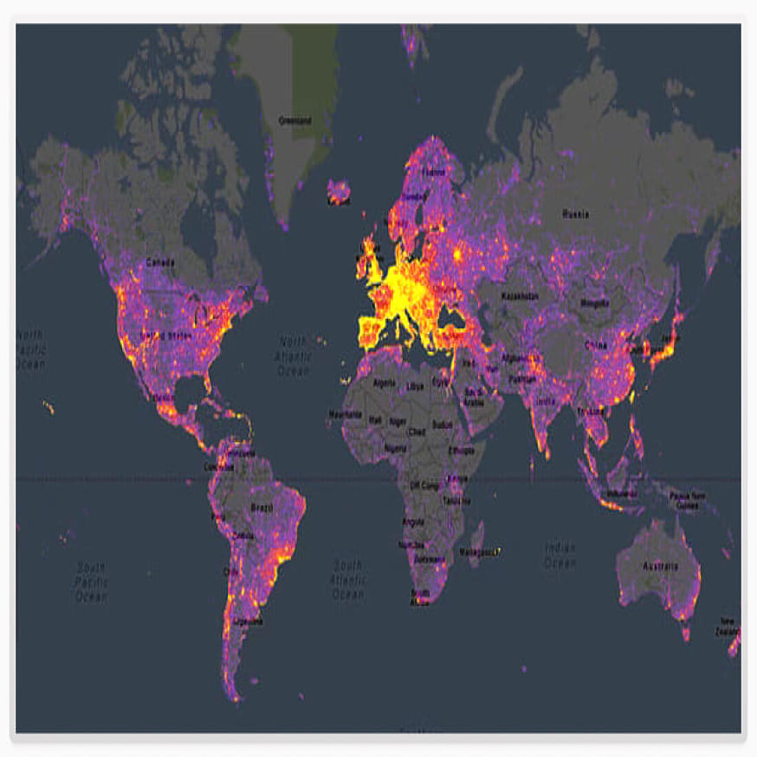
Geographic heatmaps offer a powerful way to visualize data tied to specific locations, providing valuable insights for decision-making in industries ranging from marketing to logistics.
These heatmap examples transform raw data into intuitive, location-based visuals that reveal trends, patterns, and opportunities at a glance.
Demographic segmentation is an important part of marketing and geographic heatmaps can highlight where your customers are concentrated, helping businesses tailor marketing strategies to specific regions.
For instance, a heatmap might reveal clusters of high-value customers in urban centers or under-served areas with growth potential.
By combining these insights with demographic data like age, income, or interests, brands can target their campaigns more effectively and allocate resources where they’ll have the greatest impact.
Geographic segmentation matters, and event planners and marketers use geographic heatmaps to track attendance or interest levels across regions.
For example, a concert tour promoter might use heatmaps to see which cities generate the most ticket sales or online buzz.
These visuals help guide decisions on event locations, marketing spends, or even tailoring content to match the preferences of specific audiences in high-demand areas.
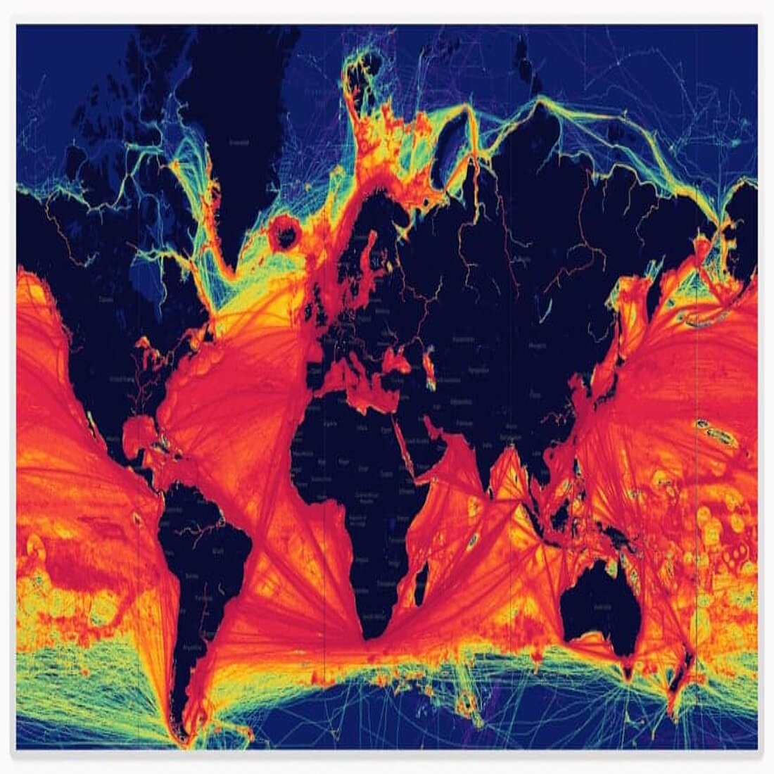
Logistics and delivery companies use geographic heatmaps to streamline operations and improve efficiency.
By analyzing delivery data, heatmaps can highlight areas with high delivery volumes, bottlenecks, or recurring delays.
For example, a heatmap might reveal that a specific neighborhood frequently experiences late deliveries due to traffic congestion, prompting route adjustments or scheduling changes.
These optimizations lead to faster delivery times, improved customer satisfaction, and reduced operational costs.
Heatmaps in High-Stakes Industries
→ More Inspiring Examples
In industries where every decision can make or break success, heatmaps provide a competitive edge.
By offering clear, actionable insights, these heat map examples empower professionals to refine strategies and improve outcomes in highly dynamic environments like gaming and sports.
Heat mapping analysis is revolutionizing the gaming industry by providing simplified insight into the behavior of players within virtual environments. Game developers use heatmaps to analyze where players spend the most time, which paths they follow, and where they encounter challenges.
For example, a heatmap might reveal that players frequently abandon a level at a specific obstacle, prompting developers to adjust difficulty or redesign the area for a better user experience.
This feedback loop ensures games are both engaging and intuitive, enhancing player satisfaction and retention.
In professional sports, heatmaps provide critical insights into player positioning, movement patterns, and game strategies.
For instance, in football, heatmaps can illustrate where players spend the most time on the field, helping coaches analyze defensive gaps or offensive strengths. In tennis, heatmaps might reveal where serves consistently land or where players are most effective during rallies.
These visuals help athletes and teams refine tactics, optimize performance, and gain a strategic advantage during high-stakes matches.
Emerging technologies are revolutionizing the financial sector, where heatmaps are also used to track market activity and manage risk.
Traders rely on heatmaps to visualize stock price movements, trading volumes, and market volatility in real-time.
For example, heatmaps can highlight which stocks or sectors are experiencing the highest activity, helping traders identify trends or anomalies.
Risk managers also use heatmaps to monitor exposure across portfolios, spotting areas of heightened risk and taking preemptive action to minimize potential losses.
These insights are crucial in fast-paced, high-stakes environments where split-second decisions can make or break outcomes.
Share article
Get Started for Free
Gain World-Class Insights & Offer Innovative Privacy & Security

You might also like
How to Use Session Replay: Step-by-Step with Videos 10 January 2020 - by Simon Coulthard
Data Management Strategy: Steps + Insights from Aleksejs Plotnikovs 08 January 2025 - by Simon Coulthard


