- Why Us?
- Features
White Label
For SaaS Platforms & Agencies
Provide our complete analytics suite to your clients, directly within your own interface and with your/their own branding. Discover Analytics-as-a-Service and White Label Analytics. Great benefit, minimal effort.
- Pricing
- White Label
- Success Stories
- Partner
- ResourcesExpand Your Knowledge
Website Heatmap Infographic: Everything You Need to Know

This website heatmap infographic is a great way to get your head around this powerful visitor behavior analytics tool.
It will help you to understand what heatmaps are, what types of heatmaps you can choose from, and also which one is best for you.
Still, how can they help increase your website traffic or conversions?
Fast and easy, just like using heatmaps.
Following the infographic below, you will find why you should be using an analytics tool that has the heatmap feature integrated.
You will also get real case studies and illustrative examples, so you can also see how valuable heatmaps are when it comes to improving your user experience or your website performance.
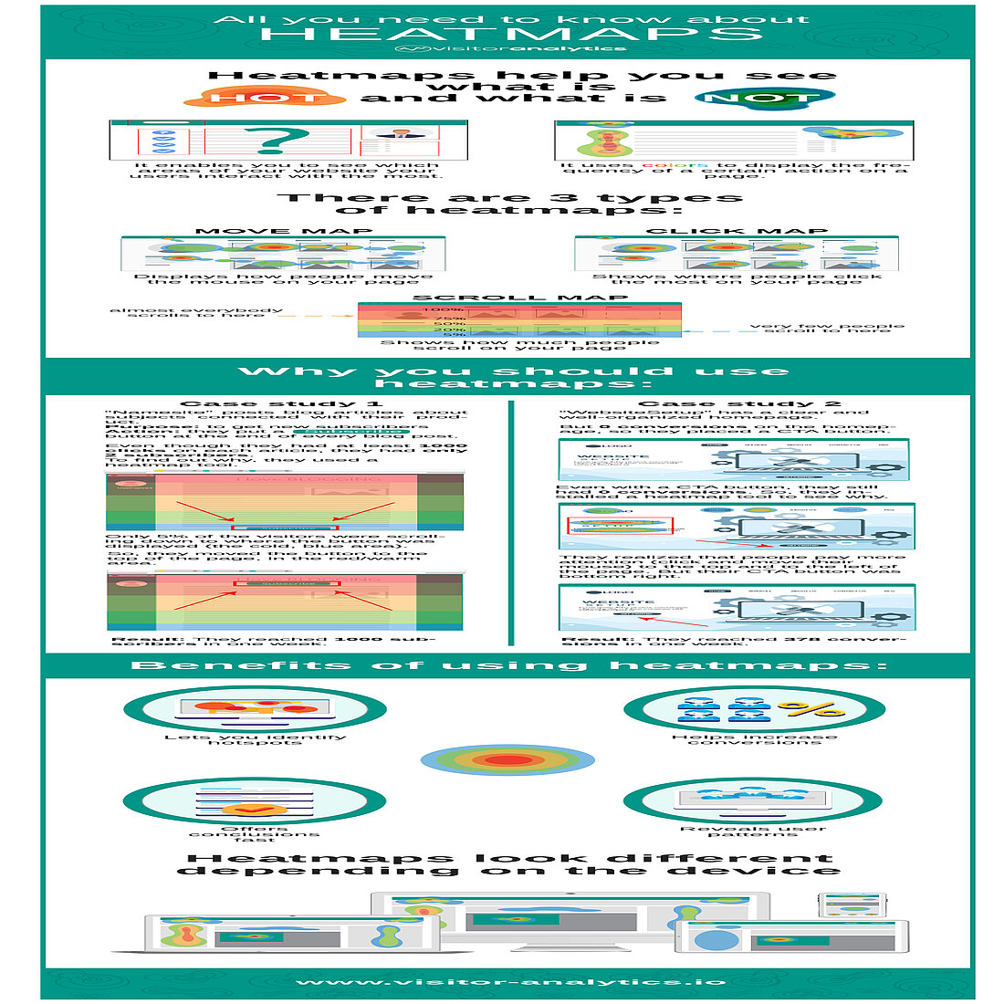
Infographic: Introducing Website Heatmaps

What Are Website Heatmaps?
Website heatmaps are visual representations that show the most popular areas (red-colored ones) of your website, and also the less popular ones (green-blue colored ones).
Using them, you can find which areas of your website users interact with the most, and also which areas you should improve.
And by using gathered data and colored representation, heatmaps also make data analysis easier and let you see how people interact with your site at a glance.
In this way, you can see where users click on, how far they scroll and also what buttons they ignore - information that will help you improve engagement.
Three Types of Heatmaps
As you saw in the website heatmap infographic, there are basically three main types of heatmaps:
1. Move Website Heatmap
This displays how people move the mouse on your web pages, and is only available for desktop users.
You could potentially correlate mouse movement with attention. This means you could therefore use this map to understand which elements users notice the most.
2. Click/tap Website Heatmap
This shows where people click the most on your website.
The more users are clicking on a page area, the darker the red color will be as a result. Tap Map is the same as Click Map, but it instead tracks screen taps, being used on mobile devices.
The interesting fact about this type of map is that you can easily see even clicks on non-clickable elements.
3. Scroll Website Heatmap
This type of heatmap shows how much people scroll on a certain page.
Usually, the “hotter” area is above the fold and the footer represents the “colder” area, but it is not mandatory.
By using it, you undoubtedly get a quick view about where your users stop scrolling as a result.
Use Case Examples of Website Heatmaps
Example #1
The first case study illustrated is about a website that posts blog articles about topics related to their product. Their purpose is to get new subscribers, so they would therefore send them notifications when they will post new articles.
In order to achieve this purpose, they thus put a “Subscribe” button at the bottom of each blog post.
Even though they had at least 1000 clicks on each article, they nevertheless had only 2 subscribers and they did not know why.
To find out why their readers did not convert into subscribers, they therefore used a scroll heatmap tool.
After about one week, they discovered that only 5% of visitors were scrolling down to where the button was displayed. More than that, the bottom of the page was the coldest area for each article.
Knowing this, they consequently moved the button to the top of the page, in the red area.
One week after that, they reached 1000 subscribers.
Example #2
The second case study exemplifies how heatmaps can impact the conversions on the homepage.
Company “WebsiteSetup” had a well-organized homepage, but they were struggling to get conversions from their homepage.
They placed a CTA button on the homepage, but, even so, they still had 0 conversions.
To find out why their users do not click on the CTA button, they then installed Visitor Heatmaps.
One week later, they realized that people paid more attention to the top and to the left side of the website, where the main message and menu were displayed.
But their CTA button was on the bottom right. So they therefore decided to move the button to the hot area.
After this change, they consequently started to get conversions. One week later, they reached 378 conversions.
Benefits of Using Website Heatmaps
Of course, using heatmaps has a lot of advantages, and they can differ depending on your website needs.
Their main advantage is obviously the ease of use and understanding, due to their visual representation of data.
They also allow you to improve user experience because they let you identify hotspots and reveal user patterns, so you can benefit from what is well done on your website and make improvements where it’s necessary.
Also, they help you get conclusions fast and they will probably lead to increased conversion rates.
That's Website Heatmaps Explained!
The website heatmap infographic is a simple introduction to what is a fascinating tool.
It really allows you to dig deep into website visitor behavior, and to also unearth insights that you can use to make your website better.
Now that you know what heatmaps are and why you should use them, would you think about giving them a try?
They undoubtedly make website analytics accessible to all.
So sign up to TWIPLA and start using website heatmaps today!
Share article
Get Started for Free
Gain World-Class Insights & Offer Innovative Privacy & Security

You might also like
Alternative to Google Analytics: Why TWIPLA Outperforms Google Analytics 06 February 2020 - by Editorial Staff


