- Why Us?
- Features
White Label
For SaaS Platforms & Agencies
Provide our complete analytics suite to your clients, directly within your own interface and with your/their own branding. Discover Analytics-as-a-Service and White Label Analytics. Great benefit, minimal effort.
- Pricing
- White Label
- Success Stories
- Partner
- ResourcesExpand Your Knowledge
- First Steps Checklist
-
Frequently Asked Questions
-
All About Features
- How to Install the Tracking Code
-
User Guides
-
Integrating With Other Platforms
-
Legal, Data Privacy & Certificates
- TWAIA Addendum
- White Label Analytics
- Glossary
- Contact
Devices
Everything About the Devices Used to Access Your Website
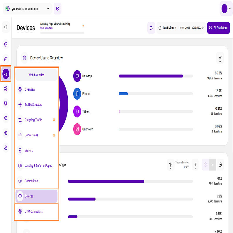
The Devices submodule gives you a full overview of the devices, operating systems, browsers, and screen resolutions visitors used to access your website. It helps you tailor your content for the devices your audience uses most. Hover over the horizontal bars to uncover even more insights. For added convenience, look for the AI Assistant button on the top right of this view, providing easy access to additional help and insights.
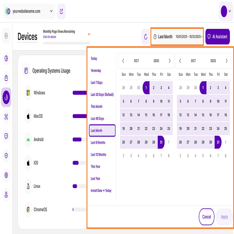
Right above the tiles, you can see a date picker. This enables you to select a certain time period, or specific day, for which you want the Dashboard's data to correspond.
It is crucial to limit the presentation of data to specific dates or timeframes during which you executed potential campaigns or implemented other strategies. This will allow you to assess the effectiveness of these actions and use the insights gained for future planning.
Important Note: The app now remembers previously set segments, filters, filter templates, and date intervals, even when you navigate away from the page, log out, or log back in. When your session expires or you close the tab, it automatically switches back to the default setting of "Last 30 Days."
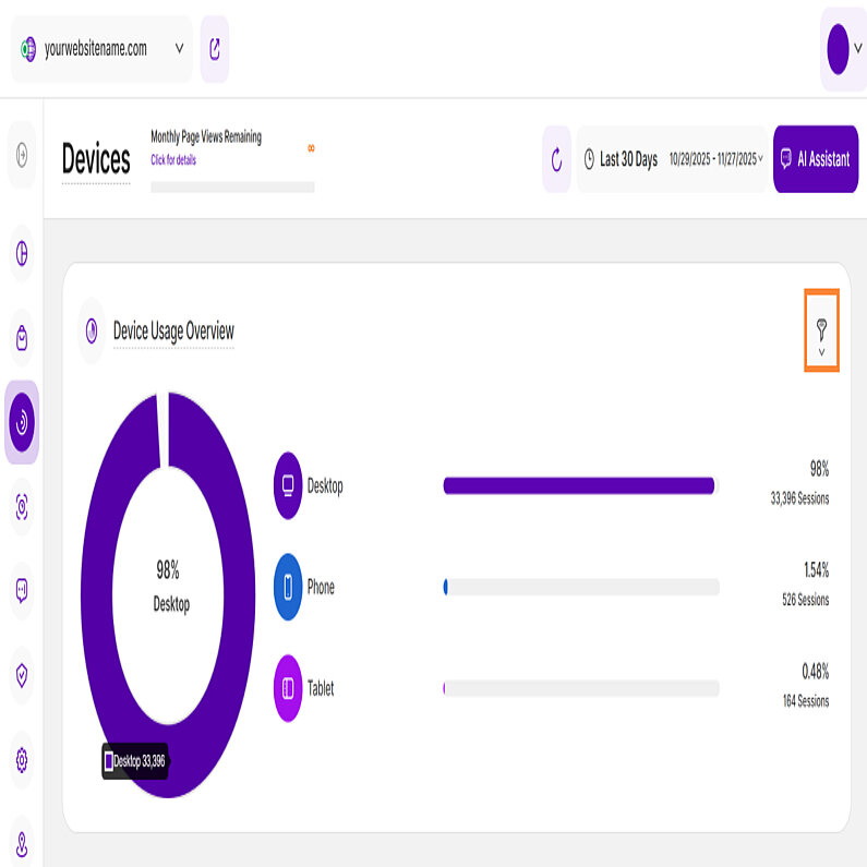
To deliver truly deeper insights, the Devices submodule has been upgraded with powerful filtering capabilities. Look for the filter icon on the upper right of any report block within this submodule. You can now apply any filter, individually or in combination, to gain precise control over your device usage data.
Below is a complete list of the available filters:
| Filter Category | What It Filters and Why |
| Browser Name | Filters the name of the web browser used (e.g., Chrome, Safari). This helps identify if functionality issues are tied to specific browser engines running on a device. |
| Browser Version | It filters the specific version of the browser used by your visitors. Crucial for diagnosing bugs that may only appear on outdated or specific browser versions across different devices. |
| City of Visit | Filters the geographical city of the visitor. Allows analysis of localized device trends and helps ensure region-specific mobile advertising is effective. |
| Company Category Associated With Visit | Filters the industry sector of the organization the visitor works for. Compares device usage between industries (e.g., are manufacturing firms accessing via mobile more often than tech firms?). |
| Company Name Associated With Visit | Filters the specific organization or business tied to the IP address. Compares device usage between B2B and consumer traffic (e.g., tracking a key company's mobile vs. desktop activity). |
| Country Name | Filters the geographical country of the visitor. Essential for analyzing global mobile OS and device trends and ensuring site optimization is relevant regionally. |
| Device Type | Filters whether the visitor is on a Desktop, Mobile, or Tablet. The primary filter for assessing responsive design needs and understanding where your visitors are engaging with the site. |
| IP | Filters the visitor's Internet Protocol address. Allows you to filter out specific known IP addresses, such as internal testing devices or device labs, for cleaner analysis. |
| Operating System | Filters the OS used (e.g., Windows, iOS, Android). Critical for testing, as certain bugs or features often only appear on specific OS versions and device types. |
| Page URL | Filters the specific pages viewed on your site. Shows which pages are causing high drop-off rates on specific devices, indicating a need for mobile/tablet optimization on those pages. |
| Referrer URL | Filters the source URL that directed the visitor to your site. Helps measure which external sites successfully refer high-quality traffic on specific devices (e.g., a forum link driving tablet traffic). |
| Screen Resolution | Filters the height and width of the visitor's screen in pixels. Crucial for identifying if layout breaks or poor UX are tied to specific, non-standard screen sizes across devices. |
| Traffic Channel | Filters the marketing group the traffic belongs to (e.g., Organic Search, Social Media, AI Traffic). Allows you to measure which channels (e.g., Paid Social) are most successful at driving high-quality traffic on mobile devices. |
| UTM Campaign Filter | Filters visits based on the specific UTM parameter used in a campaign link. Provides granular insight into which mobile-specific campaigns or ads are generating the best device-based results. |
| Visitor Type | Filters whether the visitor is New or Returning. Helps you analyze if first-time visitors have different device preferences than returning visitors, influencing landing page design across devices. |
This report block shows the ratio of different devices (mobile, tablet, desktop) used by visitors to access your website, based on the date or period selected in the date picker.
It features both a donut chart and a bar chart, showcasing the devices used by your website visitors:
- Donut Chart: When you hover your cursor over each section of the donut chart, it displays the specific percentage and the overall number of sessions associated with that device type.
- Bar Chart: Every bar in the chart represents a different device type. The column on the right displays the percentage of overall traffic from that device, and directly below it, the corresponding session count.
This information can help you decide if you need to improve your website for a specific device. For example, if you notice that many visitors are using mobile phones to access your site and your site isn't well-optimized for mobiles, you should consider making improvements. This will improve the visitor experience and potentially increase traffic and engagement
Important Hint: If you move your cursor over a bar or a section of the donut chart, it will display the exact number of sessions using that device type and the percentage of your overall sessions. For instance, "86.8%" hence means that 86.8% of your overall sessions have used this device type.
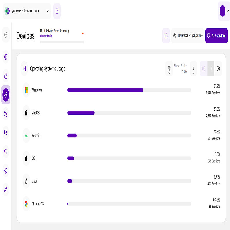
This report block features a horizontal bar chart detailing the Operating Systems (OS) used by your visitors to browse your website. Each bar represents a different operating system. To the right of each bar, you can see the percentage showing the proportion of sessions originating from that OS. Directly below the percentage, you'll see the total count of sessions that came from that OS.
You'll find several key controls on the top right of this report block. These include the filter icon for a more focused analysis, the ability to customize the number of entries shown per page, and easily navigate the data using pagination controls.
Analyzing this data will help you determine if you need to optimize your website for a certain OS, particularly if it represents a majority of your sessions. Optimizing for your most-used OS ensures the best experience for your largest visitor group.
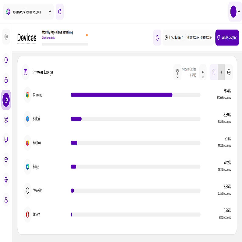
This report block also features a horizontal bar chart detailing the browsers used by your visitors to browse your website. Each bar represents a different browser. To the right of each bar, you can see the percentage showing the proportion of sessions originating from that browser. Directly below the percentage, you'll see the total count of sessions that came from that browser type.
On the top right, you have access to several controls: the filter icon (for focused analysis), the ability to customize the number of entries per page, and pagination controls for navigating the full data.
This analysis helps you confirm which browser requires the most testing and development focus. Prioritizing optimization for the browser that drives the majority of your sessions will guarantee the best visitor experience.
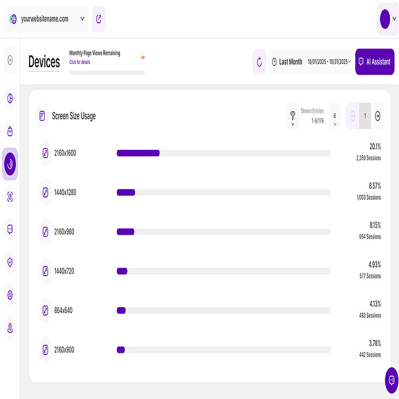
This report block also uses horizont bar chart visualization to show the ratio of screen sizes or display resolutions used by your visitors who accessed your website. Each bar represents a different screen size. The percentage shown next to each bar indicates the proportion of sessions attributed to that screen size. Right below it, you'll see the total number of sessions that used particular screen size or resolution.
Similar to the other report blocks, you can also find the key controls at the top right. Use these controls to filter the data, customize the number of entries shown per page, and utilize the pagination controls to efficiently navigate the entire dataset.
This insight will help you determine whether you should optimize your website for specific screen resolutions. If you observe that a substantial portion of visitors uses a screen resolution your website isn't optimized for, it's advisable to make the necessary adjustments.


