- Why Us?
- Features
White Label
For SaaS Platforms & Agencies
Provide our complete analytics suite to your clients, directly within your own interface and with your/their own branding. Discover Analytics-as-a-Service and White Label Analytics. Great benefit, minimal effort.
- Pricing
- White Label
- Success Stories
- ResourcesGetting Started
-
Frequently Asked Questions
-
All About Features
- How to Install the Tracking Code
-
User Guides
-
Integrating With Other Platforms
-
Legal, Data Privacy & Certificates
- White Label Analytics
- Glossary
- Affiliate Program
- Contact
When to Use Dashboards
Feature Guide for Analytics Users
About this Guide

This page explains how you can select and capitalize on the Master, Pages, and Custom Dashboards to achieve specific online objectives and wider business goals, with real world scenarios you can emulate.
The guide doesn't include detailed descriptions of the dashboards, component report blocks, or basic instructions. If you're looking for this platform information, then please refer to the Support Center.
Inside this Guide
- About this Guide
- Inside this Guide
- What Are Dashboards?
- Advantages of Dashboards
- Cons of Dashboards
- When to Use Dashboards
- Our Three Dashboard Types
- Master Dashboard: Use Cases
- → Building a YoY Performance Report
- → Creating a Monthly Performance Report
- → Identifying Seasonal Performance Trends
- → Monitoring Real-Time Visitor Activity
- → Assessing Demographic and Location Data
- → Detecting Large Data Anomalies
- → Optimizing Mobile Compatibility
- → Enhancing Technical Environment Performance
- Pages Dashboard: Use Cases
- → Reducing Webpage Bounce Rates
- → Aligning Webpages to Top Referrers
- → Optimizing Existing Webpages
- → Planning a Content Strategy
- → Finding Content to Repurpose or Promote
- → Selecting Content for A/B Testing
- → Identifying Content Gaps
- → Enhancing Internal Linking Strategy
- Custom Dashboards: Use Cases
- → General Blog Performance Analysis
- → Individual Newsletter Campaign Report
- → Technical Performance Analysis

Dashboards are a user interface that offers consolidated data from across the analytics toolkit, including all the web statistics, behavioral analytics, and visitor communication modules. They act to summarize insights, providing high-level reports from various important angles.
We offer three dashboard types - Master, Pages, and Custom. They are made up of different report blocks, and display real-time data that can be viewed historically or compared with other time periods.
Ultimately, these different dashboards exist to make it easy to analyze different aspects of your business - enabling you to make better decisions from the website performance data that is at your disposal.
Advantages of Dashboards
A Snapshot of Key Adoption Reasons
Data Visualization
Dashboards take the most important website performance KPIs and present them in easily-digestible formats.
Real-Time Insights
Dashboards enable you to quickly monitor and react to important website data patterns and trends as they happen.
Decision Support
Dashboards are there to facilitate the decision-making process from website intelligence insights.
Efficiency
Dashboards are there to help focus and streamline analytics data access and analysis, saving time.
Customization
(Custom) dashboards are there so that reports can be tailored to specific needs and objectives.
Collaboration
(Custom) dashboards help to promote data governance, sharing, and collaborations among teams.

Cons of Dashboards
Dashboards are a powerful analytics tool when used strategically, but their strengths work against them when used in the wrong context.
For by streamlining analytics, they lack the granular detail offered by other modules. This can lead to less in-depth analytics, making them unsuitable for complex data exploration and modeling.
Over-reliance on them can also cause data integration issues, and they can struggle with data from diverse sources. As such, it's important to know when to use dashboards, and when to prioritize other tools.
When to Use Dashboards

Use the dashboards whenever you need a quick but comprehensive overview of website analytics or wider business performance. They're great for meetings, collaborations, and checking key stats on the go.
Dashboards are particularly useful when you want to monitor patterns, identify strange anomalies, or track key performance indicators (KPIs), and make for an ideal jumping-off point for deeper analysis.
Whether it's tracking changes in website traffic, conversion rates, sales, or customer experience analytics, dashboards empower users to stay informed and make data-driven decisions efficiently.
Our Three Dashboard Types
Master Dashboard
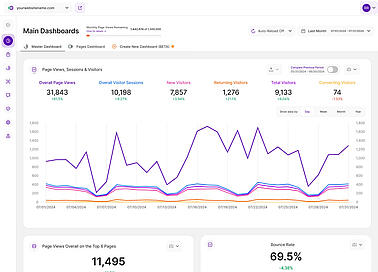
A collection of report blocks from across the analytics toolkit, selected to show all the high-level website performance KPIs.
Pages Dashboard
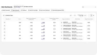
Understand site performance from the perspective of webpages, with data collected from across the toolkit.
Custom Dashboard
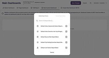
Create custom dashboards using any of the default report blocks that make up the full analytics toolkit.
Master Dashboard: Use Cases
Jump into the Master Dashboard when you want to a high-level overview of website performance, and when you want to see key metrics on page views, bounce rates, and overall visitor activity.
Read on, and you'll learn about some of the real-world scenarios for pulling up the Master Dashboard that have been bringing our community of users and businesses the most advantages.
Use Cases
- Conducting a Year-on-Year Performance Review
- Creating a Monthly Performance Review
- Identifying Seasonal Performance Trends
- Monitoring Real-Time Activity and Engagement
- Assessing Demographic and Location Insights
- Detecting Large Data Anomalies
- Optimizing Mobile Compatibility
- Enhancing Technical Environment Performance
And if you want more information about the different report blocks included and how to filter and compare data historically, then feel free to visit the Master Dashboard Support Center page.
→ Building a YoY Performance Report
Master Dashboard: Use Case #1

Year-on-Year website tracking reports enable businesses to measure changes in traffic and engagement so as to identify growth and wider trends. This analysis provides insights into how the website has evolved and whether it has improved or declined in relation to key metrics over the course of the year (or whatever period you choose to compare). Simply put, it shows whether your website is moving in the right direction and provides guidance for strategic planning.
How to Use the Master Dashboard to Analyze Year-on-Year Performance
- Go into the [Data Range Selector] at the top right of your screen and activate the [Last 12 Months] option.
- Toggle on the [Compare Year over Year] function underneath the [Data Range Selector].
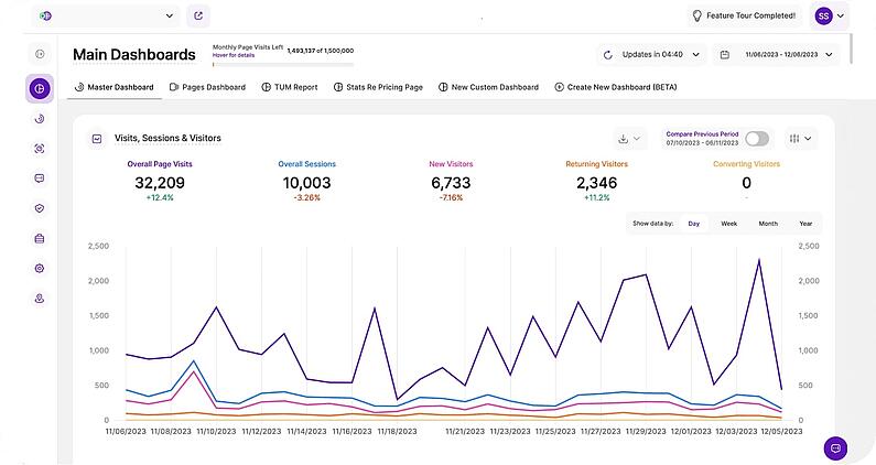
- The [Page Views, Sessions & Visitors] module will now show a Year-on-Year comparison of the following website KPIs: Overall Page Views, Overall Visitor Sessions, New Visitors, Returning Visitors, and Converting Visitors. This includes the important percentage change figure for each during this time.
- Next, go down to the [Page Views Overall on the Top 6 Pages] report block. At the top, you'll see a combined total for the year, as well as a percentage change from the previous year.
- Scroll down to the [Bounce Rate] report block, and activate [Yearly] mode so that you can see how the website's bounce rate has changed over the course of the last year.
- Below this, the [Top Visitor Countries] will display information on how popular visitor countries of origin have changed over the last year.
- The [Top Landing Pages] report block will likewise rank popular website entry pages, and how their importance has changed over the last 12 months.
- [Top Forward Referrers], [Top Pages by Session], and [Top Operating Systems] all work in a similar way.
→ Creating a Monthly Performance Report
Master Dashboard: Use Case #2

A monthly website performance report is a concise summary of key metrics and data. It's a useful tool that website owners and businesses can use to assess the effectiveness of development work, marketing campaigns, and other initiatives over a shorter time frame than the previous Year-on-Year comparison. The Master Dashboard is ideally suited to this task, making it a useful companion for high-level company meetings.
How to Use the Master Dashboard to Create a Monthly Performance Report
- Go into the [Data Range Selector] at the top right of your screen and activate the [This Month] option for a calendar month view, or [Last 30 Days] if your business months are staggered. Alternatively, select a custom 30-day date range.
- The [Page Views, Sessions & Visitors] module will now show monthly data for the following website KPIs: Overall Page Views, Overall Visitor Sessions, New Visitors, Returning Visitors, and Converting Visitors. This includes the important percentage change figure for each since the previous month.
- Next, go down to the [Page Views Overall on the Top 6 Pages] report block. At the top, you'll see a combined total for the month, as well as a percentage change since the last month.
- Scroll down to the [Bounce Rate] report block, and activate [Monthly] mode so that you can see how the website's bounce rate has changed over the course of the month.
- Below this, the [Top Visitor Countries] will display information on how popular visitor countries of origin have changed over the last month.
- The [Top Landing Pages] report block will likewise rank popular website entry pages, and how their importance has changed over the last 30 days.
- [Top Forward Referrers], [Top Pages by Session], and [Top Operating Systems] all work in a similar way.
→ Identifying Seasonal Performance Trends
Master Dashboard: Use Case #3

Understanding how audience and customer behavior changes throughout the year is crucial for strategic planning and optimization. Seasonal trends can significantly impact your website's traffic, user engagement, and conversion rates. The Master Dashboard can be used to quickly pull up this data, making it a useful companion for annual resource allocation and marketing guidance.
How to Use the Master Dashboard to Identify Seasonal Performance Trends
- Go into the [Data Range Selector] at the top right of your screen and activate the [Last Year] so that the Master Dashboard displays data for the previous calendar year. Set the display mode to [Month] to see this annual data broken up by month to best understand seasonal performance.
- Toggle on the [Compare Previous Period] to pull up comparative data from the previous year, and to confirm whether patterns from the previous year can be considered seasonal trends.
- Use the [Page Views, Sessions & Visitors] report block to then see top-level seasonable performance metrics, and to identify patterns in overall page views, session numbers, new visitors, returning visitors, and conversions.
→ Monitoring Real-Time Visitor Activity
Master Dashboard: Use Case #4

Real-time insights are invaluable for businesses looking to make immediate adjustments and maximize user engagement. This data is particularly useful when running a live event, launching a new product, or when you just want to stay on top of day-to-day website performance. The Master Dashboard is a great resource for this work, empowering you with the ability to quickly monitor real-time activity with minimal work.
Using the Master Dashboard to Monitor Real-Time Activity and Engagement
- Go into the [Data Range Selector] and select any date range that includes the current day. In this example, we'll set the data range to [Today] so that the Master Dashboard only shows the most current insights.
- Toggle on the [Compare Previous Period] function underneath the [Data Range Selector] so that the Master Dashboard shows comparative data with the previous day for context.
- Set the [Page Views, Sessions & Visitors] report block to [Bar Chart] mode by clicking on the icon at the top-left of the box, and ensure that the data is being displayed by day. This will ensure that the report block shows top-level website performance metrics for the current day, and how they have changed over the last 24 hours.
- Check the [Page Views Overall on the Top 6 Pages] report block to identify your current most popular webpages. This is particularly useful for seeing the traction of any marketing campaign landing pages that you expect to see activity on.
- Use the [Live Visitors] map to get real-time insights on who is currently visiting the website, and where they're located globally.
- Scroll down to the [Latest Visitors Overview] report block for key information on your most recent visitors, including visit time, location, technical environments, and page view counts. There's also an option to watch any of their session recordings.
→ Assessing Demographic and Location Data
Master Dashboard: Use Case #5

Learning about your audience is key to tailoring your content, marketing efforts, and user experience to meet their specific needs. This starts with demographic and location data, which provides insights into who your visitors are and where they live. This knowledge enable you to create more targeted and personalized strategies that resonate with your audience, and drive results. The Master Dashboard is a useful tool to this end, building reports on these areas from across the toolkit that you can use to quickly identify key audience segments, and understand how visitor characteristics have changed over time.
How to Use the Master Dashboard to Assess Demographic and Location Data
- Go into the [Data Range Selector] at the top right of your screen and set the time period you want to analyze.
- Toggle on the [Compare Previous Period] to pull up additional contextual data in the different report blocks.
- Scroll down to the [Top Visiting Countries] to quickly see the top-ranked visitor sources of origin for your selected time period, and how this compares with the previous period. Click into this report block to quickly pull up more data on the top countries and cities that visitors are browsing from.
- Use the [Live Visitors] map to see where current website visitors are browsing from in real time. This is particularly useful when running a live event, launching a new product, or tracking the impact of a current marketing initiative. Click on any of the countries with live visitors to pull up more top-level insights about the visitor. Additionally, click into the report block to open a map showing the global spread of visitors during the chosen time period.
→ Detecting Large Data Anomalies
Master Dashboard: Use Case #6

Large anomalies refer to significant and unexpected fluctuations or deviations in website performance, which can signify potential threats, issues, or problems that require immediate attention and investigation. These can be caused by various factors, including technical issues, security incidents, third-party integration errors, website updates, or server changes, and the Master Dashboard can be used to quickly identify when such a problem happens. And while it's important to check as regularly as possible for anomalies, the use case below will assume that you're doing so on a weekly basis.
How to Use the Master Dashboard to Detect Large Website Anomalies
- Go into the [Data Range Selector] at the top right of your screen and activate the [Last 7 Days] option.
- Check the [Page Views, Sessions & Visitors] report block for any large, unexpected downturn in any of the key metrics. But remember that a sudden change could be the result of external factors, such as industry trends, market conditions, or seasonal variations.
- If you've noticed something strange, look at the [Top Operating Systems], [Most Used Browsers], [Top Display Resolutions], and [Top Used Devices] to see whether the problem is affecting all users, or is limited to specific technical environments.
- Next, use the [Page Views, Sessions & Visitors] to identify exactly when the anomaly happened.
Once you've followed these steps, you're armed with the information you need to use other tools to work out the root of the problem, and to speak with external stakeholders.
→ Optimizing Mobile Compatibility
Master Dashboard: Use Case #7

Since most website development work is done at a desktop, it's sometimes easy to forget that more than half of internet users now access websites through their smartphones. And while this proportion will vary from business to sector to region, it's important to ensure that website visitors get a good browsing experience regardless of device type. And while the Devices module exists for this task, the combination of the device usage report block with additional website KPIs make the Master Dashboard useful for high-level mobile compatibility analysis.
How to Use the Master Dashboard to Optimize Mobile Compatibility
- First, go to the [Page Views, Sessions & Visitors] report block, open up the filter dropdown, scroll down to [Devices], and activate the phones filter.
- Overall Page Views will now tell you how many pages mobile users are viewing on your website. If mobile users are experiencing compatibility issues, they may view fewer pages, suggesting that they are either having trouble navigating or are not finding the content they need.
- Overall Visitor Sessions indicates the number of times mobile users access your website. Monitoring this metric helps you understand the volume of mobile traffic, which can be crucial for assessing the importance of mobile compatibility.
- New Visitors tracks the number of first-time visitors to your website. High numbers of new mobile visitors suggest that your website is attracting new mobile users, but it also means you need to ensure a positive first impression by providing a mobile-friendly experience.
- Returning Visitors are those who have been to your site before. Monitoring this metric can help you gauge user loyalty. If returning mobile visitors decrease, it may indicate that they are dissatisfied with the mobile experience.
- Converting Visitors are those who take desired actions on your site, such as making a purchase, signing up, or filling out a form. Assessing this metric on mobile devices helps determine if mobile users can successfully complete conversions, which is critical for business success.
- Next, refer to the [Top Used Devices] report block to identify the percentage of visitors that use a mobile device. A high percentage reveals the need to optimize for mobile users, while a low percentage means that you can prioritize this at another time.
→ Enhancing Technical Environment Performance
Master Dashboard: Use Case #8

One important aspect of website development is ensuring that it performs optimally for different technical environments. This includes the device type covered in the previous use case, but also covers operating system, browser, and screen resolution usage. And while the analytics platform has a Devices module that can be used for this work, the inclusion of these report blocks alongside additional high-level performance metrics makes the Master Dashboard a great jumping-off point for this type of work.
Using the Master Dashboard to Improve Performance Across Technical Environments
- Refer to the [Top Operating Systems], [Most Used Browsers], [Top Display Resolutions], and [Top Used Devices] report blocks to identify the computing environments that are most popular with your audience.
- Additionally, activate one or multiple device environment filters in the [Page Views, Sessions & Visitors] report block. This will enable you to whittle data down to the exact characteristics you want to focus on. And remember, if you've activated multiple filters, you can quickly save them together as a filter template with the adjacent button, saving you time if you want to go back and assess these metrics again in the future.
- Go into the [Data Range Selector] at the top right of your screen and activate a time range to see how visitor device preferences have changed over time. Alternatively, toggle on the [Compare Previous Period] function underneath the [Data Range Selector] for further understand of movements here.
Filtering the Master Dashboard in this way will enable you to quickly identify which technical environment optimization activities to focus on first. And, once you've carried out improvements to the website, you can return here, compare data, and see the impact of your work.
Pages Dashboard: Use Cases
Jump into the Pages Dashboard when you want to a summary of page performance. It holds all the top-level insights that can guide content optimization, user experience analytics, and wider page effectiveness.
Improving content is an effective way to drive online success, so click on any of the links below to go straight to the use case that interests you most, or alternatively scroll through them all at your leisure.
Use Cases
- Reducing Webpage Bounce Rates
- Aligning Webpages to Top Referrers
- Optimizing Existing Webpages
- Planning a Content Strategy
- Finding Content to Repurpose or Promote
- Selecting Content for A/B Testing
- Identifying Content Gaps
- Enhancing Internal Linking Strategy
And if you want to learn more information about all the analytics insights contained in this dashboard as well as some useful hints and tricks, then please visit the Pages Dashboard Support Center Page.
→ Reducing Webpage Bounce Rates
Pages Dashboard: Use Case #1

The bounce rate is the percentage of website visitors who arrive on a webpage, before leaving without the site without viewing any other pages. It's a useful way to understand user engagement, and will also influence the page's Google ranking. A good bounce rate is under 40%, while a bounce rate of above 60% indicates that you need to work on the page and make it more helpful and engaging for users.
How to Use the Pages Dashboard to Reduce Webpage Bounce Rates
- Start by filtering the Pages Dashboard to only show the page you want to focus on. This can be done by activating a [Page URL] filter, and pasting in the full webpage address.
- Alternatively, you may want to work on a category of webpages. Do this by activating a [Page URL] filter that includes a website URL up to the subdirectory that matches a webpage category (e.g. www.example.com/en/blog/).
- Sort the [Bounce Rate] column in ascending order, so that it shows the webpages with the highest bounce rates first. These will be your priority webpages, but use the [Visitors] column to focus on pages that have a larger number of visitors. Low visitor numbers mean that the page's bounce rate may not include enough data to be an accurate indicator of appeal.
- Click on the page URL to open the webpage in another window. Ensure that the most engaging content is at the top so that visitors will find something that will motivate them to explore the page further. Add an important CTA near the top of the page, and in-link text with other relevant webpages that visitors might want to explore.
- Return to the Pages Dashboard and digest the list of referrers. These are the search engines and other websites that bring the most visitors to your website. Consider whether the page content matches the page that visitors see on these sources, and if improvements to this heading or page content will get them to engage more with the webpage.
→ Aligning Webpages to Top Referrers
Pages Dashboard: Use Case #2

A referrer is the external webpage or website that brings website visitors to you. These can be search engines, social media platforms, or other websites that have links to you. It's important to remember that each referrer is different, and the traffic they send to your site will have different characteristics. As such, aligning content to the page's top referrer is an effective way to increase clicks, engagement, and conversions.
How to Use the Pages Dashboard to Align Webpages to their Top Referrers
- Start by filtering the Pages Dashboard to only show the page you want to focus on. This can be done by activating a [Page URL] filter, and pasting in the full webpage address.
- Alternatively, you may want to work on a category of webpages. Do this by activating a [Page URL] filter that includes a website URL up to the subdirectory that matches a webpage category (e.g. www.example.com/en/blog/).
- The Pages Dashboard will show the top referrer for each page in the generated list, as well as the number of page views that they are responsible for generating. This can often be the source of most of the webpage's traffic.
- Consider the [Average Page Session Duration], which will often be dictated largely by traffic from this top referrer. This metric tells you how long visitors are spending on your page. A longer time indicates high engagement and a healthy webpage, while a shorter time means that the page could do with some improvement.
- Consider [Average Page Session Duration] alongside the [Bounce Rate] column. If session times are low and bounce rates high for pages that have a large percentage of traffic from its top referrer, then this is a page that you should either focus on improving, or delete to save your crawl budget and get more internet users on referral sites to arrive at your website on other pages.
- Review the content on pages that are receiving a high volume of traffic from a top referrer. Ensure that the content is relevant to the referring source and matches the expectations of visitors coming from that source.
- If the top referrer is a specific marketing campaign or external website, consider creating landing page variations tailored to the audience and messaging of that referrer. Customized landing pages can improve user engagement and conversion rates.
- Experiment with different calls to action (CTAs) on the page to encourage further engagement or conversions from visitors referred by the top source. A/B testing can help you determine which CTAs are most effective.
- Continuously monitor the performance metrics in the Page Dashboard for the top referrer. Make data-driven decisions, and iterate on your optimization efforts to improve page performance over time.
→ Optimizing Existing Webpages
Pages Dashboard: Use Case #3
Content optimization is the process of refining and improving your published website content, with the goal of increasing traffic, engagement, clicks, and conversions. Put another way, content optimization is about identifying poor-performing webpages that need improving. The primary goals here are to improve the user experience, increase search engine visibility, and to achieve business end goals like purchases or signups - things that the Pages Dashboard is well-suited to.
How to Use the Pages Dashboard for Content Optimization
- Sort the [Page Views] or [Page's Share of Website's Overall Page Views] columns in ascending order to identify poor-performing webpages that need improvement.
- Do the same for the [Average Page Session Duration] column. This will reveal content that is not engaging website visitors, and which needs to be improved.
- Sort the [Bounce Rate] column in descending order, so that the pages with the highest bounce rates are at the top. This can be an indicator that visitors are not finding what they expect on the webpage, and aligning the title better with the content can improve this page metric.
- Sort the [Direct Visits in Time Period] column in ascending order, to reveal the pages with the lowest direct visits. Low traffic numbers can indicate poor branding, messaging, or content for these loyal visitors.
→ Planning a Content Strategy
Pages Dashboard: Use Case #4

Content strategy planning is the process of defining the purpose, goals, audience, and structure of online content so as to both achieve specific business goals and engage with your target audience effectively. It's a great way to ensure that content is aligned with wider goals, resonate with your audience, and enhance the user experience. And when done well, it will improve online visibility, and get you the engagement, clicks and conversions that are vital for website success.
How to Use the Pages Dashboard for Content Strategy Planning
- Use the [Page Views] and [Share of Overall Page Views] columns to identify your most popular webpages. Since these are already resonating with your audience, it would be clever to publish more content that is similar to these.
- Use the [Average Page Session Duration] column to identify pages that visitors are staying in for longer. This suggests that visitors find this content engaging and valuable. Sort this column in descending order to pinpoint the webpages with the longest session times, and publish similar content.
- Consider the bounce rate of your webpages. Sort this column in ascending order so that the lowest bounce rates are at the top. This is an indicator that these pages are motivating your audience to explore your website further, and it's likely that similar content will have the same effect.
- Digest the [Number of Visitors] column. Some of your pages will be attracting significantly more visitors than others, and working out why will be key to content strategizing success. This could be impacted by factors like content quality, topic relevance, or promotional efforts.
- Take note of the [Page URL] column. Page URL construction is an important part of content creation, and you could notice patterns in your top-performing pages that can be used to guide future content delivery. Ensure that these URLs are easy to remember and share, so as to facilitate organic growth and referrals.
- Consider the [Page's Top Referrer] column. Review these traffic sources for your high-performing pages. This indicates that you have found an audience from these referring websites, and you can use this insight to publish more content tailored to them.
- Finally, digest the [Direct Visits in Time Period] column. Direct visits are users who arrived at a webpage by entering the URL into their browser's address bar. This often indicates a loyal or returning audience, and publishing similar content in the future is likely to have similar success.
→ Finding Content to Repurpose or Promote
Pages Dashboard: Use Case #5

In website content, "repurposing" means adapting existing content into different formats to broaden its appeal and usefulness, while "promoting" involves actively marketing and distributing content to ensure it reaches the intended audience. This work maximizes the reach and impact of valuable information, and saves time for overworked individuals and marketing departments. And with the Pages Dashboard, it's easy to find webpages suited to this work.
Using the Pages Dashboard to Identify Promotional or Repurposable Content
- Go into the [Data Range Selector] at the top right of your screen and activate a long time period for displayed data. For this work, it's important to identify pages that have performed consistently well over an extended period.
- If you want to choose a specific category of pages to assess for repurposing or promotional opportunities, do this by activating a [Page URL] filter that includes a website URL up to the subdirectory that matches a webpage category.
- Sort the [Page Views] or [Page's Share of Website's Overall Page Views] columns in descending order to identify top-performing webpages.
- Sort the [Bounce Rate] column in ascending order to identify pages with the lowest bounce rates. This indicates that the pages are motivating visitors to engage further with your website, which is an ideal basis for the type of content you're looking for.
- Sort the [Conversion Rate] column in descending order to identify pages that have motivated visitors to take a key website action. This indicates that they would perform well as repurposed or promotional vehicles.
→ Selecting Content for A/B Testing
Pages Dashboard: Use Case #6

A/B testing and content experimentation involve comparing two or more variations of a webpage or content to determine which performs better in terms of user engagement, conversions, or other desired outcomes through systematic experimentation and data analysis. This process facilitates data-driven optimization of web content and design, leading to improved user experiences, higher conversions, and better overall website performance.
Using the Pages Dashboard to Select Content for A/B Testing
- Use the [Page Views] column to identify webpages that receive a significant amount of traffic, making them suitable candidates for A/B testing or content experimentation. Higher traffic pages provide a larger sample size for meaningful comparisons.
- Review the [Average Page Session Duration] and [Page's Bounce Rate] column to establish baseline values that you want to improve through experimentation.
- Away from the Pages Dashboard, create alternatives versions (otherwise known as A/B variants) of the selected webpages with the proposed design, content, or layout changes. Make sure to clearly define the goals of the experiment, such as improving engagement or increasing conversions.
- During the A/B test or content experiment, continuously monitor the Pages Dashboard to track how the alternative versions are performing compared to the original versions. Pay attention to changes in [Page Views], [Page's Bounce Rate], and [Average Page Session Duration].
Based on the results of this experiment, you can make design or content improvements across the website to keep what works best and refine what doesn't. And by referring back to the Pages Dashboard, you can make data-driven decisions about what works best for your audience.
→ Identifying Content Gaps
Pages Dashboard: Use Case #7

Content gaps refer to topics, subjects, or areas that are not adequately covered or addressed on a website, potentially leaving information or user needs unfulfilled and leading to missed opportunities for engaging the audience. The identification of content gaps is important because it allows website owners to understand what information or topics their audience is seeking but not finding, enabling them to create relevant, valuable content to meet those needs, improve user experience, and enhance overall website performance.
How to Use the Pages Dashboard to Identify Content Gaps
- Use the [Page Views], [Share of Overall Page Views], [Average Page Session Duration], and [Page's Bounce Rate] columns to identify poor-performing pages. One reason for this may be that they do not align with the search intent of your target audience. By identifying these pages, you can recognize where there might be a mismatch between the content you're offering and what users are seeking.
- Low-traffic pages may also indicate topics or areas that you haven't adequately covered on your website. These gaps can suggest content opportunities to address unmet user needs or expand your content portfolio.
- Pages with low engagement may point to content quality issues, such as outdated information, poor formatting, or unclear messaging. By examining these pages, you can assess and improve the quality of your content.
- Low-traffic pages may not be optimized for search engines. Analyzing them can help identify opportunities for SEO improvement, including keyword targeting, meta tags, or on-page optimization.
- Pages with low engagement may have usability or user experience issues, such as slow loading times, confusing navigation, or poor mobile compatibility. Addressing these issues can improve engagement and retention.
- Poor-performance may equally indicate that these pages are not adequately promoted. Identifying them allows you to strategize promotion efforts to increase visibility and traffic to these specific areas.
In summary, while low traffic and engagement on certain pages may indicate a lack of interest, they can also serve as indicators of underlying issues that, once addressed, can help fill content gaps and improve overall user experience and website performance.
→ Enhancing Internal Linking Strategy
Pages Dashboard: Use Case #8

Internal linking is the practice of creating hyperlinks within a website's content that connect one page to another page on the same site. It's important because this work enhances user experience, improves SEO, and facilitates content discovery and navigation within a website.
How to Use the Pages Dashboard to Enhance Internal Linking
- Use the [Page View] and [Visitors] columns to identify pages that are popular and frequently visited.
- Click on the page URL to open up the page in a new window.
- Then, analyze this page for opportunities to link words to related or relevant pages within your website, thereby improving navigation, user engagement, and SEO.
Custom Dashboards: Use Cases
Custom Dashboards are by their nature highly versatile, and users can create one of almost any website work imaginable. They can be used to monitor anything from click tracking to mobile session replay work, enabling you to create reports that include only the information you need. Each report block can be renamed for ease of reference, and filters can be activated by default to show only the data you need.
Below, you'll find a number of Custom Dashboard examples that showcase how they can be used to calibrate the analytics toolkit to your exact preferences. Click on the link below to jump straight to the example that interests you, or keep scrolling to read through them all.
Use Cases
- General Blog Performance Analysis
- Individual Newsletter Campaign Report
- Technical Performance Analysis
And if you want to learn more information about all the analytics insights contained in this dashboard as well as some useful hints and tricks, then please visit the Custom Dashboard Support Center Page.
→ General Blog Performance Analysis
Custom Dashboards: Example Dashboard #1
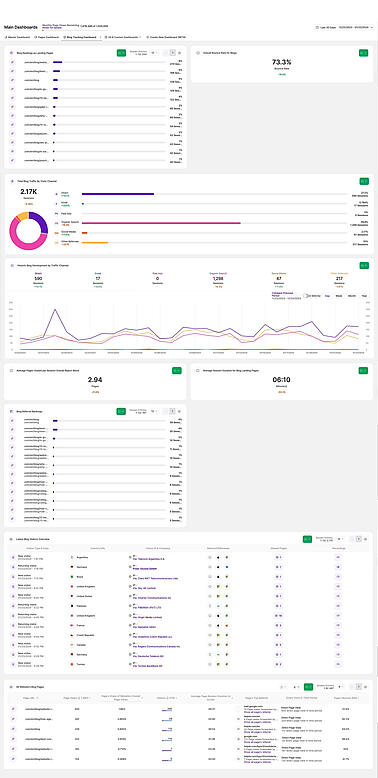
For anyone from individual bloggers and content marketers to large businesses, it's useful to be able to keep track of the performance of blogs - both individually and collectively. Pages offers one avenue, and the Pages Dashboard another. But an additional approach is to create a custom dashboard specifically for blog performance tracking, which provides a level of flexibility absent from the previously-mentioned options.
This is because this tool enables you to view every report block related to the performance of each blog - and their success in relation to others published on your site - all in one place. It streamlines analytics work; key blocks can be placed next to each other for comparison and specific filters activated by default. And taken together, this means you can use the custom dashboard as a one-stop-shop for content analysis.
Below, you'll find a list of all the default report blocks to include in a Custom Dashboard that will enable you to monitor blog performance from the following angles:
- Blog pages as website entry points for internet users.
- Capacity of blogs to motivate exploration of wider website.
- Digital channel or source of blog traffic.
- Other pages viewed by blog visitors.
- Length of time visitors spent on-page.
- Referring sites attracting the most blog traffic.
- Device, location, and other blog visitor characteristics.
Report Blocks Required to Build Example Dashboard #1
| Required Report Blocks | Customized Report Block Name | Activated Filter |
|---|---|---|
| Default Landing Pages Report Block | Blog Rankings as Landing Pages | Page URL [Contains] /blog |
| Default Bounce Rate Overall Report Block | Overall Bounce Rate for Blogs | Page URL [Contains] /blog |
| Default Total Website's Traffic by Traffic Channel Report Block | Total Blog Traffic By Visits Channel | Page URL [Contains] /blog |
| Default Historic Development by Traffic Channel Report Block | Historic Blog Development by Traffic Channel | Page URL [Contains] /blog |
| Default Average Pages Visited per Session Overall Report Block | Average Pages Visited per Session Overall Report Block | Page URL [Contains] /blog |
| Default Average Session Duration Overall Report Block | Average Session Duration for Blog Landing Pages | Page URL [Contains] /blog |
| Default Referrers Report Block | Blog Referrer Rankings | Page URL [Contains] /blog |
| Default Latest Visitors Overview Report Block | Latest Blog Visitors Overview | Page URL [Contains] /blog |
| Default All Website's Pages Report Block | All Website's Blog Pages | Page URL [Contains] /blog |
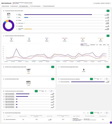
Report Blocks Required to Build Example Dashboard #2
| Required Report Blocks | Customized Report Block Name | Activated Filter |
|---|---|---|
| Default Total Website's Traffic by Traffic Channel Report Block | Total December Newsletter Traffic by Traffic Channel | Page URL [Contains] /website-intelligence-news-roundup-december-2023 |
| Default Historic Development by Traffic Channel Report Block | Newsletter Development by Traffic Channel | Page URL [Contains] /website-intelligence-news |
| Default Average Pages Visited per Session Overall Report Block | Newsletter Visitors: Average Pages Visited per Session Overall | Page URL [Contains] /website-intelligence-news-roundup-december-2023 |
| Default Average Session Duration Overall Report Block | December News Roundup: Average Session Duration | Page URL [Contains] /website-intelligence-news-roundup-december-2023 |
| Default Bounce Rate Overall Report Block | December News Roundup: Bounce Rate | Page URL [Contains] /website-intelligence-news-roundup-december-2023 |
| Default Landing Pages Report Block | December News Roundup: Performance as Landing Page | Page URL [Contains] /website-intelligence-news-roundup-december-2023 |
| Default Referrers Report Block | December News Roundup: Data on Referring Websites | Page URL [Contains] /website-intelligence-news-roundup-december-2023 |
| Default All Website's Pages Report Block | December News Roundup: Webpage Analysis | Page URL [Contains] /website-intelligence-news-roundup-december-2023 |
→ Technical Performance Analysis
Custom Dashboards: Example Dashboard #3
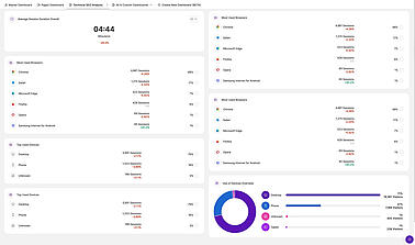
Internet users will visit a website using many different technological environments, and it's important to ensure that all are catered for well. This will help to facilitate a good user experience, and has obvious implications for an online business' technical SEO score. Technical performance analysis also includes identifying bugs, glitches, broken links, slow loading speeds, and other functionality issues that are limiting performance and creating further frustrations for users.
And while Devices includes the relevant report blocks, it can be useful to create a custom dashboard to help with this work. This is particularly so because report blocks can be included with pre-set filters that make it easy to align the dashboard(s) with specific tasks and to quickly assess the effectiveness of work over time. Below, you'll find a list of the report blocks that you can leverage to guide technical website development:
- Default Average Session Duration Overall Report Block: Use this report block to identify webpages with session durations far below the average for similar website pages. This is an indicator of a low page loading speed or other potential technical issue.
- Default Browser Usage Report Block: Use this report block to identify certain browser types not commonly used by visitors. This might be an indicator that the website has technical issues that are causing functionality problems for internet users accessing the web with these browsers.
- Default Use of Devices Overview Report Block: Use this report block to identify lower-than-expected usage patterns for different device types. This could be an indicator that table or mobile users are experiencing website performance issues.
- Default Top Used Devices Report Block: Use this report block to decide which device types to prioritize, particularly with regard to smartphones and desktops.


