- Why Us?
- Features
White Label
For SaaS Platforms & Agencies
Provide our complete analytics suite to your clients, directly within your own interface and with your/their own branding. Discover Analytics-as-a-Service and White Label Analytics. Great benefit, minimal effort.
- Pricing
- White Label
- Success Stories
- Partner
- ResourcesExpand Your Knowledge
- First Steps Checklist
-
Frequently Asked Questions
-
All About Features
- How to Install the Tracking Code
-
User Guides
-
Integrating With Other Platforms
-
Legal, Data Privacy & Certificates
- TWAIA Addendum
- White Label Analytics
- Glossary
- Contact
Page Heatmaps
See What's Hot and What's Not
Page Heatmaps reveal the most engaging areas of your website through a colorful visual representation of user interactions. You see the exact spots that receive the most clicks (for desktops) and taps (for mobiles and tablets); which areas the mouse is moved most frequently across the screen, and what the average scroll rate is for a specific page. While the session recordings feature focuses on viewing a single user session, heatmaps are based on up to 8,000 views of one page.
To provide a clearer understanding of the Page Heatmaps feature, we've organized the article into the following sections:
Some General Hints
- If the screenshot of your page heatmap is incorrect, or if you recently changed your page design, you can always manually re-take the screenshot to update your heatmap.
- Your plan includes a fixed set number of heatmaps for each website, not per month. Feel free to create, delete, and update them as you see fit.
- The number of page views for which the actions are recorded on your heatmap, is per heatmap, not per month. It will not reset to 0 each month, therefore you will need to reset your heatmap if you want to receive new views on the page and new hot spots.
- Make sure your heatmap is active in order to record data.
- Creating multiple heatmaps on the same page URL is not possible. Make sure you do not have 2 heatmaps set up for the same page, otherwise, there might be a conflict and the data cannot be tracked.
- Depending on the volume of traffic on your website, it may take hours or minutes to gather enough information to create a heatmap from your page views.
- Your website heatmap can only use data collected after you set everything up and your first visitor lands on the page. It cannot be generated retroactively, based on the page views acquired before the initial setup.
- The screenshot that displays the color-coded data will represent the page's status from the initial visit. If you make changes to the page design after this first visit, there may be a discrepancy in the representation of the data. We recommend resetting the heatmap after you make significant changes to the page.
Page Heatmaps provide a powerful visual representation of how visitors interact with your web pages, helping you identify which areas receive high or low attention.
To activate the Heatmaps feature, please follow these steps:
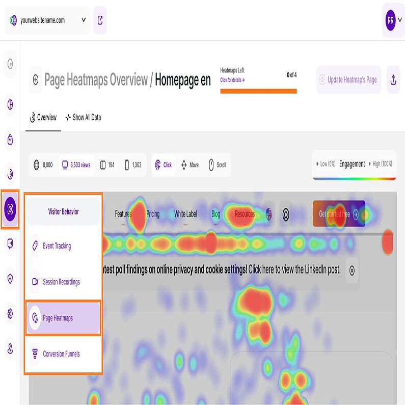
- In the Main Menu, navigate to Visitor Behavior, and select Page Heatmaps.
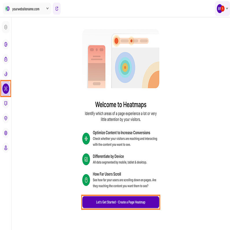
- On the Welcome screen, click the Let's Get Started - Create a Page Heatmap button.
- You will be taken to the view where you can configure your new heatmap.
Once the heatmap is configured and created, data collection will begin immediately according to your defined settings, allowing you to monitor how visitors interact with your content.
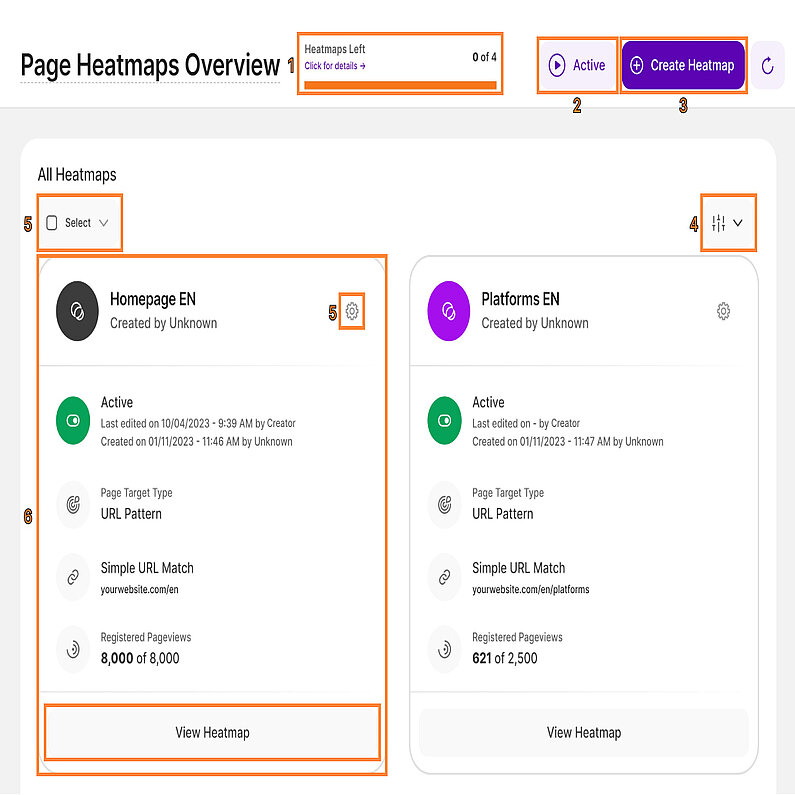
The main overview is the core of this submodule. It gives an outline of all the created heatmaps, as tiles, for the selected website and mostly consists of the following elements:
- Feature Counter:See how many heatmaps you have left in your current plan. Hover over the counter for details about your subscription and upgrade options if needed.
- Page Heatmaps Current Status: This button toggles between active and paused states for all heatmaps. All heatmaps are active by default unless individually paused.
- Create Heatmap: Click this button to create a new heatmap.
- Filter Option: Apply filtering options to search page heatmaps by URL or by status. Save Filter Template for future use.
- Actions and Mass Actions for Heatmaps: These actions can be taken for each heatmap. Clicking on the Settings icon of each tile will allow you to:
- Edit Details: This option allows you to edit the name of the selected heatmap, and the icon color for a better distinction.
- Start session recordings: The gathering of data is started again until the individually set page views limit has been reached.
- Pause Recording: The gathering of data for the selected heatmap will be paused (can be continued at any point in time).
- Reset & Update: If you have updated the design/UI of your website or a specific page recently and you want your heatmaps to show your newest page design, you can reset the heatmap data completely for an existing heatmap.Important Note:
This action will update all changes in your page’s layout shown in the selected heatmaps AND also reset all of the user action data recorded so far. After that your visitor’s actions will be recorded from scratch again, thus creating an entirely new map for your new UI. - Select Heatmap: You can choose to select the desired heatmaps this way, or simply by clicking on the colored icon next to each heatmap name. Once selected, you will see the number of Entry(ies) selected and you can select a mass action from the dropdown menu.
- Delete: The selected heatmaps will be deleted forever. This action can not be reversed.Important Notes:
If you move your cursor over each heatmap's colored icon, you will see a radio button appear, making it possible to select it. Once the desired tiles are selected, the mass-action selector will appear right above the first tile, so you can take action for all the selected heatmaps at once. You can also easily select all of them in your overview, by clicking on the action Select then choose All.
In the mass actions dropdown, you can choose between the following actions which were also described above, this time applied en masse: Start session recordings, Pause recording, Reset & update, and Delete.
- Heatmap Details: Each time you create a new heatmap, a new tile will appear in your overview. Each tile gives you basic information about the heatmap:
- Colored icon (or heatmap selection tool): Click the colored icon in the top left corner of each tile to select the heatmap. Tap again to deselect. The icon color matches the color selected during the heatmap creation.
- Name: Displays the unique name you assigned to the heatmap.
- Created by: Either the site owner or an editor invited as a contributor. Both have editing privileges. You can learn more about the different contribution roles here.
- Settings Icon (or heatmap's actions): Click this to edit the details, change status, reset & update or delete the heatmaps.
- Heatmap status: Shows the heatmap's current status, creation date/time, and creator's name. If there were any changes made to the heatmap, it will also display the time of the last change and the name of the editor are also shown. You can also click the play/pause button.
- Page Target Type: This line summarizes the rules that you set while creating a heatmap, shows either: Specific Page, Dynamic Page, or URL Pattern.
- URL: The web page URL used to collect data for this heatmap. It also displays whether it’s based on Specific Page, Simple URL Match, Exact URL Match, etc.
- Pageviews: The amount of page views that have already been recorded out of the limit which was set as a maximum during the initial setup.
- View Heatmap button: Click to access a comprehensive analysis of the heatmap data. This will lead you to the Detail View page that shows more heatmap details including screenshots, and page views via desktop, tablet, or mobile.
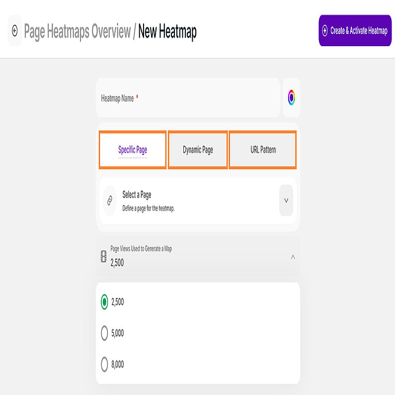
With the help of heatmaps, you can effectively visualize user behavior inside your website and identify locations where users are engaged, and where improvements can be made. Gaining insight into how users engage with your interface can help you make informed design decisions, boosting user experience and satisfaction. Let’s explore the three options for creating heatmaps:
- Specific Page: Ideal for analyzing individual pages to understand user interactions on that specific page.
- Dynamic Page: Gathers data across pages with similar structures to understand user behavior within a specific feature or section.
- URL Pattern: Tracks behavior on pages matching a defined URL pattern to offer insights into broader user journeys and trends across similar content types.
Ready to start creating heatmaps and gaining a deeper understanding of your users? Let's dive in!
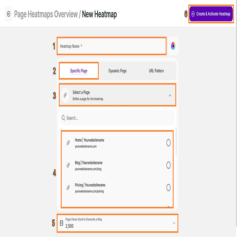
This option makes analyzing user behavior a breeze. Simply pick a specific page, and the heatmap reveals how users interact with it. Perfect for quick insights into clicks, scrolls, and taps.
To create a simple heatmap using specific pages, follow these steps:
- Define the heatmap name and choose a color.
- Select Specific Page.
- Click Select a Page to open the dropdown list.
- Select a page from the dropdown list. You can also use the Search bar to look for the page you want to use.
- Click Page Views Used to Generate a Map to open the dropdown menu. You can choose between 2,500, 5,000, or 8,000 page views to generate the heatmap.
- Click Create & Activate Heatmap on the upper right to save the heatmap.
Once created and you have enough page views, you will be able to see the resulting color-coded graphics overlaid on a screenshot of the page you want to analyze. As the page gets more and more page views, your heatmap will evolve to include data from all these page views and it will stop once it reaches the maximum number of page views you set
Important Notes:
- We can only analyze pages with tracked activity. The dropdown list will only display web pages with at least one visit.
- If the page you want to select does not appear in the list, just visit that page, reload the app, and check again the list if it is there.
- Only the name and the color can be edited after the heatmap has been created, so make sure you create it for the right page. Otherwise, the heatmap needs to be deleted and a new one has to be created.
Analyzing individual pages is valuable, but sometimes you need a broader perspective. That's where dynamic heatmaps come in, ideal for pages with similar structures like product pages or blog posts. Imagine you have an e-commerce website. Each product page follows the same layout but showcases different items. Most likely, visitor behavior on these pages will be similar, in terms of attention distribution. Analyzing each page individually can be time-consuming but if you select this option, you will be able to create an aggregated map for all of these pages in one.
The first viewed page of this defined type will be the snapshot you see for this heatmap if you build one for your dynamic pages. For instance, the screenshot might be taken on the first visited product page, but the color-coded data will be gathered from all pages of this type.
If you are not new to the application, you may have used the dynamic page option before. It allows you to cluster pages that have the same URL path up to a certain point, and get aggregated stats for that cluster. For example if you want to track the aggregated data for all of your product pages, you could have a dynamic page structured like: www.website.com/shop/product/*/
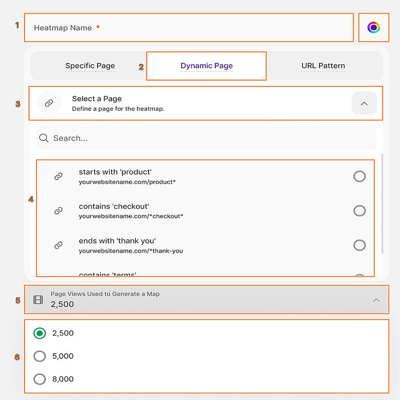
Follow these steps to create a heatmap using the Dynamic Page option:
- Define the heatmap name and choose a color.
- Select Dynamic Page.
- Click Select a Page to open the dropdown list.
- Select the dynamic page from the dropdown list that you want to use. You can also use the Search bar to look for the page you want to use.
- Click Page Views Used to Generate a Map to open the drowdown menu.
- Select the number of page views to be used to generate the heatmap. You can choose between 2,500, 5,000, or 8,000 page views.
- Click Create & Activate Heatmap on the upper right to save the heatmap.
Important Notes:
- The auto-generated list is based on the Dynamic Pages you have already defined within the Special Pages settings section of the app.
- If you did not create one, you can do it following the guide here, or choose the next option presented below to define the URL pattern on the spot.
While specific and dynamic page heatmaps provide valuable insights into individual pages or similar page structures, the real power lies in unlocking user journeys across your entire app. This is where Custom URL Pattern heatmaps come into play.
Imagine you have a complex website with various product categories, each with numerous product pages. Analyzing each page individually would be overwhelming. By using this option, you can simply create a pattern matching multiple pages, like "/products/*". This captures user behavior across all product pages, regardless of individual product variations. This will also help with understanding user journeys across large content sections.
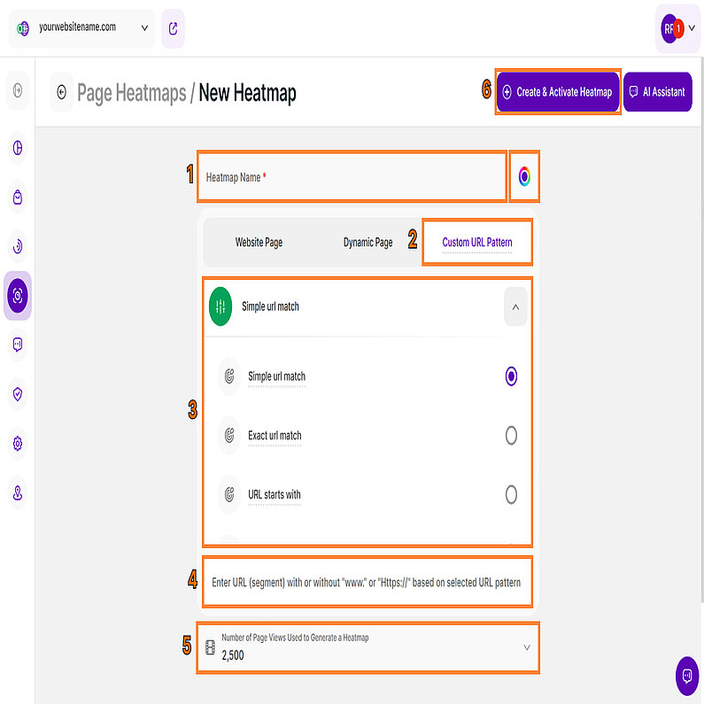
Follow these steps to set up a heatmap using the Custom URL Pattern option:
- Define the heatmap name and choose a color.
- Select Custom URL Pattern.
Click the dropdown list to select a URL pattern for this heatmap. Choose one of the URL patterns below based on your preference. The default option is Simple url match.
Custom URL Pattern Option A Heatmap Pageview is Recorded When it Matches … When to Use the Option? Simple url match … a single, specific page path you entered, ignoring common variables like the protocol (http/https), the www. subdomain, and any query strings (?param=x) or fragments (#section). Ideal for tracking a single, core page whose URL may contain dynamic elements like UTM codes or internal tracking links. Exact url match … the URL exactly as you enter it, including the protocol, query strings, and fragments. This is the most restrictive option. Essential when you need to specifically analyze a page that has a unique identifier in the URL. URL starts With … any URL that begins with the text value you input. Use this to analyze an entire section or category of your website (e.g., entering yourwebsite.com/blog/ will include all posts within your blog directory). URL contains … any URL that includes the text value you enter anywhere within the address. Great for gathering data across pages that share a common unique string (e.g., tracking a specific version of a shopping cart across multiple steps in the checkout process, or any URL containing /thank-you/). URL ends with … any URL that finishes with the text value you input. Useful for targeting pages that have a consistent file extension or a common final path segment (e.g., pages ending in .html or pages that all end with /register). - Enter URL (segment) with or without "www." or "Https://" based on selected URL pattern.
- Click Number of Page Views Used to Generate a Heatmap to open the dropdown menu. You can choose between 2,500, 5,000, or 8,000 page views.
- Click Create & Activate Heatmap on the upper right to save the heatmap.
Important Notes:
- Remember, while this option offers broad insights, it doesn't replace the value of specific page analysis. Use them together to paint a complete picture of user behavior and drive informed decision-making.
- Further information about each of the URL patterns, can be found here.
Detail View of Page Heatmaps
Understanding user behavior starts here! Explore two key tabs on the heatmap detail view:
Now, let's explore the details of your heatmap. The Overview provides valuable insights into how visitors behave on your web pages. In this section, you’ll learn more about the different types of heatmaps, update heatmap’s screenshot, and many more.
We have four types of heatmaps:
- Click Maps (Desktop): See where visitors click their mouse to reveal areas of interest and potential interaction.
- Move/Mouse Movement/Hover Maps (Desktop): Track mouse movement patterns.
- Tap Maps (Mobile & Tablet): Shows where visitors tap their fingers on mobile and tablet devices, pinpointing user engagement hotspots.
- Scroll Maps (All Devices): Visualize how far users typically scroll down your page.
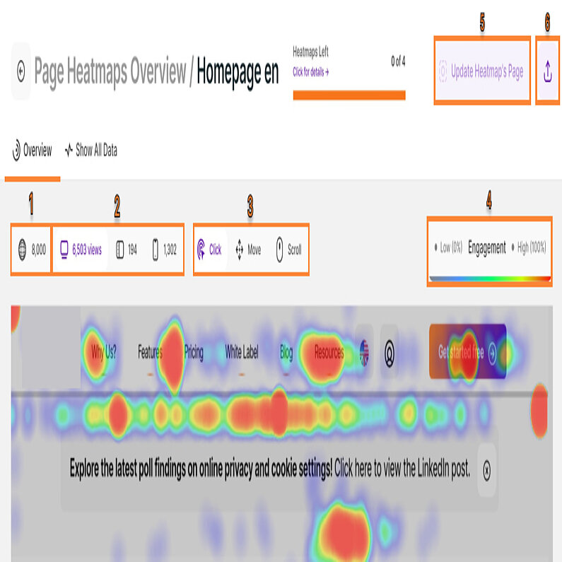
The Overview tab shows the following options:
- Global Page View Map
- Device Types
- Heatmap Types
- Colored Scale
- Update Heatmap's Page
- Download Heatmap
Ready to uncover hidden patterns in how visitors interact with your pages? Continue reading for more heatmap insights.
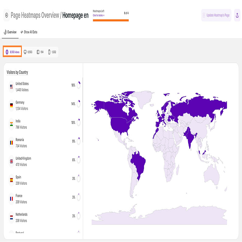
This section provides a visual overview of where visitors to your selected heatmap came from. It counts the page views based on origin. Quickly grasp which countries contribute the most visitors. Simply hover over specific map areas to see visitor numbers. Use your scroll or touchpad to zoom in on regions of interest.
To easily identify visitor origins, it shows the flags and the corresponding country names. Below each country is the total number of visitors, and on the right, it displays the percentage and a donut chart that represents the overall traffic received by this country for the selected heatmap.
A global map offers a geographical perspective of your visitor base. Gray countries mean that no visitors from these countries interacted with the pages in this heatmap. The country coloring changes from high engagement (as a darker green color) to low engagement (as a lighter green color).
Important Hint:
You may have received visits from other countries when you were recording visits, but those visits did not happen on the pages you selected for this specific heatmap.
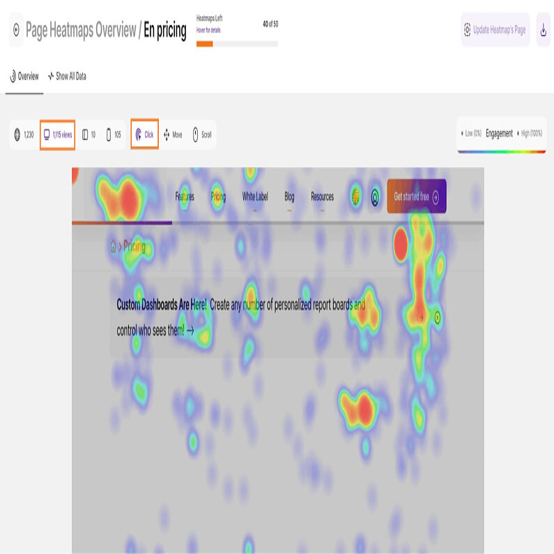
Dive into how visitors interact with your chosen page through this heatmap. This sample image showcases a Click Heatmap, the most common type. It reveals where visitors click on your webpage, highlighting areas of interest and potential engagement opportunities.
Clicking the Desktop button shows the total page views and unlocks three options: Click, Move, and Scroll heatmaps for further analysis. Use these insights to optimize your content and rearrange elements, guiding users toward your desired interaction points.
Hot zones (red) indicate high engagement, while cooler areas (blue) show where clicks are less frequent.
Ideally, your key call to action button (CTA) should be a fiery red, attracting clicks and conversions!
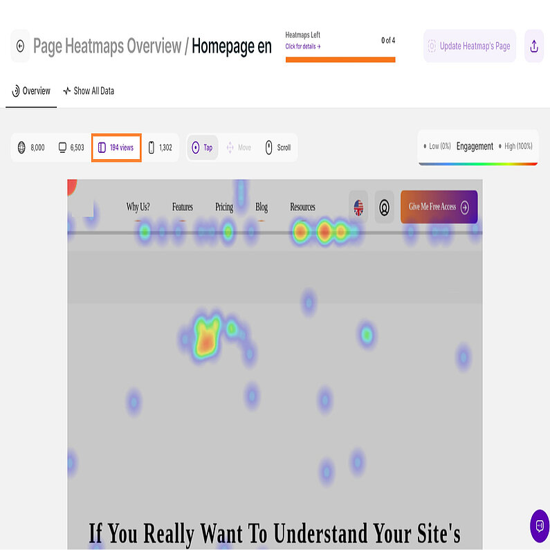
This section unlocks how visitors interact with your page on tablet devices. By selecting the Tablet Device button, you'll gain valuable insights:
- Page Views: See how many users visited your page through a tablet.
- Interaction Options: Analyze user behavior with Tap and Scroll heatmaps.
The sample above showcases a Tap Heatmap, offering an overview of all touch interactions on your page recorded across all tablet visits. Like Click Heatmaps, it reveals areas where users tap their fingers, highlighting points of high engagement.
Use this information to understand how users navigate your tablet-optimized page. Prioritize key content near the top of your page, as users tend to scroll less compared to mobile devices.
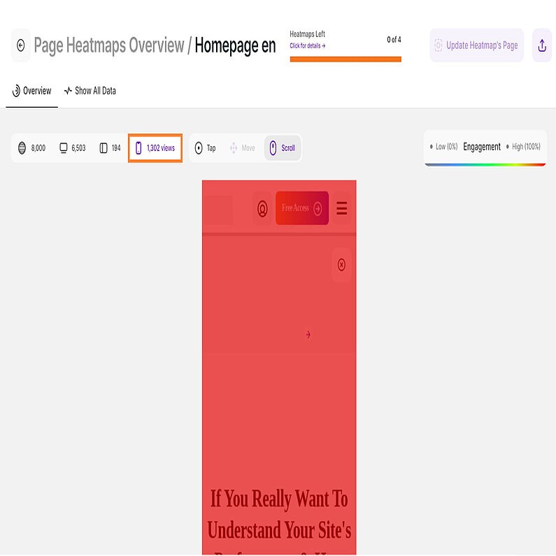
This heatmap unveils how users interact with your chosen page on mobile devices. See every tap and scroll across all mobile visits.
Select the Mobile Device button to reveal key metrics:
- Page Views: Understand how many mobile users visited this page.
- Interaction Options: Tap and Scroll heatmaps offer deeper insights.
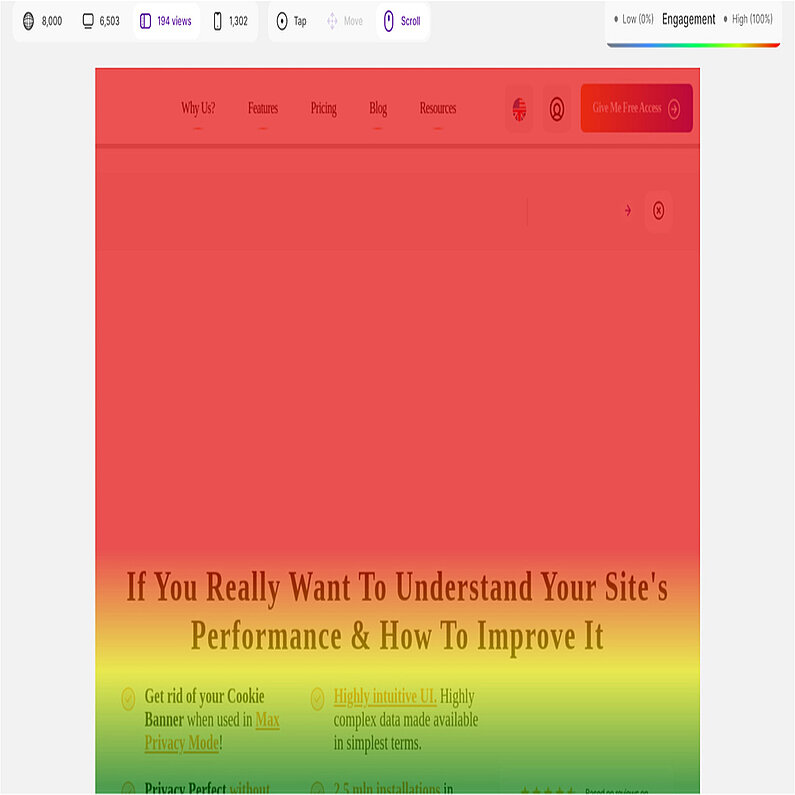
The sample above shows a Scroll Heatmap. Darker shades indicate areas most users scrolled down to view, while cooler colors represent less-reached areas (often near the bottom).
For optimal engagement, prioritize important content near the top of your page. This aligns with how users typically scroll on mobile devices.
On the right side of each view containing a heatmap, you will be shown a color scale implying the representation of each coloring in terms of engagement.
The example we have is a scroll heatmap from tablet devices. An area is marked with a dark red color, which means that it received a lot of interaction. Typically for a scrolling heatmap, the lower part of a page is way bluer or cooler than the upper part, meaning that way fewer people scroll to the end. So keep your important content at the top of a page.
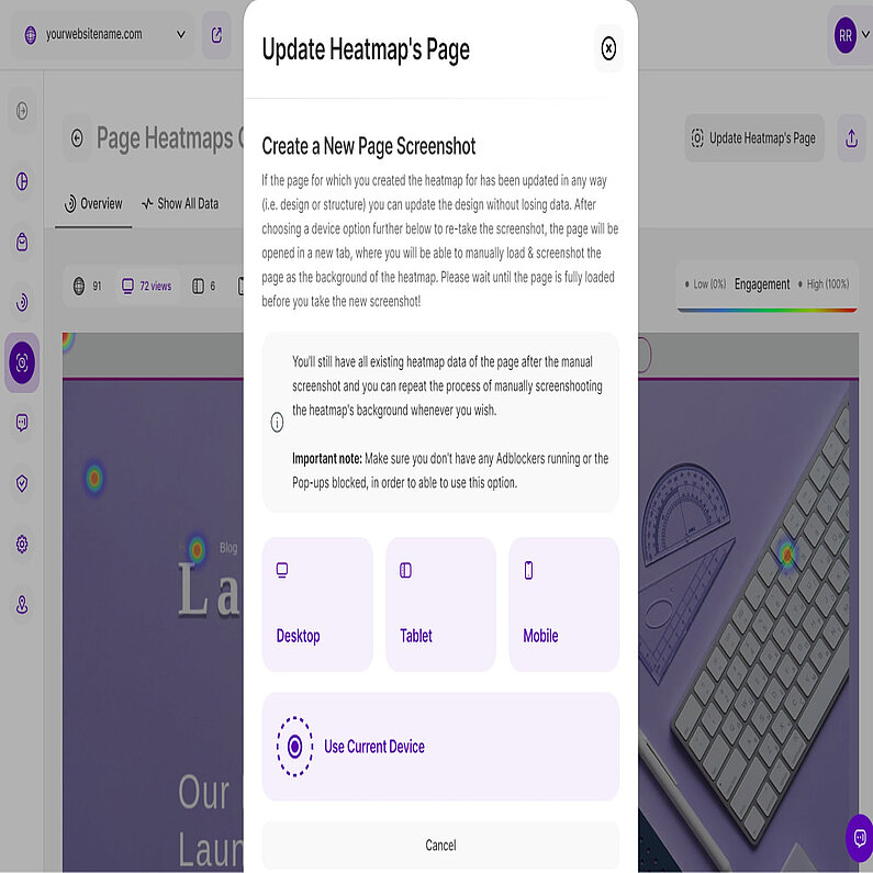
Your heatmap reflects your page's design and layout. You may always manually take a new screenshot to update your heatmap if the one you have is inaccurate, or if you've made any changes (i.e., design, structure), update the heatmap to ensure accurate data.
Follow these step-by-step guide to update your heatmap's screenshot:
- Open the heatmap you want to update.
- Click Update Heatmap's Page.
- Choose the device (desktop, tablet, mobile) you want to update.
- Wait for your page to fully load in a new window.
- Click Capture New Screenshot.
- Review the image. Click Add Screenshot to Heatmap, if satisfied, or click Capture Again to retake.
Important Hints:
- Scroll down before capturing to ensure all contents are included.
- This process updates the design without losing interaction data.
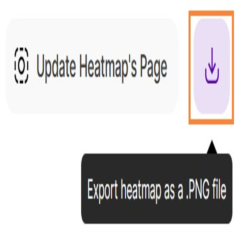
If you wish to maintain a record of your heatmap's progress, you can now easily download it by clicking the Export button located at the top right corner of your screen. Upon clicking, the file will be instantly downloaded as a PNG file, enabling you to access it without delay.
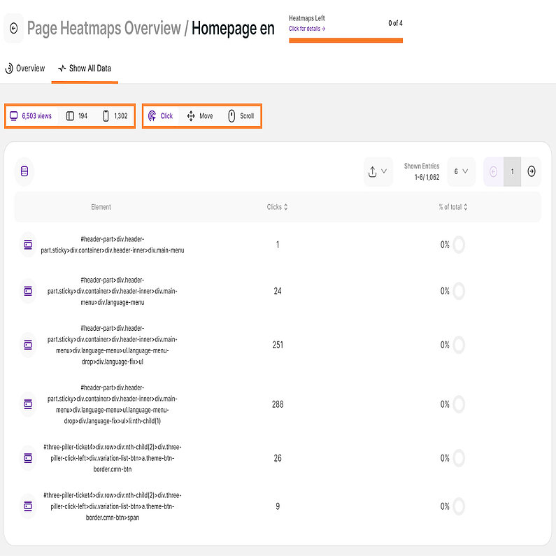
Now that you know the basics of heatmaps, let’s dive into analyzing the collected data. The Show All Data tab displays a table with the actual data generated. You may need more advanced technical knowledge to fully understand it and use it.
The data displayed is dependent on the device type and the heatmap type selected. You’ll find the following columns on each heatmap table:
- Click/Tap (All devices):
- Element: Shows the specific HTML element where the visitor clicked/tapped.
- Clicks: Displays the total number of clicks received by this element.
- % of total: Presents the percentage breakdown and a donut chart indicating how much of your overall clicks were received by this element for the selected heatmap.
- Move (Desktop):
- Element: Shows the exact HTML element visitors interacted with through mouse movement.
- Interaction points: Displays the total number of interaction points for this element.
- % of total: Shows the percentage breakdown and a donut chart indicating how much of your interaction points were received by this element for the selected heatmap.
- Scroll (All devices):
- % of page scrolled: This metric showcases the average percentage of the page scrolled down by visitors.
- Pixels scrolled: Presents the average pixel distance scrolled vertically by visitors on the page.
- # of visitors: Displays the total number of visitors grouped based on the % of pages scrolled.
- % of visitors: Shows the distribution of scroll depth among your visitors, shown with a donut chart and expressed as a percentage of total visitors.
The sample image shows the data from a click map recorded on a desktop device. Each HTML element that received at least one interaction is listed on the table.
You can also sort the Clicks column in descending order to see which elements received the most interactions. Once sorted, you will also notice that the % of total column shows the highest percentage.
You now have the option to export the data as a .CSV file, which you can then share with your team. This enables you to track your progress and collaborate effectively.


