- Why Us?
- Features
White Label
For SaaS Platforms & Agencies
Provide our complete analytics suite to your clients, directly within your own interface and with your/their own branding. Discover Analytics-as-a-Service and White Label Analytics. Great benefit, minimal effort.
- Pricing
- White Label
- Success Stories
- ResourcesGetting Started
-
Frequently Asked Questions
-
All About Features
- How to Install the Tracking Code
-
User Guides
-
Integrating With Other Platforms
-
Legal, Data Privacy & Certificates
- White Label Analytics
- Glossary
- Affiliate Program
- Contact
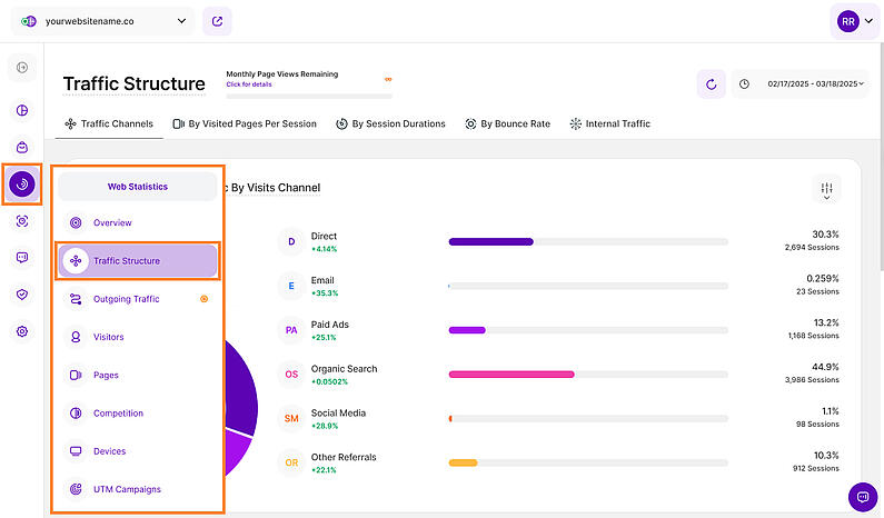
Traffic Structure
See How Your Traffic is Structured & Which Channels Attract Visitors
Within the traffic structure submodule, you'll find comprehensive details about how your incoming website traffic is organized.
Determine which channels bring the most traffic to your website and uncover hidden gems that might be attracting valuable visitors. With diverse origins for your website traffic, you can now delve into the performance of each source through:
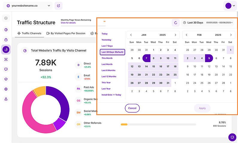
Right above the tiles, you can see a date picker. This enables you to select a certain time period, or specific day, for which you want the Dashboard's data to correspond.
It is crucial to limit the presentation of data to specific dates or timeframes during which you executed potential campaigns or implemented other strategies. This will allow you to assess the effectiveness of these actions and use the insights gained for future planning.
Important Notes:
- We only track data for this module from the moment it has been released.
- The app now remembers previously set segments, filters, filter templates, and date intervals, even when you navigate away from the page, log out, or log back in. When your session expires or you close the tab, it automatically switches back to the default setting of "Last 30 Days."
- What's New? Tooltips now display the abbreviated day of the week wherever dates are available. This will help you identify trends and analyze website traffic in relation to the days of the week.
- A lot of elements contain options to hover information or further actions. Just let your cursor run over various elements and discover how much data is actually packed into the view.
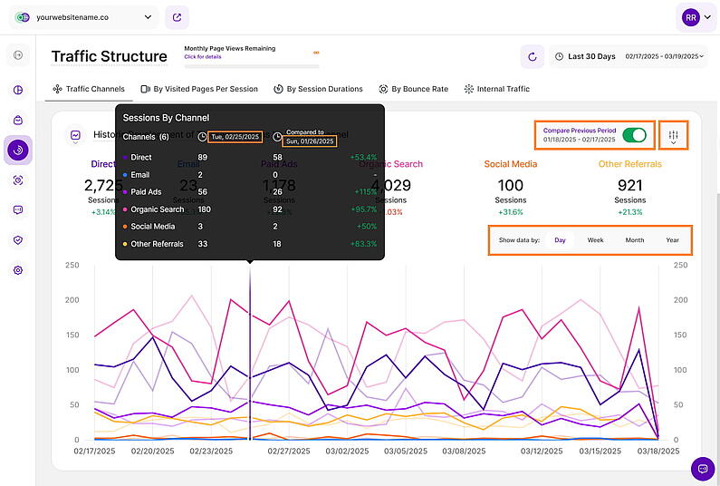
- On each tab, you'll find the option to compare the data. When you enable the Compare radio button, a second line (lighter shade) will be added to the graph for each metric. These lines will show data from the preceding time period before the one selected. You now have two options, Compare Previous Period and Compare Year over Year.
- You have the option to show the data by day, week, month or year. As a result, if the chosen period to study is this week, the preceding period would be the same number of days but prior to the current week.
- "Apply filtering" option is available on all of the report blocks.
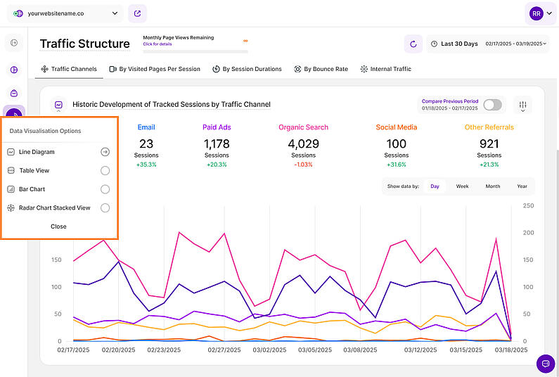
See your traffic data like never before! We're excited to announce improvements to the report blocks within the Traffic Structure module. Now, you have even more control over how you visualize your traffic data with the introduction of Data Visualization Options!
Whether you prefer bar charts, line graphs, or other formats, you can now visualize your traffic data in a way that clicks for you. This makes it easier to grasp trends and patterns, ultimately leading to better decisions.
Explore the following visualization options available for the Traffic Structure report blocks:
Line Diagram View
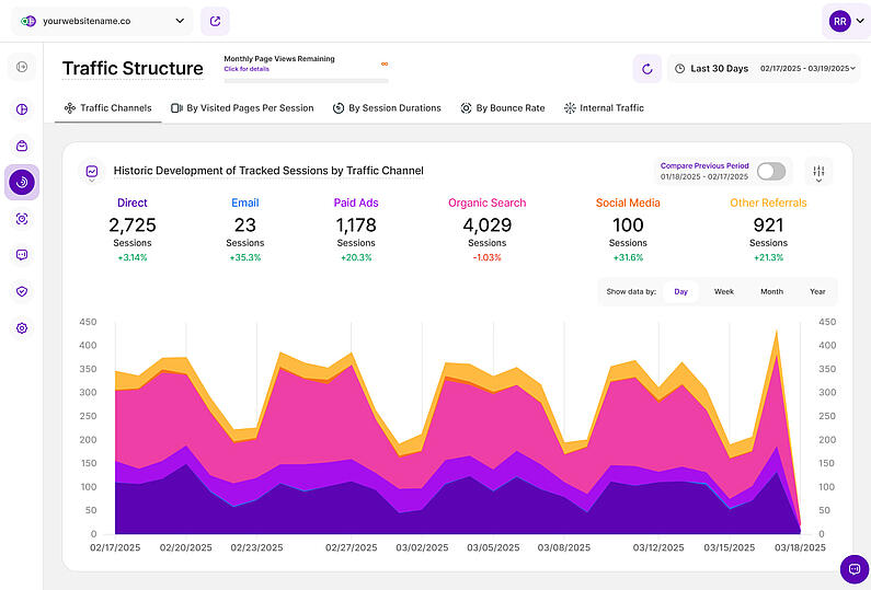
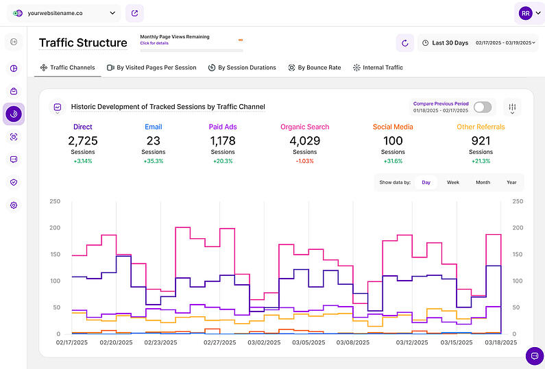
Line diagrams serve as the backbone of data visualization, adept at illustrating trends and patterns over time. Picture a series of data points resembling stepping stones across a river; a line chart connects these points, forming a visual bridge that unveils the trajectory of your data journey.
Continue reading to learn more about the different line diagram views and line styling options.
Important Hint: To have a better perspective on the data provided in the chart, simply click on each KPI above the graph to choose or deselect it. Enable only those that interest you, or keep them all enabled for a more comprehensive look.
Line diagrams, commonly known as line charts, excel at presenting trends by connecting data points with a line. This data representation makes it easy to observe or analyze how a certain KPI evolves over time, making it ideal for tracking website traffic, sales growth, or any other metric with a narrative.
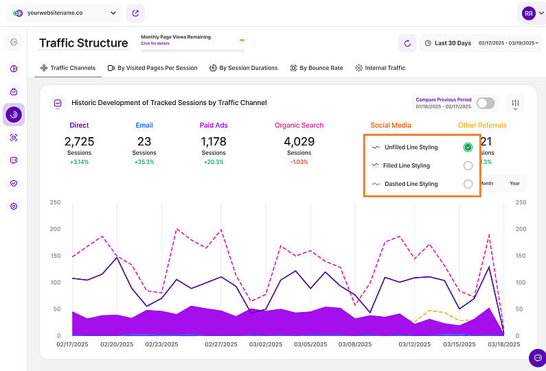
Want to tailor the way your data is visualized? Click the three-dot icon next to each KPI to unlock the following line styling options:
- Unfilled Line Styling
- Filled Line Styling
- Dashed Line Styling
By experimenting with these options, you can customize your data visualization to best suit your needs and effectively communicate your findings.
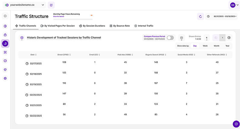
Need to examine specific values or compare data points side-by-side? The table view offers a different perspective on your data, transitioning from a visual representation to a detailed breakdown. It presents your information in a clear, tabular format, with each data point occupying its own cell.
The table is divided into the following columns:
- Date
- Direct
- Paid Ads
- Organic Search
- Social Media
- Other Referrals
Moving on to another data visualization powerhouse, let's explore bar charts! This type of chart excels at demonstrating how different KPIs compare to one another. Each KPI is represented by a rectangular bar whose height is directly proportionate to the relevant value.
This makes bar charts helpful for determining which category has the highest or lowest value.
Radar chart stacked view is a great tool for displaying performance information. You can easily determine which KPIs are strong points and those that may need some enhancement by comparing variables on the same chart. They are thus effective tools for evaluating performance and making strategic decisions.
Each variable has a central axis. All axes are aligned radially, with equal distances between them, while the scale remains constant. Grid lines that connect axis to axis are commonly used as guides. Each variable value is shown on a separate axis, and all variables in a dataset are joined to form a polygon.
Traffic Channels
This subtab dives deeper into your website's traffic, helping you understand where your visitors come from. It's divided into two key sections:
- Total Website's Traffic By Visits Channel
- Historic Development of Tracked Sessions by Traffic Channel
The first step in analyzing your traffic is to have an overview of the traffic channels. In addition to identifying the primary traffic channels, direct and organic, you must also understand the distinctions between all of your traffic sources and how they are categorized.
Here is a breakdown of the traffic channels and how are they determined:
- Direct: This refers to visitors who come to your website by directly typing your website's URL into their web browser's address bar. In cases where the source of the traffic is uncertain, it's still considered as direct.
- Email: Traffic that originates from email marketing campaigns. It's tracked when specific tags are included as parameters in the URLs within your email campaigns.
- Paid Ads: Traffic that comes from search engine results of paid advertising (either across search ads or due to a targeting strategy).
- Organic Search: This traffic comprises visitors who discovered your website through search engine results like those from Google or Bing. Importantly, this traffic is unpaid and is based on the natural search results.
- Social Media: Traffic that origines from social media platforms such as Facebook, Instagram, LinkedIn, Twitter, and other similar platforms.
- Other Referrals: This traffic is gained when visitors learn about your website by clicking on links from other websites or apps. These links come from various sources on the internet and are distinct from search engine referrals.
This comprehensive understanding will provide you with insights into how visitors reach your site and enable you to make informed decisions to enhance your online presence.
Enhancing Traffic Data Accuracy with GET Parameters
To improve the categorization of traffic channels, you can use GET parameters. Our platform uses referring websites and/or URL parameters to assess the traffic's source and its structure.
You MUST add both the “channel” and “category” fields in each parameter after the landing page URL.
The format is as follows: landing page URL + ?_channel=[channel]&_category=[category]
For example, your landing page URL is www.yourwebsitename.com and you want to set the channel to 'social' and the category to 'instagram', the formatted URL would be: www.yourwebsitename.com?_channel=social&category=instagram.
Here are some more examples of URLs with parameters:
- https://www.myserver.com/?_channel=email&_category=gmail
- https://www.site.com/?_channel=search&_category=bing
- https://www.example.com/?_channel=paid&_category=google
The possible channels are listed below while the category is free to set:
- email: Assigned to Traffic Channel Email
- paid: Assigned to Traffic Channel Paid Ads
- search: Assigned to Traffic Channel Organic Search
- social: Assigned to Traffic Channel Social Media.
- unknown: Assigned to Traffic Channel Other Referrals.
To name a few possible categories: Gmail, Yahoo, Facebook, Instagram, Pinterest, etc.
To make this information easily accessible to you, we've prepared a CSV file that shows how we categorize URLs by traffic channel.
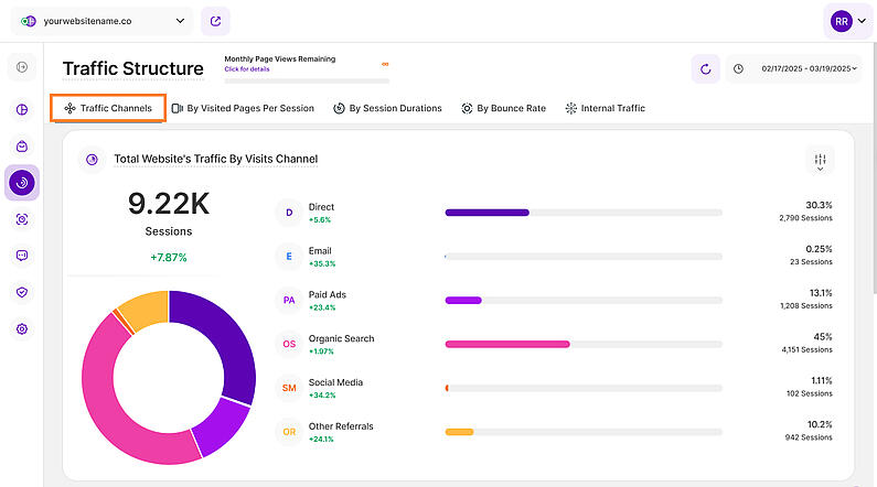
Now that we have identified each of the traffic channels, let's delve into understanding the data we have collected. The first chart provides a simple yet powerful overview, featuring both a donut chart and a bar chart, highlighting the various traffic channels utilized by your website visitors.
Located on the top left, just above the donut chart, you'll find the total number of sessions tracked within the selected time frame. Hover your cursor over the channels listed to view the number of visitors that accessed your site through each channel. Additionally, you can hover over the segments of the donut chart to reveal the corresponding percentages.
Each bar in this chart represents a different traffic channel. On the right side of the chart, you can see the percentage indicating how much of the total sessions came from that source. Directly below, you'll find the exact number of sessions tracked for each channel.
Each traffic channel also has a percentage beneath it, which represents a comparison with the previous equivalent period. A green percentage indicates an increase while red shows a decrease.
Gain greater control and deeper insights with our new filtering options for the Traffic Structures report blocks. This helps you narrow down the data for better analysis. Create custom filters using one or multiple options, and save them as templates for later use. You can read more about the filters here.
For Email category, note that association of visits with traffic channels are based on HTTP referrers. Sometimes the HTTP referrer is forced to be set as empty by an external platform we have no control over – this could lead to a result that a visit coming from a email channel is categorized as direct traffic.
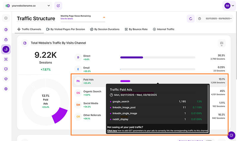
If you're not seeing all your paid traffic, click on the "Paid Ads" section to open the tooltip. Then, click the "Click here" link within the tooltip to learn how adding GET parameters to your paid ads can help you categorize them more effectively and ensure more accurate traffic data.
Historic Development of Tracked Sessions by Traffic Channel
With a foundational understanding of your web traffic channels, you can now analyze traffic share trends by source. Each tab within the Traffic Structure submodule focuses on a particular aspect of the Historic Development of Tracked Sessions by Traffic Channel. The contained report blocks visualize how Key Performance Indicators (KPIs) have evolved over the chosen timeframe, segmented by traffic channel.
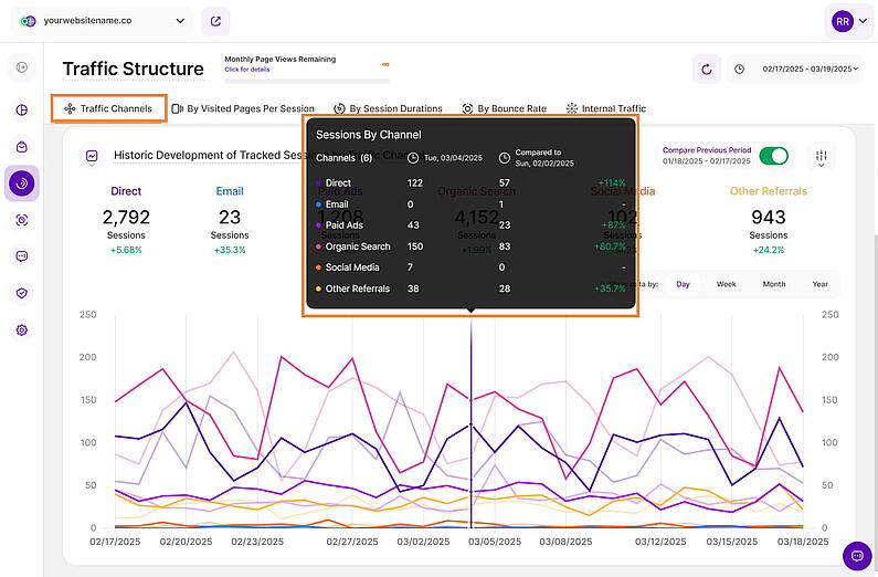
The report block illustrated above shows how the amount of your tracked website sessions have developed in the selected time range based on a traffic channel. You have the flexibility to pick the channels you want to observe on the graph. You are also able to select whether the data should be shown based on a day, a week, a month or a year.
Hovering over a data point displays the following details:
- Channels: A list of all the traffic channels.
- Sessions: This shows the total number of sessions for each traffic channel during the date range you've selected. If you've turned on the comparison, you'll also see a column with the session counts from the previous period, so you can easily compare performance.
- Percentage Change: A percentage comparison of the current data with the previous equivalent period. A green percentage indicates improvement, while red signifies a decline.
At the top right of each report block, you’ll find the Compare radio button that enables the following data comparison options:
- Compare Previous Period: Compares the current data to the previous period (if it exists).
- Compare Year over Year: Compares the current data to the same period of the previous year(if it exists).
You can now compare your current data to the previous period or compare it year over year. You’ll also find the dates covered by the previous period or year, for example, 01/22/2024 - 02/20/2024. This enables you to get a better view of your current data compared to the previous equivalent period or year. The lines in lighter shades represent the data from the previous time period or year.
To narrow down your analysis, use the filter icon located next to the Compare button. Saved filter templates are available for your convenience. You can now filter data by various criteria, including browser name and version, city and country of visit, company name and category, and more.
By Visited Pages Per Session
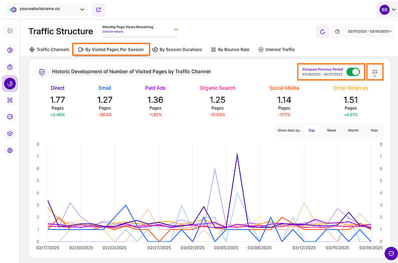
Now that you've explored your traffic sources, delve into engagement with the Visited Pages Per Session metric. This subtab is divided into two sections which will unlock insights into how visitors interact with your content:
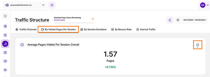
This section reveals the average pages visitors explore per session, helping you identify traffic channels that keep them hooked. We calculate this metric based on all visitor sessions within your chosen timeframe, ensuring accuracy.
Below the average shows a percentage, green shows an increase, red shows a decrease compared to the last similar period you chose.
The filter icon on the right empowers you to tailor the data to your needs. Filter the data by browser, device type and many more. Create custom filters using one or multiple options, and save them as templates for later use. You can read more about the filters here.
Important Hints: In order to generate a more accurate result, the average will not take into account days with 0 data. More than that, the average is made for unique page visits, therefore if there is a page viewed multiple times within a session, it will only be counted once.
Historic Development of Number of Visited Pages by Traffic Channel
Like the previous tab, this view contains a report block that displays a line diagram. This tab unveils the historical changes in website sessions, showing how many pages visitors viewed from each traffic channel within your chosen timeframe.
You can find the compare radio button and the filter icon on the top right of the report block. Enabling Compare Year over Year option allows you to compare the current data to the same period of the previous year(if it exists).
Important Hints: Click on the channels to display or hide the data on the line chart for that specific channel. You are also able to select whether the data should be shown based on a day, a week, a month or a year. Hovering the lines will show you more information.
By Session Durations
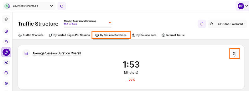
This subtab empowers you to identify which traffic channels drive the most engaged visitors by analyzing session duration. This is divided into two report blocks:
This tile displays the average time spent in a session, based on the source of the traffic. You can select the period of time the data displayed should correlate to.
You’ll also see a percentage below the average that represents a comparison with the previous equivalent period. A green percentage indicates an increase while red shows a decrease.
You’ll find the filter icon on the right side of the report block. You can also create custom filters using one or multiple options, and save them as templates for later use.
Important Hint: The average session duration will not take into account the sessions with only one visited page. Therefore, it may display a not so accurate time for single-page websites (or sessions that contain only one visit), unless the site is reloaded multiple times. This happens due to the fact that the time spent on the site is deducted as the sum of the exact time of a visit on the first page and the exact time on the next page(s).
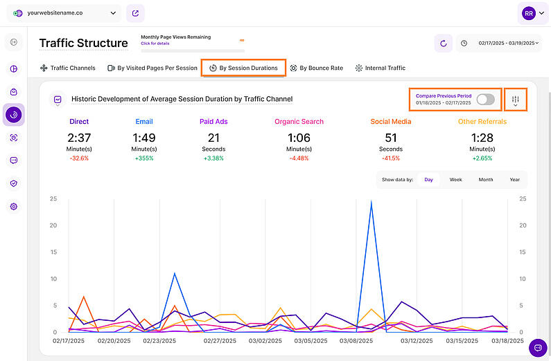
Historic Development of Average Session Duration by Traffic Channel
This report block displays the average length of all visits' session duration(in minutes or seconds) is shown that resulted via each traffic channel. You will also see how the average session duration has evolved in comparison to the previous time period by the percentage shown below each of the traffic source.
It also displays a chart that unveils how much time visitors spend on your site on the average depending on the traffic channel within the selected timeframe. The image above shows bar chart view
You can find the compare radio button and the filter icon on the top right of the report block. You can compare your current data to the previous period or compare it year over year.
Important Hints: Click on the channels to display or hide the data on the line chart for that specific channel. You are also able to select whether the data should be shown based on a day, a week, a month or a year. Hovering the lines will show you more information.
By Bounce Rate
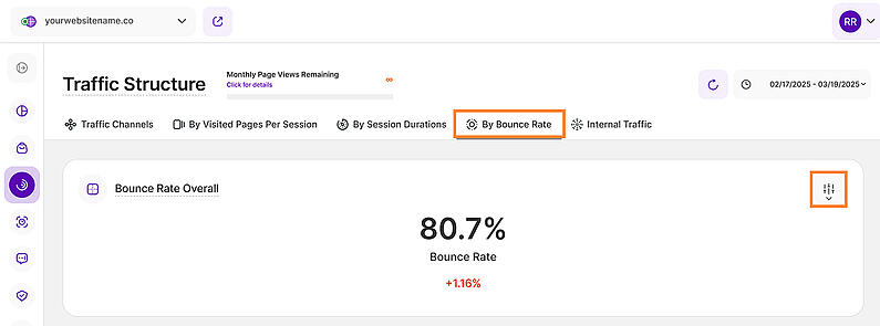
This subtab empowers you to identify traffic channels with the lowest bounce rate, showcasing which sources drive the most engaged visitors. It is divided into two sections:
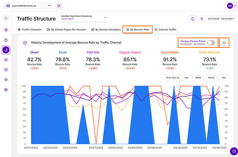
This tile displays the average bounce rate within the selected time range. The bounce rate means the percentage of visitors that left your website after only one-page view.
It doesn't matter how long the visitor was on the page or how they left. We call it a "bounce" if it is a visit with only one interaction with your website.
You can find the filter icon on the top right of the report block.
Important Hint: A decrease in the percentage of the bounce rate indicates an improvement of your website's performance.
Historic Development of Average Bounce Rate by Traffic Channel
This report block allows you to check the historic development for each traffic channel in terms of average bounce rate. You can select whether you want the data to be shown based on a daily, weekly, monthly or yearly scale.
You can also activate the comparison lines (always a lighter coloring of the original line) by clicking on the compare radio button on the upper right corner of this tile.
Like the other blocks, you’ll also find the filter icon on the upper right corner of this tile.
Important Hints: Click on the channels to display or hide the data on the line chart for that specific channel. Hovering the lines will show you more information.
Internal Traffic
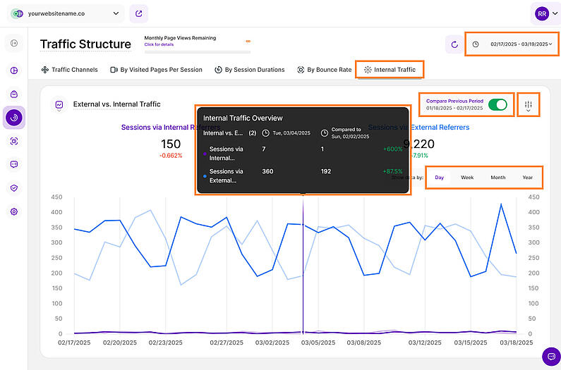
This subtab provides detailed insights into your website's internal traffic. The report block reveals the amount of sessions in the selected period of time that visited at least one website's page before visiting a second page on that same website. It does not matter where the website's session initially came from.
This implies the level of activity on your website after visiting a first page.
This section presents a visual representation of your website's traffic sources through a clear and informative graph. It categorizes sessions into two primary groups:
- External Referrers: These represent sessions originating from sources outside your website's domain. This includes traffic from search engines (like Google), social media platforms, other websites linking to yours, and direct traffic where users type your URL directly into their browser. Understanding external referrers is crucial for evaluating the effectiveness of your marketing and outreach efforts.
- Internal Referrers: These represent the amount of sessions in the selected period of time that visited at least one website's page before visiting a second page on that same website. It does not matter where the website's session initially came from. The number includes clicks on internal links, navigation menus, and other on-site elements. Analyzing internal referrers helps you understand how active your website visitors are on your website after visiting a first page.
Control the dashboard's data display by selecting a time period or specific day with the date picker. The refresh button beside it, allows you to update the data instantly within your dashboard without a full page reload.
The graph visually displays the proportion of sessions attributed to each referrer type, enabling historical comparison of traffic from external and internal sources. Select both options to view overall trends or isolate a single source for focused analysis.
By default, the data is displayed using line charts with each KPIs represented by a line. We offer a variety of customizable data visualization options that you can choose from based on your preference.
As with other report blocks, the 'Compare' feature option (top right) enables comparison to the previous period or year-over-year, when data is available.
To refine your data view, click the filter icon adjacent to the 'Compare' button. Saved filter templates are also available. Filter by browser name and version, visit location (city and country), company information, and other criteria.
The data can be grouped by days, weeks, months, or years. For more in-depth data, simply click on any data point.


